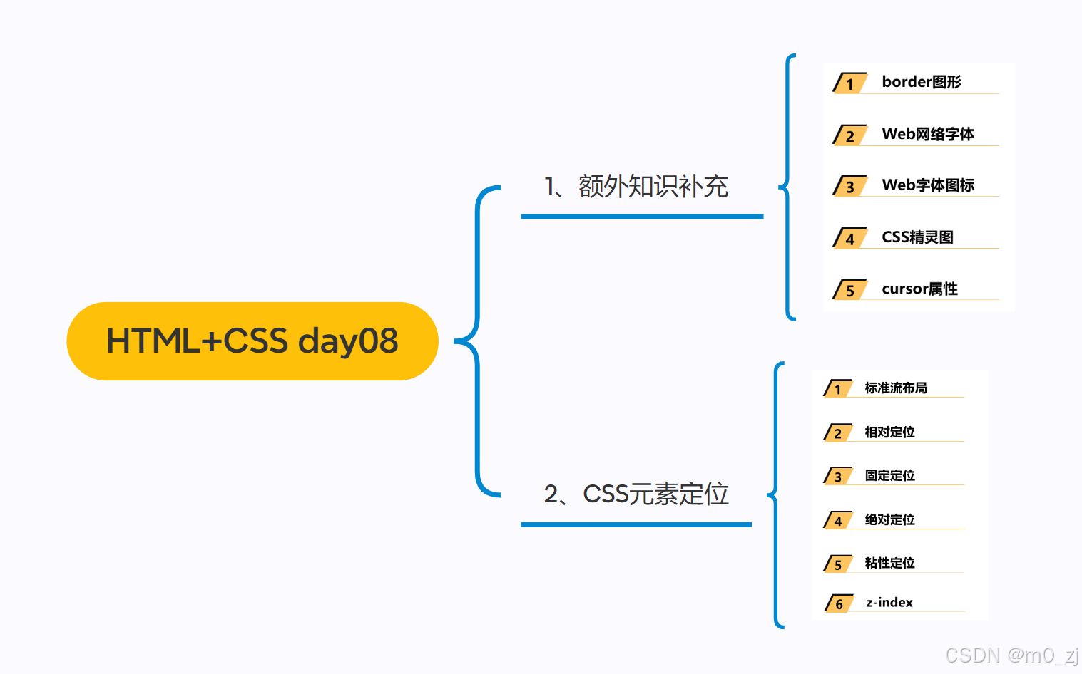
一、额外知识补充
1 border图形
边框的形状
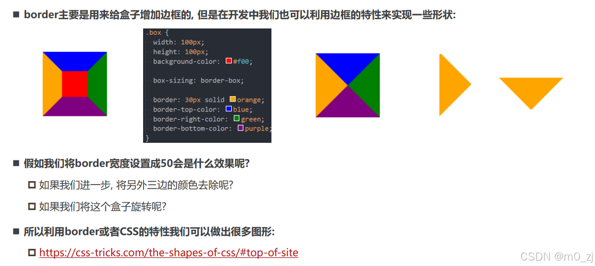
<!DOCTYPE html>
<html lang="en">
<head><meta charset="UTF-8"><meta http-equiv="X-UA-Compatible" content="IE=edge"><meta name="viewport" content="width=device-width, initial-scale=1.0"><title>Document</title><style>.box {width: 100px;height: 100px;/* background-color: transparent; */border: 50px solid transparent;/* border-right-color: blue;border-bottom-color: aqua;border-left-color: blueviolet; *//* border-right-color: transparent;border-bottom-color: transparent;border-left-color: transparent; */border-top-color: orange;box-sizing: border-box;/* 旋转 */transform-origin: center 25%;transform: rotate(180deg);}</style>
</head>
<body><div class="box"></div></body>
</html>
2 Web网络字体
认识Web字体
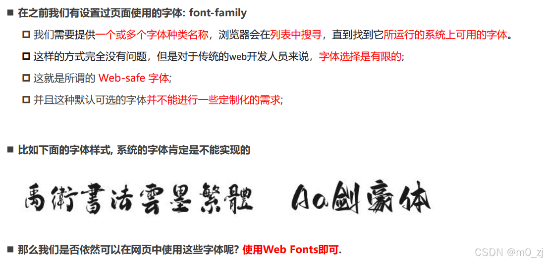
Web fonts的工作原理(理解)
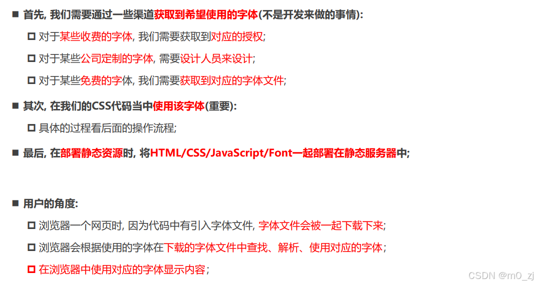
使用Web Fonts

<!DOCTYPE html>
<html lang="en">
<head><meta charset="UTF-8"><meta http-equiv="X-UA-Compatible" content="IE=edge"><meta name="viewport" content="width=device-width, initial-scale=1.0"><title>Document</title><style>/* 将这个字体引入到网页中 */@font-face {font-family: "why";src: url("./fonts/AaQingHuanYuanTi-2.ttf");}.box {font-family: "why";}</style>
</head>
<body><div class="box">我是div元素</div></body>
</html>

web-fonts的兼容性(理解)
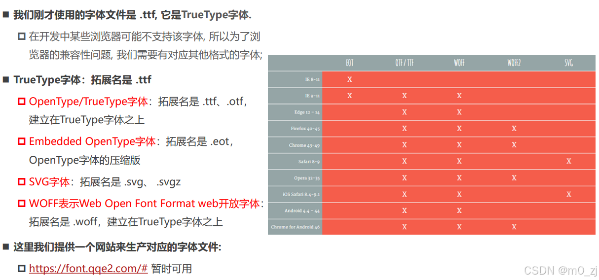
web fonts兼容性写法
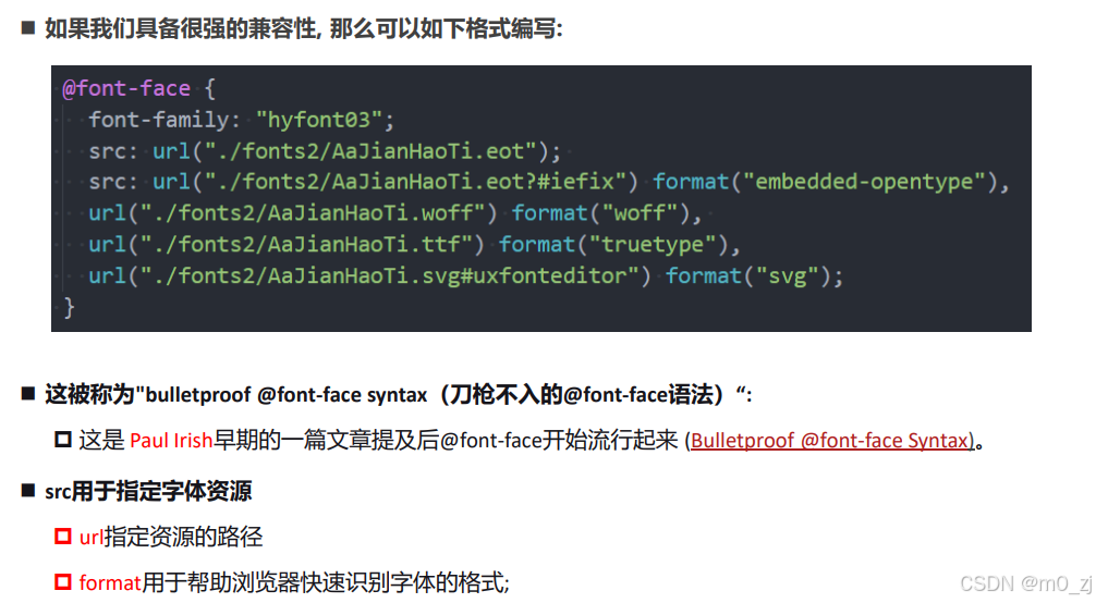
<!DOCTYPE html>
<html lang="en">
<head><meta charset="UTF-8"><meta http-equiv="X-UA-Compatible" content="IE=edge"><meta name="viewport" content="width=device-width, initial-scale=1.0"><title>Document</title><style>@font-face {font-family: "why";src: url("./fonts02/AaQingHuanYuanTi.eot"); /* IE9 */src: url("./fonts02/AaQingHuanYuanTi.eot?#iefix") format("embedded-opentype"), /* IE6-IE8 */url("./fonts02/AaQingHuanYuanTi.woff") format("woff"), /* chrome、firefox */url("./fonts02/AaQingHuanYuanTi.ttf") format("truetype"), /* chrome、firefox、opera、Safari, Android, iOS 4.2+ */url("./fonts02/AaQingHuanYuanTi.svg#uxfonteditor") format("svg"); /* iOS 4.1- */font-style: normal;font-weight: 400;}body {font-family: "why";}</style>
</head>
<body><div class="box">我是div元素</div></body>
</html>
如何生成?
在线字体编辑器-JSON在线编辑器 (qqe2.com)
注意:把之前下载的icon.css下载下来,里面已经给出了兼容性写法。直接拿过来用即可
注意查看URL的路径是否和自己的匹配


3 Web字体图标
认识字体图标
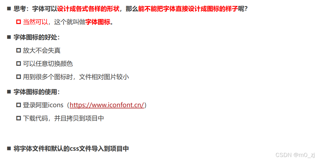
iconfont-阿里巴巴矢量图标库
可以点击购物车,然后下载素材/下载代码
字体图标的本质就是一种网络字体
字体图标的使用
<!DOCTYPE html> <html lang="en"> <head><meta charset="UTF-8"><meta http-equiv="X-UA-Compatible" content="IE=edge"><meta name="viewport" content="width=device-width, initial-scale=1.0"><title>Document</title><style>@font-face {font-family: "iconfont";src: url("./fonts03/iconfont.ttf");}.iconfont {font-family: "iconfont";font-style: normal;}.music::before {content: "\e664";}.icon {display: inline-block;width: 20px;height: 20px;}</style> </head> <body><!-- 直接通过内容(字符实体) --><i class="iconfont"></i><i class="iconfont"></i><i class="icon"></i><!-- 不使用字符实体的方式展示出来(伪元素) --><i class="iconfont music"></i></body> </html>
但实际上,开发的时候,当我们下载文件后,是直接用的,而不是上面自己写。
从我们下载的文件,导入.css和.ttf 然后,创建05文件去使用
<!DOCTYPE html>
<html lang="en">
<head><meta charset="UTF-8"><meta http-equiv="X-UA-Compatible" content="IE=edge"><meta name="viewport" content="width=device-width, initial-scale=1.0"><title>Document</title><link rel="stylesheet" href="./fonts03/iconfont.css"><style>.icon-shouye {font-size: 30px;color: red;}</style>
</head>
<body><i class="iconfont icon-shouye"></i></body>
</html>
使用的话,只用 <i class="iconfont icon-shouye"></i>类似这种代码即可,想用那个图标,就从css文件里找对应的class
如果想自己调整样式,可以在<style>里加上,改文本即可:
<style>
.icon-shouye {
font-size: 30px;
color: red;
}
</style>


4 CSS精灵
认识精灵图 CSS Sprite
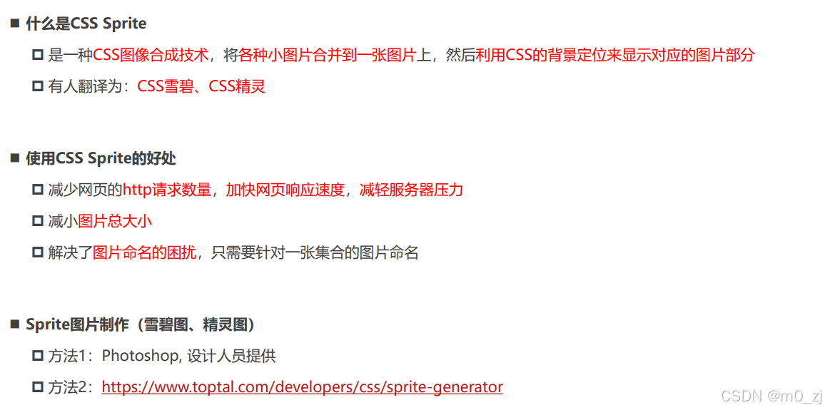
CSS Sprites Generator Tool | Toptal®
精灵图的使用
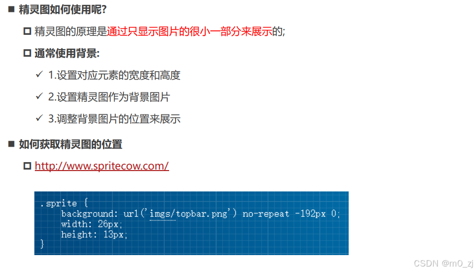
<!DOCTYPE html>
<html lang="en">
<head><meta charset="UTF-8"><meta http-equiv="X-UA-Compatible" content="IE=edge"><meta name="viewport" content="width=device-width, initial-scale=1.0"><title>Document</title><style>.box {background: #333;}.topbar {background-image: url(../images/topbar_sprite.png);background-repeat: no-repeat;display: inline-block;}i.hot-icon {background-position: -192px 0;width: 26px;height: 13px;}i.logo-icon {background-position: 0 -19px;width: 157px;height: 33px;}</style>
</head>
<body><div class="box"><i class="topbar hot-icon"></i><i class="topbar logo-icon"></i><!-- <i class="topbar "></i> --></div></body>
</html>

5 cursor属性
cusor
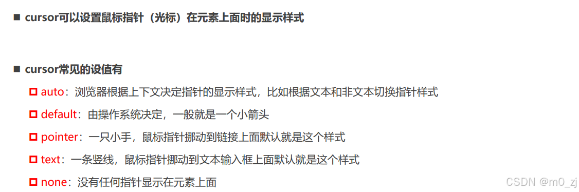
<!DOCTYPE html>
<html lang="en">
<head><meta charset="UTF-8"><meta http-equiv="X-UA-Compatible" content="IE=edge"><meta name="viewport" content="width=device-width, initial-scale=1.0"><title>Document</title><style>div {cursor: none;text-decoration: underline;color: #00f;}</style>
</head>
<body><div>我是box</div><a href="#">百度一下</a></body>
</html>

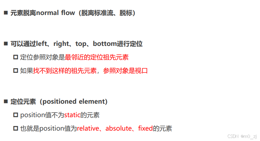
二、CSS元素定位
1 标准流布局
标准流(Normal Flow)

margin-padding位置调整

认识元素的定位

认识position属性

<!DOCTYPE html>
<html lang="en">
<head><meta charset="UTF-8"><meta http-equiv="X-UA-Compatible" content="IE=edge"><meta name="viewport" content="width=device-width, initial-scale=1.0"><title>Document</title><style>.box {display: inline-block;position: static;left: 0;top: 100px;bottom: 20px;right: 30px;}</style>
</head>
<body><div>div元素</div><span>span元素</span><img src="../images/gouwujie01.jpg" alt=""><div class="box"></div></body>
</html>
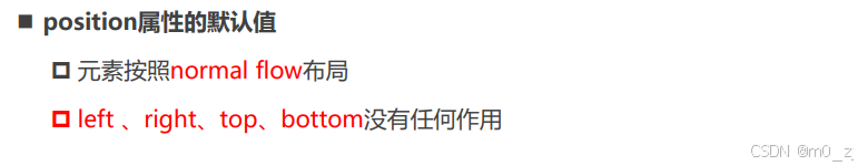
注意:上述代码设置position为static也就是默认的静态,(静态定位)那么以下属性是无效的:
left: 0;
top: 100px;
bottom: 20px;
right: 30px;因为,我们如果让元素变绝对定位元素,即脱离标准流,该变某个元素,不会影响其他元素的位置。

静态定位 - static
2 相对定位
相对定位 - relative

<!DOCTYPE html>
<html lang="en">
<head><meta charset="UTF-8"><meta http-equiv="X-UA-Compatible" content="IE=edge"><meta name="viewport" content="width=device-width, initial-scale=1.0"><title>Document</title><style>.text {/* margin-left: 30px; */  /* relative: 相对定位 */position: relative;left: -30px;top: -50px;/* bottom: 50px;right: 30px; */}</style>
</head>
<body><span>我是span元素</span><strong class="text">我是strong元素</strong><img src="../images/kobe01.jpg" alt=""><div>我是div元素</div></body>
</html>
对strong元素设置的-30和-50是相当于它自己原来位置而言的
相对定位的练习
<!DOCTYPE html>
<html lang="en">
<head><meta charset="UTF-8"><meta http-equiv="X-UA-Compatible" content="IE=edge"><meta name="viewport" content="width=device-width, initial-scale=1.0"><title>Document</title><style>div {font-size: 20px;}span {font-size: 12px;position: relative;bottom: 8px;}</style>
</head>
<body><div>3<span>2</span> + 2<span>3</span> = 17</div></body>
</html>
很好用:用 position: relative;对元素进行微调


相对定位练习
梦幻西游的练习-背景
background: url(../images/mhxy.jpg) center;
<!DOCTYPE html>
<html lang="en">
<head><meta charset="UTF-8"><meta http-equiv="X-UA-Compatible" content="IE=edge"><meta name="viewport" content="width=device-width, initial-scale=1.0"><title>Document</title><style>body {margin: 0;padding: 0;}.box {height: 489px;background-color: #f00;background: url(../images/mhxy.jpg) center;}</style>
</head>
<body><div class="box"></div></body>
</html>
梦幻西游练习-相对定位
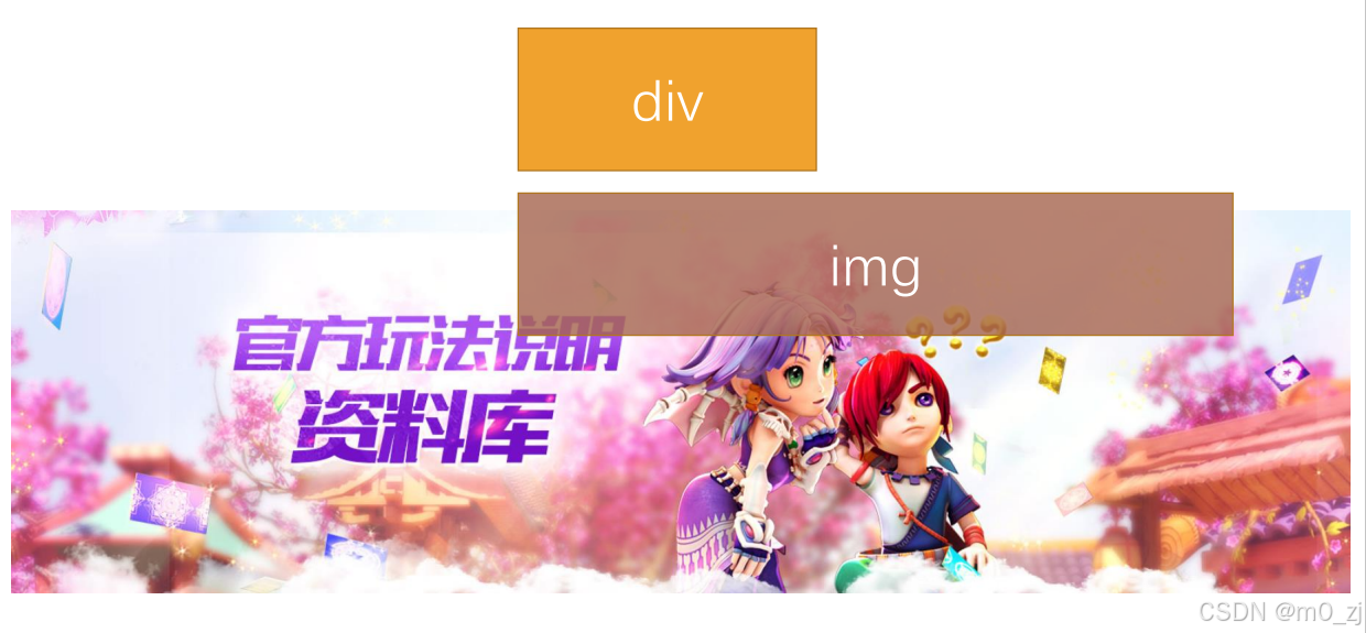
<!DOCTYPE html>
<html lang="en">
<head><meta charset="UTF-8"><meta http-equiv="X-UA-Compatible" content="IE=edge"><meta name="viewport" content="width=device-width, initial-scale=1.0"><title>Document</title><style>body {margin: 0;padding: 0;}.box {height: 489px;background-color: #f00;overflow: hidden;}.box img {position: relative;/* left: 图片的一般 */left: -960px;/* translate中的百分比是相对于自己 *//* transform: translate(-50%); *//* 向右边移动div的一般 */margin-left: 50%;}</style>
</head>
<body><div class="box"><img src="../images/mhxy.jpg" alt=""></div></body>
</html>
先将left: -960px;图标移动图片自己左边一边
margin-left: 50%;是相对于其父元素,也就是div的box.
这句话的含义是向移动div的一半


3 固定定位
固定定位 - fixed

1
<!DOCTYPE html>
<html lang="en">
<head><meta charset="UTF-8"><meta http-equiv="X-UA-Compatible" content="IE=edge"><meta name="viewport" content="width=device-width, initial-scale=1.0"><title>Document</title><style>.text {position: fixed;right: 30px;bottom: 30px;}</style>
</head>
<body><span>我是span元素</span><strong class="text">我是strong元素</strong><img src="../images/kobe01.jpg" alt=""><div>我是div元素</div><br><br><br><br><br><br><br><br><br><br><br><br><br><br><br><br><br><br><br><br><br><br><br><br><br><br><br><br><br><br><br><br><br><br><br><br><br><br><br><br></body>
</html>

画布 和 视口

定位元素的特点

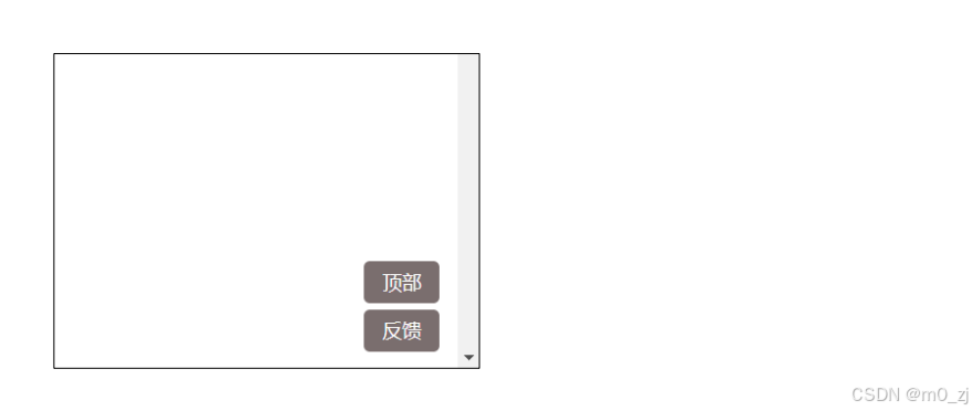
固定定位练习
1
<!DOCTYPE html>
<html lang="en">
<head><meta charset="UTF-8"><meta http-equiv="X-UA-Compatible" content="IE=edge"><meta name="viewport" content="width=device-width, initial-scale=1.0"><title>Document</title><style>.handle {position: fixed;right: 30px;bottom: 30px;}.handle .item {width: 80px;height: 40px;text-align: center;line-height: 40px;background-color: brown;color: #fff;border-radius: 8px;cursor: pointer;}.handle .item:hover {background-color: red;}.top {margin-bottom: 10px;}</style>
</head>
<body><div class="handle"><div class="item top">顶部</div><div class="item bottom">反馈</div></div><br><br><br><br><br><br><br><br><br><br><br><br><br><br><br><br><br><br><br><br><br><br><br><br><br><br><br><br><br><br><br><br><br><br><br><br><br><br><br><br><br><br><br><br><br><br><br><br><br><br></body>
</html>

4 绝对定位
绝对定位 - absolute
绝对定位练习
<!DOCTYPE html>
<html lang="en">
<head><meta charset="UTF-8"><meta http-equiv="X-UA-Compatible" content="IE=edge"><meta name="viewport" content="width=device-width, initial-scale=1.0"><title>Document</title><style>.container {width: 1000px;height: 800px;background-color: #f00;/* position: fixed; */position: relative;top: 0;}.box {position: relative;width: 600px;height: 400px;background-color: #0f0;}strong {/* 脱离标准版 */position: absolute;/* 设置的四个值 *//* 在没有祖先元素定位的情况下, 相对于的是谁? 视口 */right: 0;top: 0;}img {width: 100px;height: 100px;}</style>
</head>
<body><div>哈哈哈啊</div><div class="container"><div class="box"><span>我是span元素</span><strong>我是strong元素</strong><img src="../images/gouwujie01.jpg" alt=""><div>我是div元素</div></div></div><div>呵呵呵呵</div></body>
</html>
绝对定位的练习
[先整理在局部,先做绿色,再strong]
绝对元素,相对于最邻近祖先元素定位的
比如图中strong相对于绿色的box,绿色的box相对于红色的大box
<!DOCTYPE html>
<html lang="en">
<head><meta charset="UTF-8"><meta http-equiv="X-UA-Compatible" content="IE=edge"><meta name="viewport" content="width=device-width, initial-scale=1.0"><title>Document</title><style>.container {width: 800px;height: 800px;background-color: #f00;position: relative;}.box {width: 500px;height: 500px;background-color: #0f0;position: absolute;right: 0;bottom: 0;}strong {position: absolute;left: 0;bottom: 0;}img {width: 100px;}</style>
</head>
<body><div class="container"><div class="box"><span>我是span元素</span><strong>我是strong元素</strong><img src="../images/gouwujie01.jpg" alt=""><div>我是div元素</div></div></div></body>
</html>
绝对定位
【】


子绝父相
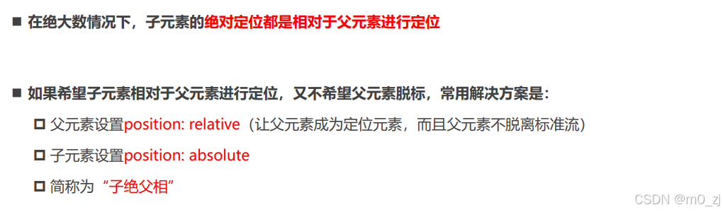
将position设置为absolute/fixed的特点
- absolute和fixed都是绝对定位元素
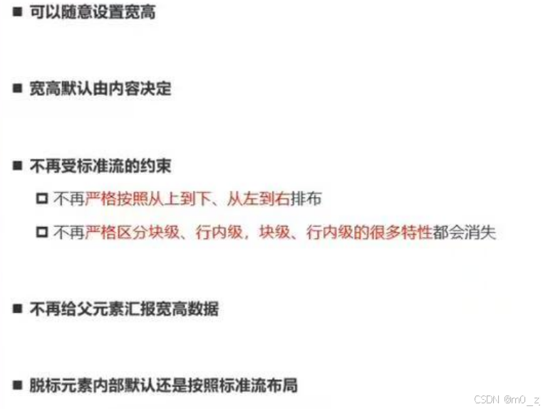
注意:行内非替换元素,如span等不可以设置宽度和高度
但是,如果我们将其设置为absolute/fixed,则可以设置宽高
<!DOCTYPE html>
<html lang="en">
<head><meta charset="UTF-8"><meta http-equiv="X-UA-Compatible" content="IE=edge"><meta name="viewport" content="width=device-width, initial-scale=1.0"><title>Document</title><style>.container {width: 800px;height: 800px;background-color: #f00;position: relative;}.box {width: 500px;height: 500px;background-color: #0f0;position: absolute;right: 0;bottom: 0;}strong {position: absolute;left: 0;bottom: 0;background-color: #00f;color: #fff;width: 200px;height: 60px;}img {width: 100px;}</style>
</head>
<body><div class="container"><div class="box"><span>我是span元素</span><strong>我是strong元素</strong><img src="../images/gouwujie01.jpg" alt=""><div>我是div元素</div></div></div></body>
</html>
绝对定位元素不再汇报宽高
<!DOCTYPE html>
<html lang="en">
<head><meta charset="UTF-8"><meta http-equiv="X-UA-Compatible" content="IE=edge"><meta name="viewport" content="width=device-width, initial-scale=1.0"><title>Document</title><style>.box{background-color: red;}.box strong{position: absolute;}</style>
</head>
<body><div class="box"><strong>我是strong</strong></div></body>
</html>
可以看到,当我们给position设置为absolute的时候,就不再给父元素 汇报宽度和高度


绝对定位练习
<!DOCTYPE html>
<html lang="en">
<head><meta charset="UTF-8"><meta http-equiv="X-UA-Compatible" content="IE=edge"><meta name="viewport" content="width=device-width, initial-scale=1.0"><title>Document</title><style>.box {width: 800px;height: 300px;background-color: #f00;position: relative;}/* 兼容性 */.container {height: 100px;background-color: #0f0;width: 200px;/* width: 100%; */position: absolute;left: 0;right: 0;top: 0;bottom: 0;margin: auto;}</style>
</head>
<body><div class="box"><div class="container"></div></div></body>
</html>
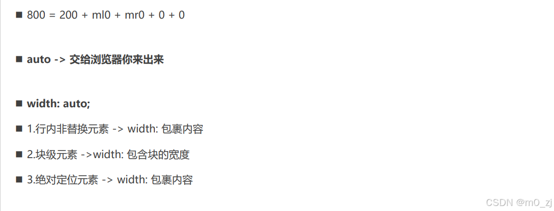
回顾:之前我们的一个公式
<!DOCTYPE html>
<html lang="en">
<head><meta charset="UTF-8"><meta http-equiv="X-UA-Compatible" content="IE=edge"><meta name="viewport" content="width=device-width, initial-scale=1.0"><title>Document</title><style>.box {width: 800px;height: 300px;background-color: #f00;}.container{height: 100px;background-color: #0f0;width: 200px;margin: 0 auto;}</style>
</head>
<body><div class="box"><div class="container"></div></div></body>
</html>


auto到底是什么?
auto的意思是交给浏览器来处理
绝对定位的案例练习
建议:从外往里,从上往下写
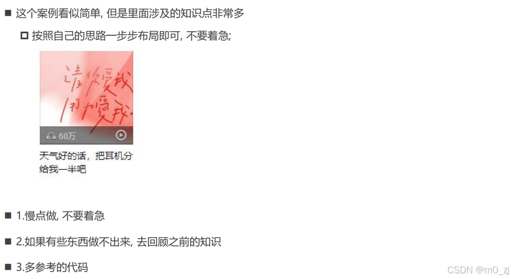
<!DOCTYPE html>
<html lang="en">
<head><meta charset="UTF-8"><meta http-equiv="X-UA-Compatible" content="IE=edge"><meta name="viewport" content="width=device-width, initial-scale=1.0"><title>Document</title><style>/* 重置代码 */a {text-decoration: none;color: #333;}/* 公共的CSS */.sprite_01 {background-image: url(../images/music_sprite_01.png);display: inline-block;}.sprite_02 {background-image: url(../images/music_sprite_02.png);display: inline-block;}.sprite_02_icon_music {width: 14px;height: 11px;background-position: 0 -24px;}.sprite_02_icon_play {width: 16px;height: 17px;background-position: 0 0;}/* 布局代码 */.item {width: 140px;margin: 0 auto;}.item .top {position: relative;}.item .top img {/* 将图片下面的多出来的区域去除 */vertical-align: top;/* display: block; */}.item .top .cover {position: absolute;top: 0;bottom: 0;left: 0;right: 0;background-image: url(../images/music_sprite_01.png);background-position: 0 0;}.item .top .info {position: absolute;bottom: 0;left: 0;right: 0;height: 27px;padding-left: 10px;line-height: 27px;font-size: 12px;color: #ccc;background-image: url(../images/music_sprite_01.png);background-position: 0 -537px;}.item .top .info .icon-music {position: relative;top: 1px;/* display: inline-block; *//* width: 14px;height: 11px; *//* background-image: url(../images/music_sprite_02.png); *//* background-position: 0 -24px; */}.item .top .info .count {margin-left: 4px;}.item .top .info .icon-play {position: absolute;top: 0;bottom: 0;right: 10px;margin: auto 0;/* display: inline-block; *//* width: 16px;height: 17px; *//* background-image: url(../images/music_sprite_02.png); *//* background-position: 0 0; */}/* 底部的样式 */.item .bottom {display: block;margin-top: 8px;font-size: 14px;}.item .bottom:hover {text-decoration: underline;}</style>
</head>
<body><div class="item"><div class="top"><img src="../images/music_album01.jpg" alt="音乐封面"><a class="cover" href="#"></a><div class="info"><i class="sprite_02 sprite_02_icon_music icon-music"></i><span class="count">62万</span><i class="sprite_02 sprite_02_icon_play icon-play"></i></div></div><a class="bottom" href="#">天气好的话,把耳机分给我一半吧</a><i class="sprite_02 sprite_02_icon_play"></i><i class="sprite_02 sprite_02_icon_music"></i></div></body>
</html>
注意:当a为绝对定位元素,已经脱离行内块元素的概念了不用对a设置display:inline-block
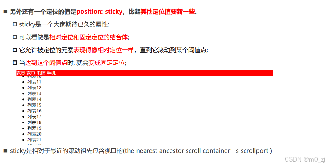
5 粘性定位
粘性定位 - sticky
<!DOCTYPE html>
<html lang="en">
<head><meta charset="UTF-8"><meta http-equiv="X-UA-Compatible" content="IE=edge"><meta name="viewport" content="width=device-width, initial-scale=1.0"><title>Document</title><style>.nav {background-color: #f00;color: #fff;/* position: relative;top: 0;left: 0;right: 0; */position: sticky;top: 0;}</style>
</head>
<body><h1>我是标题</h1><div class="nav"><span>电脑</span><span>手机</span><span>衣服</span><span>鞋子</span></div><ul><li>电脑列表1</li><li>电脑列表2</li><li>电脑列表3</li><li>电脑列表4</li><li>电脑列表5</li><li>电脑列表6</li><li>电脑列表7</li><li>电脑列表8</li><li>电脑列表9</li><li>电脑列表10</li><li>电脑列表11</li><li>电脑列表12</li><li>电脑列表13</li><li>电脑列表14</li><li>电脑列表15</li><li>电脑列表16</li><li>电脑列表17</li><li>电脑列表18</li><li>电脑列表19</li><li>电脑列表20</li><li>电脑列表21</li><li>电脑列表22</li><li>电脑列表23</li><li>电脑列表24</li><li>电脑列表25</li><li>电脑列表26</li><li>电脑列表27</li><li>电脑列表28</li><li>电脑列表29</li><li>电脑列表30</li><li>电脑列表31</li><li>电脑列表32</li><li>电脑列表33</li><li>电脑列表34</li><li>电脑列表35</li><li>电脑列表36</li><li>电脑列表37</li><li>电脑列表38</li><li>电脑列表39</li><li>电脑列表40</li><li>电脑列表41</li><li>电脑列表42</li><li>电脑列表43</li><li>电脑列表44</li><li>电脑列表45</li><li>电脑列表46</li><li>电脑列表47</li><li>电脑列表48</li><li>电脑列表49</li><li>电脑列表50</li><li>电脑列表51</li><li>电脑列表52</li><li>电脑列表53</li><li>电脑列表54</li><li>电脑列表55</li><li>电脑列表56</li><li>电脑列表57</li><li>电脑列表58</li><li>电脑列表59</li><li>电脑列表60</li><li>电脑列表61</li><li>电脑列表62</li><li>电脑列表63</li><li>电脑列表64</li><li>电脑列表65</li><li>电脑列表66</li><li>电脑列表67</li><li>电脑列表68</li><li>电脑列表69</li><li>电脑列表70</li><li>电脑列表71</li><li>电脑列表72</li><li>电脑列表73</li><li>电脑列表74</li><li>电脑列表75</li><li>电脑列表76</li><li>电脑列表77</li><li>电脑列表78</li><li>电脑列表79</li><li>电脑列表80</li><li>电脑列表81</li><li>电脑列表82</li><li>电脑列表83</li><li>电脑列表84</li><li>电脑列表85</li><li>电脑列表86</li><li>电脑列表87</li><li>电脑列表88</li><li>电脑列表89</li><li>电脑列表90</li><li>电脑列表91</li><li>电脑列表92</li><li>电脑列表93</li><li>电脑列表94</li><li>电脑列表95</li><li>电脑列表96</li><li>电脑列表97</li><li>电脑列表98</li><li>电脑列表99</li><li>电脑列表100</li></ul></body>
</html>
给定粘性定位和一个距离
position: sticky;
top:0;
注意:◼ sticky是相对于最近的滚动祖先包含滚动视口的(the nearest ancestor scroll container’s scrollport )
<!DOCTYPE html>
<html lang="en">
<head><meta charset="UTF-8"><meta http-equiv="X-UA-Compatible" content="IE=edge"><meta name="viewport" content="width=device-width, initial-scale=1.0"><title>Document</title><style>.box {width: 500px;height: 500px;margin: 100px auto 0;overflow: scroll;background-color: #ccc;}.nav {background-color: #f00;color: #fff;position: sticky;top: 0;}</style>
</head>
<body><div class="box"><h1>我是标题</h1><div class="nav"><span>电脑</span><span>手机</span><span>衣服</span><span>鞋子</span></div><ul><li>电脑列表1</li><li>电脑列表2</li><li>电脑列表3</li><li>电脑列表4</li><li>电脑列表5</li><li>电脑列表6</li><li>电脑列表7</li><li>电脑列表8</li><li>电脑列表9</li><li>电脑列表10</li><li>电脑列表11</li><li>电脑列表12</li><li>电脑列表13</li><li>电脑列表14</li><li>电脑列表15</li><li>电脑列表16</li><li>电脑列表17</li><li>电脑列表18</li><li>电脑列表19</li><li>电脑列表20</li><li>电脑列表21</li><li>电脑列表22</li><li>电脑列表23</li><li>电脑列表24</li><li>电脑列表25</li><li>电脑列表26</li><li>电脑列表27</li><li>电脑列表28</li><li>电脑列表29</li><li>电脑列表30</li><li>电脑列表31</li><li>电脑列表32</li><li>电脑列表33</li><li>电脑列表34</li><li>电脑列表35</li><li>电脑列表36</li><li>电脑列表37</li><li>电脑列表38</li><li>电脑列表39</li><li>电脑列表40</li><li>电脑列表41</li><li>电脑列表42</li><li>电脑列表43</li><li>电脑列表44</li><li>电脑列表45</li><li>电脑列表46</li><li>电脑列表47</li><li>电脑列表48</li><li>电脑列表49</li><li>电脑列表50</li><li>电脑列表51</li><li>电脑列表52</li><li>电脑列表53</li><li>电脑列表54</li><li>电脑列表55</li><li>电脑列表56</li><li>电脑列表57</li><li>电脑列表58</li><li>电脑列表59</li><li>电脑列表60</li><li>电脑列表61</li><li>电脑列表62</li><li>电脑列表63</li><li>电脑列表64</li><li>电脑列表65</li><li>电脑列表66</li><li>电脑列表67</li><li>电脑列表68</li><li>电脑列表69</li><li>电脑列表70</li><li>电脑列表71</li><li>电脑列表72</li><li>电脑列表73</li><li>电脑列表74</li><li>电脑列表75</li><li>电脑列表76</li><li>电脑列表77</li><li>电脑列表78</li><li>电脑列表79</li><li>电脑列表80</li><li>电脑列表81</li><li>电脑列表82</li><li>电脑列表83</li><li>电脑列表84</li><li>电脑列表85</li><li>电脑列表86</li><li>电脑列表87</li><li>电脑列表88</li><li>电脑列表89</li><li>电脑列表90</li><li>电脑列表91</li><li>电脑列表92</li><li>电脑列表93</li><li>电脑列表94</li><li>电脑列表95</li><li>电脑列表96</li><li>电脑列表97</li><li>电脑列表98</li><li>电脑列表99</li><li>电脑列表100</li></ul></div></body>
</html>


position值对比
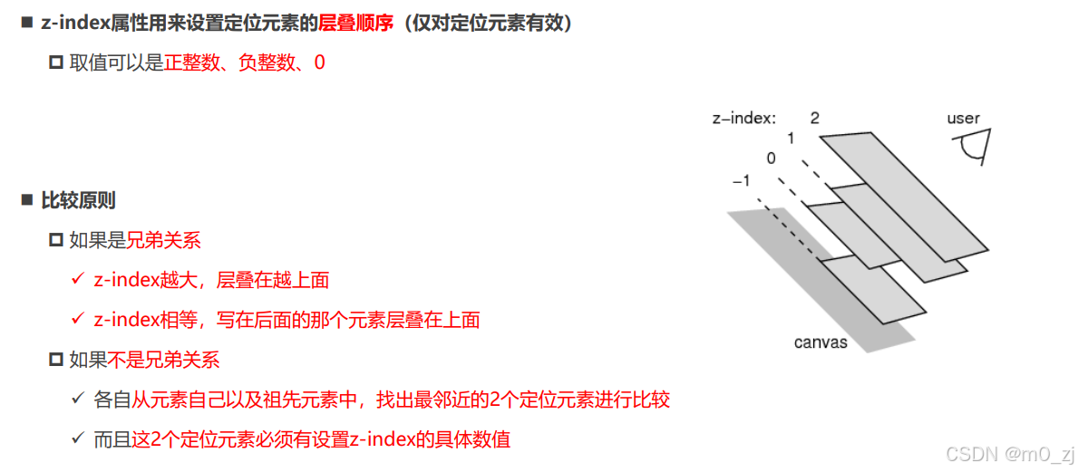
6 z-inde
CSS属性 - z-index
<!DOCTYPE html>
<html lang="en">
<head><meta charset="UTF-8"><meta http-equiv="X-UA-Compatible" content="IE=edge"><meta name="viewport" content="width=device-width, initial-scale=1.0"><title>Document</title><style>.item {position: fixed;width: 100px;height: 100px;left: 0;top: 0;background-color: #f00;}.box2 {left: 20px;top: 20px;background-color: #0f0;z-index: -1;}.box3 {left: 40px;top: 40px;background-color: #00f;}</style>
</head>
<body><div class="item box1">1</div><div class="container"><div class="item box2">2</div></div><div class="item box3">3</div></body>
</html>
<!DOCTYPE html>
<html lang="en">
<head><meta charset="UTF-8"><meta http-equiv="X-UA-Compatible" content="IE=edge"><meta name="viewport" content="width=device-width, initial-scale=1.0"><title>Document</title><style>.item {position: fixed;width: 100px;height: 100px;left: 0;top: 0;background-color: #f00;}.box2 {left: 20px;top: 20px;background-color: #0f0;z-index: -1;}.box3 {left: 40px;top: 40px;background-color: #00f;}.info {position: absolute;z-index: 999;}</style>
</head>
<body><div class="item box1">1</div><div class="container"><div class="item box2"><div class="info">哈哈哈</div><div>呵呵呵</div></div></div><div class="item box3">3</div></body>
</html>


三、Day08 练习
一. 完成所有的代码
已完成
二. 说出结构伪类的nth-child和nth-of-type的区别,并且写出案例练习
:nth-child 只计算父元素的第几个子元素 ,不管是否是同种类型,也不会排除干扰项.
:nth-of-type 计数时只计算同种类型的元素,会排除所有的干扰项
<!DOCTYPE html>
<html lang="en"><head><meta charset="UTF-8" /><meta http-equiv="X-UA-Compatible" content="IE=edge" /><meta name="viewport" content="width=device-width, initial-scale=1.0" /><title>Document</title><style>/* 获取box 的第3个div元素 */.box div:nth-child(3) {color: red;}/* 父元素下的3个孩子 */.box :nth-child(3) {color: pink;}/* 需求: 选择box中的第三个div元素(排除所有的干扰项) */.box div:nth-of-type(3) {font-weight: 700;color: green;}.box div:nth-of-type(2n) {background-color: pink;}.box div:nth-of-type(2n + 1) {background-color: blue;}/* 前几个 */.box div:nth-of-type(-n + 4) {color: purple;font-weight: 700;}/* 会找ul下的子元素同类型的第几个 */ul :nth-of-type(3) {color: pink;}</style></head><body><div class="box"><div>第1个元素</div><span>干扰项1</span><span>干扰项2</span><span>干扰项3</span><span>干扰项4</span><span>干扰项5</span><div>第2个元素</div><div>第3个元素</div><div>第4个元素</div><div>第5个元素</div><div>第6个元素</div><div>第7个元素</div><div>第8个元素</div><p>干扰项6</p><div>第9个元素</div><div>第10个元素</div></div><ul><li>第1个li元素</li><li>第2个li元素</li><span>干扰项3</span><span>干扰项4</span><span>干扰项5</span><li>第3个li元素</li><li>第4个li元素</li><li>第5个li元素</li><li>第6个li元素</li><li>第7个li元素</li><li>第8个li元素</li><li>第9个li元素</li><li>第10个li元素</li></ul></body>
</html>
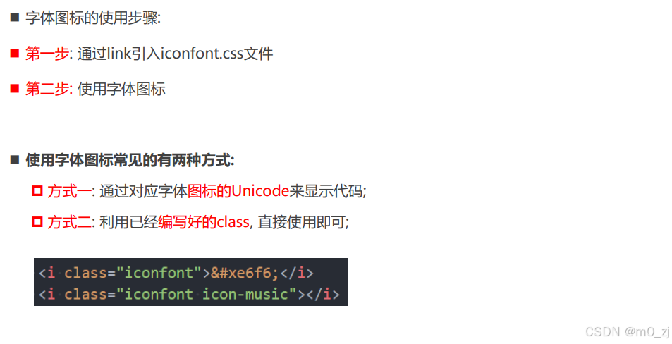
三. 自己练习使用字体图标
-
从iconfont中下载图标练习
-
方式一 通过对应字体图标的Unicode来显示代码;
<!DOCTYPE html>
<html lang="en"><head><meta charset="UTF-8" /><meta http-equiv="X-UA-Compatible" content="IE=edge" /><meta name="viewport" content="width=device-width, initial-scale=1.0" /><title>Document</title><style>/* 1.引入字体文件 */@font-face {font-family: "iconfont";src: url(./fonts03/iconfont.ttf);}/* 抽取公共类 */.iconfont {font-family: "iconfont";font-style: normal;}.person {display: inline-block;width: 100px;height: 100px;background-color: pink;font-size: 80px;}.gonchang::before {content: "\e98e";display: inline-block;width: 300px;height: 300px;font-size: 80px;background-color: pink;}</style></head><body><i class="iconfont">𐂭</i><i class="iconfont person"></i><i class="iconfont"></i><i class="iconfont gonchang"></i></body>
</html>
-
方式二 利用已经编写好的class, 直接使用即可;
-
<!DOCTYPE html> <html lang="en"><head><meta charset="UTF-8" /><meta http-equiv="X-UA-Compatible" content="IE=edge" /><meta name="viewport" content="width=device-width, initial-scale=1.0" /><title>Document</title><link rel="stylesheet" href="./fonts03/iconfont.css" /><style>.icon-hetong {display: inline-block;width: 40px;height: 40px;font-size: 30px;background-color: pink;}</style></head><body><i class="iconfont icon-hetong"></i></body> </html>
四. 自己找精灵图进行练习
<!DOCTYPE html>
<html lang="en"><head><meta charset="UTF-8" /><meta http-equiv="X-UA-Compatible" content="IE=edge" /><meta name="viewport" content="width=device-width, initial-scale=1.0" /><title>Document</title><link rel="stylesheet" href="./css/reset.css" /><style>.service {background: #eaeaea;border-bottom: 1px solid #666;margin-top: 200px;}.w {width: 1200px;margin: 0 auto;}.slogen {display: flex;align-items: center;height: 42px;padding: 30px 0 30px 55px;}.slogen .item {display: flex;flex: 1;align-items: center;height: 42px;line-height: 42px;font-size: 18px;font-weight: 700;color: #444;text-indent: 8px;}.slogen .icon {display: inline-block;width: 36px;height: 42px;background: url(../image/jd_sprite.png) no-repeat;}.slogen .more {background-position: 0 -192px;}.slogen .fast {background-position: -41px -192px;}.slogen .good {background-position: -82px -192px;}.slogen .cheap {background-position: -123px -192px;}</style></head><body><div class="service"><div class="w"><ul class="slogen"><li class="item"><i class="icon more"></i>品类齐全,轻松购物</li><li class="item"><i class="icon fast"></i>多仓直发,极速配送</li><li class="item"><i class="icon good"></i>正品行货,精致服务</li><li class="item"><i class="icon cheap"></i>天天低价,畅选无忧</li></ul></div></div></body>
</html>
五. 结合CSS元素定位,并且找出对应的练习案例(2个)
第一个模仿京东我的购物车
<!DOCTYPE html>
<html lang="en"><head><meta charset="UTF-8" /><meta http-equiv="X-UA-Compatible" content="IE=edge" /><meta name="viewport" content="width=device-width, initial-scale=1.0" /><link rel="stylesheet" href="./fonts/iconfont.css" /><title>Document</title><style>body {padding: 0;margin: 0;}a {text-decoration: none;font-size: 14px;}.shopping-cart {position: relative;width: 130px;height: 34px;line-height: 34px;text-align: center;border: 1px solid #eee;margin: 100px auto;}.shopping-cart .icon-gouwuche {color: #e1251b;font-size: 18px;font-weight: 700;margin-right: 10px;}.shopping-cart .my-cart {color: #e1251b;font-size: 14px;font-weight: 700;}.shopping-cart .num {position: absolute;left: 27px;top: 2px;display: inline-block;width: 12px;text-align: center;line-height: 12px;padding: 1px 3px;font-size: 12px;border-radius: 7px;color: #fff;background-color: #e1251b;font-style: normal;}</style></head><body><div class="shopping-cart"><i class="icon-gouwuche iconfont"></i><a href="#" class="my-cart">我的购物车</a><i class="num">0</i></div></body>
</html>
第二个模仿B站头部服务列表
<!DOCTYPE html>
<html lang="en"><head><meta charset="UTF-8" /><meta http-equiv="X-UA-Compatible" content="IE=edge" /><meta name="viewport" content="width=device-width, initial-scale=1.0" /><title>Document</title><link rel="stylesheet" href="./css/reset.css" /><link rel="stylesheet" href="./fonts02/iconfont.css" /><style>.list {width: 300px;height: 50px;color: #fff;background-color: #ccc;margin: 30px auto;}.list .item {float: left;width: 50px;}.list .item .outside {position: relative;display: flex;flex-direction: column;justify-content: center;align-items: center;width: 50px;height: 50px;font-size: 10px;color: #fff;}.list .item .outside .icon {display: inline-block;width: 22px;height: 23px;font-size: 20px;}.list .item .outside .message {position: absolute;top: -1px;right: 5px;width: 15px;height: 15px;line-height: 15px;text-align: center;font-size: 12px;color: #fff;border-radius: 7px;background-color: #fa5a57;}</style></head><body><ul class="list"><li class="item"><a href="#" class="outside"><i class="iconfont icon-wodedahuiyuan icon"></i><span class="text">大会员</span></a></li><li class="item"><a href="#" class="outside"><i class="iconfont icon-xiaoxi icon"></i><div class="message">2</div><span class="text">消息</span></a></li><li class="item"><a href="#" class="outside"><i class="iconfont icon-fengche icon"></i><div class="message">3</div><span class="text">动态</span></a></li><li class="item"><a href="#" class="outside"><i class="iconfont icon-shoucang icon"></i><span class="text">收藏</span></a></li><li class="item"><a href="#" class="outside"><i class="iconfont icon-lishi icon"></i><span class="text">历史</span></a></li><li class="item"><a href="#" class="outside"><i class="iconfont icon-dengpao icon"></i><span class="text">创作中心</span></a></li></ul></body>
</html>
四、总结
一. 结构伪类
1.1. nth-child
nth-child(2)
nth-child(2n+1)
nth-child(-n+5)
1.2. nth-last-child/nth-of-type/nth-last-of-type
1.3. 其他结构伪类
first-child
相对比较重要的两个伪类:
:root => html
:empty => 小程序
1.4. 否定伪类
:not(简单选择器)
二. 额外知识补充
2.1. border的图形
三角形
旋转(后续)
2.2. 网络字体
-
拿到字体
-
@font-face
-
使用它
-
兼容性
2.3. 字体图标
-
选择图标
-
下载代码
-
在项目中使用
<i>字符实体</i>
<i class="iconfont icon-video"></i>
补充: 如果有新的图标
-
使用最新下载的字体
2.4. CSS Sprite
将多个图标放到一张图片
使用图片
-
width/height
-
background-position
2.5. cursor
cursor: pointer
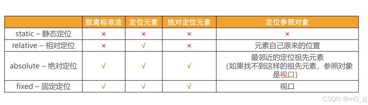
三. 元素定位(布局)
3.1. 对标准流的理解
3.2. 元素的定位
常见的值:
-
static
-
relative
-
absolute
-
fixed
-
sticky
3.3. 相对定位
-
relative
-
相对自己原来的位置(标准流中的位置)
-
left/right/top/bottom
-
-
小案例
-
3 + 2 = 5
-
-
img居中显示(了解)
-
背景完成
-
3.4. 固定定位
-
fixed
-
相对视口(可视区域viewport)
-
不会随着内容的滚动而滚动
-
-
练习:
-
顶部/反馈
-
一. 绝对定位(absolute)
1.1. 绝对定位
1.会脱离标准流
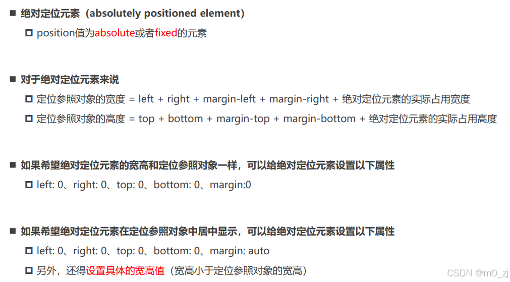
2.相对的参照对象
-
最近的祖先定位元素;
-
如果祖先元素都没有定位, 相对视口
3.子绝父相
-
子元素绝对定位
-
父元素相对定位
4.子绝父绝
-
子元素绝对定位
-
父元素绝对定位
5.子绝父固
-
子元素绝对定位
-
父元素固定定位
1.2. position设置absolute/fixed特性
1.都是脱离标准流
2.可以任何设置宽度和高度
3.默认宽度高度是包裹内容
4.不再给父级元素汇报宽度和高度
5.自己内部依然按照标准流布局
6.公式
-
包含块的width = left + right + margin-left + margin-right + width
-
left0 right0 margin 0 auto width: 200px -> 水平居中
-
left 0 right 0 margin 0 -> 宽度沾满包含块的宽度
-
-
垂直方向也是一样
-
俺也一样
-
1.3. 绝对定位案例
网易云item的练习
-
基本布局
-
背景
-
绝对定位
1.4. 粘性定位 sticky
-
基本演练
-
默认相对定位
-
top: 0 -> 固定(绝对)
-
-
top/bottom/left/right -> 最近的滚动视口
1.5. position多个值总结
1.6. z-index
-
只对定位元素有效
-
兄弟比较