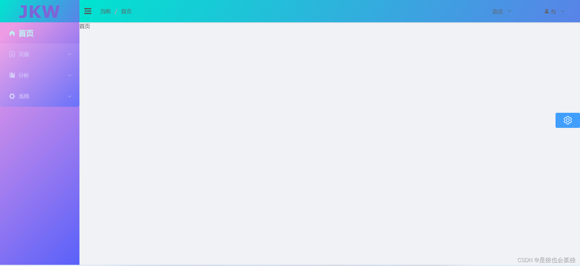
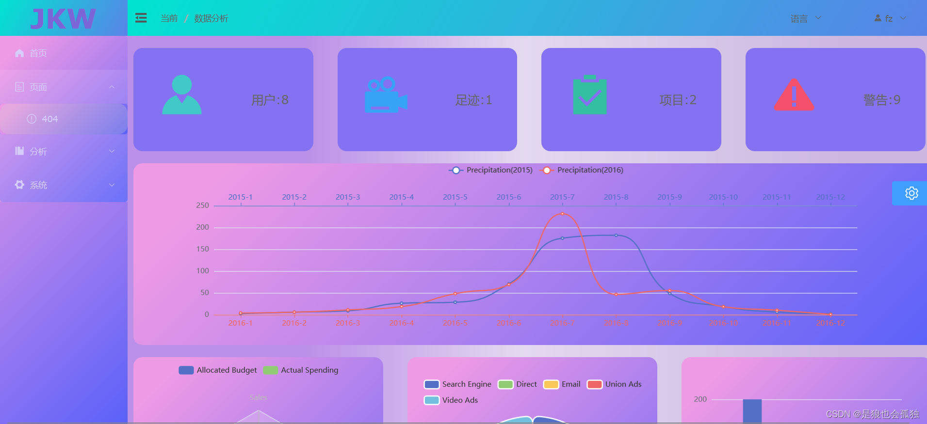
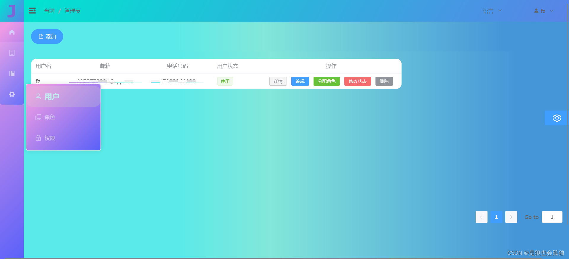
效果演示
先给大家看一下效果吧

el-menu详解
| 属性名 | 说明 | 类型 | 可选值 | 默认值 |
|---|
| mode | 菜单展示模式 | string | horizontal / vertical | vertical |
| collapse | 是否水平折叠收起菜单(仅在 mode 为 vertical 时可用) | boolean | — | false |
| ellipsis | 是否省略多余的子项(仅在横向模式生效) | boolean | — | true |
| background-color | 菜单的背景颜色(十六进制格式)(已被废弃,使用--bg-color) | string | — | #ffffff |
| text-color | 文字颜色(十六进制格式)(已被废弃,使用--text-color) | string | — | #303133 |
| active-text-color | 活动菜单项的文本颜色(十六进制格式)(已被废弃,使用--active-color) | string | — | #409EFF |
| default-active | 页面加载时默认激活菜单的 index | string | — | — |
| default-openeds | 默认打开的 sub-menu 的 index 的数组 | Array | — | — |
| unique-opened | 是否只保持一个子菜单的展开 | boolean | — | false |
| menu-trigger | 子菜单打开的触发方式,只在 mode 为 horizontal 时有效。 | string | hover / click | hover |
| router | 是否启用 vue-router 模式。 启用该模式会在激活导航时以 index 作为 path 进行路由跳转 使用 default-active 来设置加载时的激活项。 | boolean | — | false |
| collapse-transition | 是否开启折叠动画 | boolean | — | true |
| popper-effect | Tooltip 主题,内置了 dark / light 两种主题 | string | dark / light | dark |
| 方法名 | 说明 | 参数 |
|---|
| open | 展开指定的 sub-menu | index: 需要打开的 sub-menu 的 index |
| close | 收起指定的 sub-menu | index: 需要收起的 sub-menu 的 index |
| 事件名 | 说明 | 回调参数 |
|---|
| select | 菜单激活回调 | index: 选中菜单项的 index, indexPath: 选中菜单项的 index path, item: 选中菜单项, routeResult: vue-router 的返回值(如果 router 为 true) |
| open | sub-menu 展开的回调 | index: 打开的 sub-menu 的 index, indexPath: 打开的 sub-menu 的 index path |
| close | sub-menu 收起的回调 | index: 收起的 sub-menu 的 index, indexPath: 收起的 sub-menu 的 index path |
| 插槽名 | 说明 | 子标签 |
|---|
| — | 自定义默认内容 | SubMenu / Menu-Item / Menu-Item-Group |
| 属性名 | 说明 | 类型 | 可选值 | 默认值 |
|---|
| index | 唯一标志 | string | — | — |
| popper-class | 为 popper 添加类名 | string | — | — |
| show-timeout | 展开 sub-menu 的延时 | number | — | 300 |
| hide-timeout | 收起 sub-menu 的延时 | number | — | 300 |
| disabled | 是否禁用 | boolean | — | false |
| popper-append-to-body(已废弃) | 是否将弹出菜单插入至 body 元素。 在菜单的定位出现问题时,可尝试修改该属性 | boolean | — | 一级子菜单:true / 非一级子菜单:false |
| teleported | 是否将 popup 的下拉列表插入至 body 元素 | boolean | — | 一级子菜单:true / 非一级子菜单:false |
| popper-offset | 弹出窗口偏移 | number | — | 6 |
| expand-close-icon | 父菜单展开且子菜单关闭时的图标, expand-close-icon 和 expand-open-icon 需要一起配置才能生效 | string | Component | — | — |
| expand-open-icon | 父菜单展开且子菜单打开时的图标, expand-open-icon 和 expand-close-icon 需要一起配置才能生效 | string | Component | — | — |
| collapse-close-icon | 父菜单收起且子菜单关闭时的图标, expand-close-icon 和 expand-open-icon 需要一起配置才能生效 | string | Component | — | — |
| collapse-open-icon | 父菜单收起且子菜单打开时的图标, expand-open-icon 和 expand-close-icon 需要一起配置才能生效 | string | Component |
| 插槽名 | 说明 | 子标签 |
|---|
| — | 自定义默认内容 | SubMenu / Menu-Item / Menu-Item-Group |
| title | 自定义标题内容 | — |
| 属性名 | 说明 | 类型 | 可选值 | 默认值 |
|---|
| index | 唯一标志 | string/null | — | null |
| route | Vue Router 路径对象 | object | — | — |
| disabled | 是否禁用 | boolean | — | false |
| 事件名 | 说明 | 回调参数 |
|---|
| click | 菜单点击时的回调函数 | el-menu-item 实例 |
| 插槽名 | 说明 |
|---|
| — | 自定义默认内容 |
| title | 自定义标题内容 |
| 属性名 | 说明 | 类型 | 可选值 | 默认值 |
|---|
| title | 组标题 | string | — | — |
| 插槽名 | 说明 | 子标签 |
|---|
| — | 默认插槽内容 | Menu-Item |
| title | 自定义组标题内容 | — |
直接上代码
<!--添加动画效果:设置内部样式--><div class="slider-navs" :style="{ width: menuStore.isCollapse ? '64px' : '210px' }"><div v-if="menuStore.toggleStore" class="logo">{{ menuStore.isCollapse ? 'J' : "JKW" }}</div><!--background-color:背景颜色(只有菜单这块,菜单占多少背景占多少) text-color:文本颜色 active-text-color:选中后文本颜色:default-active="active":点击高亮(与index=""搭配,在script设置默认访问/)router:可以把点击高亮里的index的地址变为路由地址,进行路由访问:collapse:是否开启折叠面板unique-opened 是否只保持一个子菜单的展开点击的是el-sub-menu,所以el-sub-menu 的唯一性是必须的,设置index属性来保持唯一性--><el-menu background-color="rgba(255,255,255,.1)" text-color="rgb(214, 205, 251)" active-text-color="orange":default-active="active" router class="el-menu-vertical-demo" :collapse="menuStore.isCollapse" unique-opened><el-menu-item index="/home/index"><el-icon><HomeFilled /></el-icon><span>首页</span></el-menu-item><el-sub-menu index="99"><template #title><el-icon><Tickets /></el-icon><span>页面</span></template><el-menu-item index="/:pathMath(.*)*"><el-icon><Warning /></el-icon><span>404</span></el-menu-item></el-sub-menu><el-sub-menu index="1"><template #title><el-icon><Management /></el-icon><span>分析</span></template><el-menu-item index="/annlysis/Analysis1"><el-icon><Operation /></el-icon><span>样例1</span></el-menu-item></el-sub-menu><el-sub-menu index="2"><template #title><el-icon><Tools /></el-icon><span>系统</span></template><el-menu-item index="/sys/admin"><el-icon><User /></el-icon><span>用户</span></el-menu-item><el-menu-item index="/sys/role"><el-icon><CopyDocument /></el-icon><span>角色</span></el-menu-item><el-menu-item index="/sys/permission"><el-icon><Lock /></el-icon><span>权限</span></el-menu-item></el-sub-menu></el-menu></div>
<script setup>
import { ref } from 'vue';
import { useMenuStore } from "@/stores/menuStore.js";//stores
//解决页面刷新后 菜单高亮与面包屑不匹配
const menuStore = useMenuStore()
const active = ref("/")
if (localStorage.getItem("active")) {active.value = localStorage.getItem("active")
}
</script>
<style scoped>
.slider-navs {background-image: linear-gradient(135deg, #EE9AE5 10%, #5961F9 100%) !important;/*固定在左侧(position: fixed生成绝对定位的元素, 相对于浏览器窗口进行定位) */position: fixed;left: 0;top: 0;bottom: 0;/*width: 210px;*//*设置动画过渡 和<el-menu>内部的一样 */transition: 0.3s ease-in;
}.el-menu-vertical-demo {background-image: linear-gradient(to bottom right, rgb(114, 135, 254), rgb(130, 88, 186));}.logo {background-image: linear-gradient(120deg, #00e4d0, #5983e8) !important;/*需要在App.vue设置公共样式,把element menu的右边框去掉,否则对不齐 */width: 100%;height: 60px;background-color: #364e6d;font-size: 45px;font-weight: 900;color: rgb(124, 101, 215);text-align: center;/*左右居中 */line-height: 60px;/*上下居中:和高度保持一致 */
}.icon {width: 16px;height: 16px;margin-right: 5px;/*让图标和文字有空隙 */
}
</style>
app.vue全局样式的设计
/**侧边栏样式修改 */
.el-menu{border-radius: 5px!important;background-image: linear-gradient(135deg, #EE9AE5 10%, #5961F9 100%) !important;}
.el-menu-item{border-radius: 15px!important;
}
.el-menu-item.is-active {font-weight: 900!important;font-size: 20px!important;color: #c1ecef!important;
}