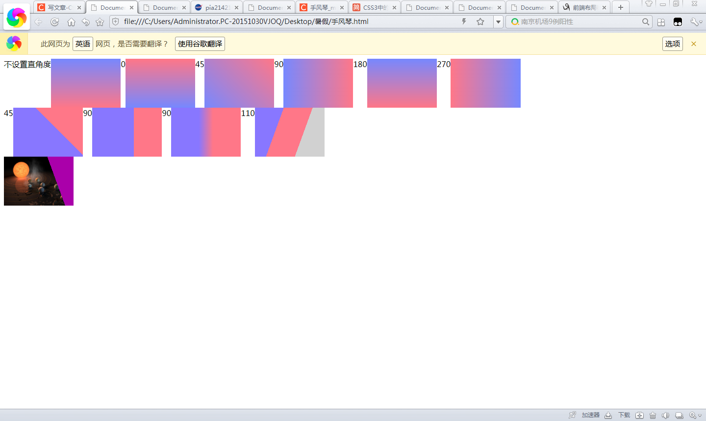
一: 一般渐变
- 未设置角度,则默认为180deg(从上到下)
- 设置了角度,则0deg为竖直向上,然后顺时针旋转
上图!

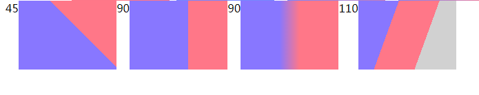
二: 块渐变
.aq1{background-image: linear-gradient(45deg,#87f 60%,#f78 60%);}.aq2{background-image: linear-gradient(90deg,#87f 60%,#f78 60%);}.aq3{background-image: linear-gradient(90deg,#87f 40%,#f78 60%);}.aq4{background-image: linear-gradient(110deg,#87f 33%,#f78 33%,#f78 66%,#d1d1d1 66%);}
注意aq124和aq3的区别,如果比例之间有空隙则会形成渐变来过渡,如果同一比例有两种颜色则不会形成渐变。
多块
代码:
.aq5{width: 500px;height: 200px;background-image: linear-gradient(100deg,red 30%,transparent 30%),linear-gradient(60deg,yellow 25%,yellow 60%,transparent 60%),linear-gradient(150deg, transparent 20%,green 20%);}
效果

为了处理留白问题,所以设置了重叠部分,即后面的百分比小于前面的
测试demo
<!DOCTYPE html>
<html lang="en">
<head><meta charset="UTF-8"><meta http-equiv="X-UA-Compatible" content="IE=edge"><meta name="viewport" content="width=device-width, initial-scale=1.0"><title>Document</title><style type="text/css">body,.one,.two,.three{display: flex;flex-wrap: wrap;}.a{width: 100%;}.a *{height: 100px;width: 10%;}.anull{background-image: linear-gradient(#78f, #f78);}.a0{background-image: linear-gradient(0deg,#78f, #f78);}.a45{background-image: linear-gradient(45deg,#78f, #f78);}.a90{background-image: linear-gradient(90deg,#78f, #f78);}.a180{background-image: linear-gradient(180deg,#78f, #f78);}.a270{background-image: linear-gradient(270deg,#78f, #f78);}.aq1{background-image: linear-gradient(45deg,#87f 60%,#f78 60%);}.aq2{background-image: linear-gradient(90deg,#87f 60%,#f78 60%);}.aq3{background-image: linear-gradient(90deg,#87f 40%,#f78 60%);}.aq4{background-image: linear-gradient(110deg,#87f 33%,#f78 33%,#f78 66%,#d1d1d1 66%);}#div3{background:linear-gradient(250deg,#a0a 30%,rgba(0,0,0,0) 30%),url('https://www.nasa.gov/sites/default/files/thumbnails/image/pia21421-cr.jpg');background-size:cover;/* background-position:top left; */} </style>
</head>
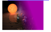
<body><div class="one a">不设置直角度<div class="anull"></div>0<div class="a0"></div>45<div class="a45"></div>90<div class="a90"></div>180<div class="a180"></div>270<div class="a270"></div></div><div class="two a">45<div class="aq1"></div>90<div class="aq2"></div>90<div class="aq3"></div>110<div class="aq4"></div></div><div class="three a"><div id="div3"></div></div>
</body>
</html>
效果:
注意最后一个例子一定要设置透明(不一定要一个比例的位置有两种颜色,可有空隙形成渐变,可见下图),因为至少要有两个颜色
补充2022.5.21
background-image: linear-gradient(to bottom, white 0%, red 50%, #000 100%);
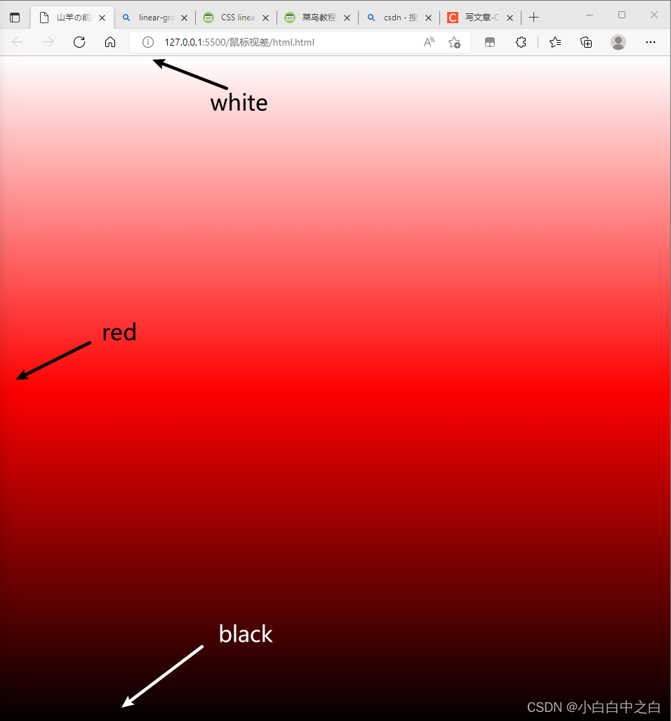
0%处:纯白
50%处:纯红
100%处:纯黑
设置颜色,其实是设置颜色点。下面这句和上面那句等效
background-image: linear-gradient(to bottom, /* rgb(86, 71, 117) */white, red, #000);
三个颜色点,则有两个均等的过度块,将100vh分为2个均等的过度块,则系统默认将颜色点的位置设为0%,50%,100%


