前言
上篇博客主要讲了Flutter的Shape实现
Flutter基础入门:实现各种Shape效果
今天主要讲下Flutter中常用的一些容器组件
Flutter中组件数量很多,分类方式也各有不同
比如可以分为有态组价和无态组件
又可以分为容器组件、功能组件等
拿功能组件来说
有用来显示文字的TextView
显示图片的Image
显示列表的ListView等等
不过今天主要讲的还是一些容器组件
那么何为容器组件呢?
容器组件指的是可以容纳下级组件(1个或多个),
使用时以独立组件形式被运用的组件。
比如Row组件,刚刚提到的ListView组件等。
今天讲的容器组件
主要侧重点在于讲他们所支持的一些功能
通过介绍他们需要传入的参数的含义
来更清晰地了解这些容器的功能
而不仅仅是介绍用法
当然,这边也是选择一些常用并且功能强大的组件来介绍
下面正式开始
各种容器
Container
Container会是我们进行Flutter开发中用到的最强大也是最常用的单容器类控件
它可以实现装饰、定位、背景颜色、对齐方式、变换、裁剪等等一系列功能
我们先看下它的构造方法
Container({super.key,this.alignment,this.padding,this.color,this.decoration,this.foregroundDecoration,double? width,double? height,BoxConstraints? constraints,this.margin,this.transform,this.transformAlignment,this.child,this.clipBehavior = Clip.none,})
可以看到,这里可以传入很多的可选入参,我们逐一介绍
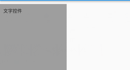
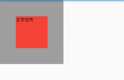
alignment
对齐方式,可以设置子组件的对齐方式
举例如下:
Widget build(BuildContext context) {return Container(width: 200,height: 200,alignment: Alignment.center,color: Colors.grey,child: Text('文字控件'),);}
Alignment.center点进去会看到,其实是
center = Alignment(0.0, 0.0);
同理:
topLeft = Alignment(-1.0, -1.0);
bottomRight = Alignment(1.0, 1.0);
这样我们就知道了:
Alignment构造方法的第一个参数代表左右位置,第二个参数代表上下位置
0代表中心点,-1代表最左/最上,1代表最右/最下
比如:Alignment(0,1) 就是左右居中,靠下对齐
也就是:
bottomCenter = Alignment(0.0, 1.0);
padding & margin
padding是内边距,margin是外边距
比如:
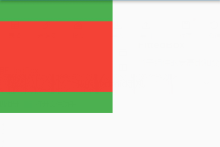
Widget build(BuildContext context) {return Container(width: 200,height: 200,padding: EdgeInsets.all(10),margin: EdgeInsets.only(top: 10),alignment: Alignment.topLeft,color: Colors.grey,child: Text('文字控件'),);}
出来效果就是:
这里要注意,padding & margin需要传入的都是EdgeInsetsGeometry类型
EdgeInsetsGeometry抽象类有两个子类:EdgeInsets和EdgeInsetsDirectional
可以理解为这个类就是用来设置一些间距的
decoration & foregroundDecoration
foregroundDecoration是绘制在child前面的装饰。如果设置decoration, 此时foregroundDecoration 样式会叠加在decoration样式上边
装饰器可以看我这个系列下专门的博客
Flutter基础入门:装饰器Decoration
constraints
constraints是一个BoxConstraints类型
主要用来控制子控件的最小宽高,如下:
Container(width: 200,height: 200,color: Colors.grey,alignment: Alignment.center,child: Container(child: Text('文字控件'),constraints: BoxConstraints(minWidth: 100,minHeight: 100),color: Colors.red,),);
限制了最小宽高为100后,文字的背景大小就变成100了,而不再是之前紧紧包裹着文字
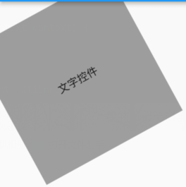
transform & transformAlignment
transform主要是通过一个4*4的变换矩阵来对子组件就行变换
可以实现的效果如:斜切,缩放,平移,旋转,透视等
transformAlignment则是变换的位置,
这个参数的类型和对齐方式alignment参数的类型是一样的
都是AlignmentGeometry类型
默认是Alignment.topLeft
比如我们可以以组件中心位置对Z轴进行旋转变换:
  Container(width: 200,height: 200,transformAlignment: Alignment.center,//变换位置:中心点旋转transform: Matrix4.rotationZ(-0.5),//z轴旋转color: Colors.grey,alignment: Alignment.center,child: Text('文字控件'),
);
效果如下:
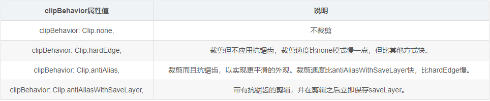
clipBehavior
clipBehavior是是组件内容边缘的切割方式,当组件内容溢出时可以选择不同的裁剪方式
color & width &height & child
color就是用来设置容器填充色的,宽高传入double类型就好
child自然就是子组件了
这些简单的就不演示了
Padding
Padding主要是给子组件添加内边距的,可参考Container的padding
Align
Align用来设置子组件的对齐方式,可参考Container的alignment
ConstrainedBox
ConstrainedBox用来设置最小宽高,需要传入一个BoxConstraints类型,可参考Container的constraints
DecoratedBox
DecoratedBox可以在其子组件绘制前(或后)绘制一些装饰(Decoration),如背景、边框、渐变等。
它的构造函数如下:
const DecoratedBox({super.key,required this.decoration,this.position = DecorationPosition.background,super.child,})
其中position属性主要是设置装饰位置的
分为:
(DecorationPosition.foreground)前景,(DecorationPosition.background)背景
Transform
Transform主要是给子组件添加变换效果的的,可参考Container的transform
RotatedBox
用来旋转子组件的容器
const RotatedBox({super.key,required this.quarterTurns,super.child,})
quarterTurns代表旋转的次数,每次旋转的度数只能是90度的整数倍
所以RotatedBox旋转的角度也只能是90度的整数倍
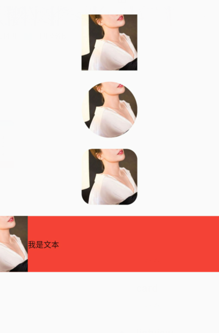
Clip裁剪相关组件
Clip相关组件主要用来进行对子组件的裁剪,如:
ClipOval:子组件为正方形时剪裁成内贴圆形;为矩形时,剪裁成内贴椭圆
ClipRRect:将子组件剪裁为圆角矩形
ClipRect:默认剪裁掉子组件布局空间之外的绘制内容(溢出部分剪裁)
ClipPath:按照自定义的路径剪裁
下面看具体例子:
class _ClipWidget extends StatelessWidget {final Image photo = Image.network('https://tse1.mm.bing.net/th/id/OET.5272002b31e349ca8b7f061d2d17466f?w=135&h=272&c=7&rs=1&o=5&dpr=2&pid=1.9',height: 100,width: 100,fit: BoxFit.cover,);Widget build(BuildContext context) => MaterialApp(home: Scaffold(body: Center(child: Column(mainAxisAlignment: MainAxisAlignment.center,crossAxisAlignment: CrossAxisAlignment.center,children: [photo,const SizedBox(height: 20,),ClipOval(child: photo,),const SizedBox(height: 20,),ClipRRect(child: photo,borderRadius: const BorderRadius.all(Radius.circular(20)),),const SizedBox(height: 20,),Container(color: Colors.red,child: Row(children: [Align(alignment: Alignment.centerRight,widthFactor: 0.5,child: ClipRect(child: photo,),),const Text('我是文本')],),),],),),),);
}
效果如下:
FittedBox
当子组件的宽高比和父组件的宽高比不一样时,我们等比拉伸或者填充父组件,这时我们可以使用FittedBox
Container(height: 200,width: 200,color: Colors.green,child: FittedBox(fit: BoxFit.contain,child: Container(height: 50,width: 80,color: Colors.red,),),);
如图:
其中fit参数表示了子控件的填充方式,说明如下:
fill:填充父组件,宽高比发生变化。
contain:等比拉伸,但子控件不能超出父控件。
cover:尽可能的小,等比拉伸充满父控件。
fitWidth:等比拉伸,宽充满父控件。
fitHeight:等比拉伸,高充满父控件。
none:默认子控件居中,不做拉伸处理,超出父控件的部分裁剪。
scaleDown:在子控件为Image且缩小的情况和contain一样,否则和none一样。
card
用来把子组件做成卡片类的样式
也可以用来实现一些Shape的效果
主要属性如下:
const Card({super.key,this.color,//背景色this.shadowColor,//阴影颜色this.surfaceTintColor,this.elevation,//阴影高度this.shape,this.borderOnForeground = true,//是否在 child 前绘制 border,默认为 truethis.margin,this.clipBehavior,this.child,this.semanticContainer = true,})
可以看到大部分还是和Container类似的
Row & Column
这两个类似Android的LinearLayout
他们的children属性可以传入一个子组件数组
Row是对子组件进行横向布局
Column则是对子组件进行纵向布局
Wrap & Stack
Wrap 流式布局
Stack 类似Android中的帧布局FrameLayout
Scaffold
Scaffold翻译过来是脚手架的意思
其实也是为了方便我们快速搭建页面而提供给我们的一个模板组件
const Scaffold({super.key,this.appBar,this.body,this.floatingActionButton,this.floatingActionButtonLocation,this.floatingActionButtonAnimator,this.persistentFooterButtons,this.persistentFooterAlignment = AlignmentDirectional.centerEnd,this.drawer,this.onDrawerChanged,this.endDrawer,this.onEndDrawerChanged,this.bottomNavigationBar,this.bottomSheet,this.backgroundColor,this.resizeToAvoidBottomInset,this.primary = true,this.drawerDragStartBehavior = DragStartBehavior.start,this.extendBody = false,this.extendBodyBehindAppBar = false,this.drawerScrimColor,this.drawerEdgeDragWidth,this.drawerEnableOpenDragGesture = true,this.endDrawerEnableOpenDragGesture = true,this.restorationId,})
Scaffold的属性特别多,我们挑一些常用的来讲
appBar:页面顶部栏,是一个PreferredSizeWidget抽象类,可以选择AppBar,TabBar这些实现类来作为顶部栏
body:主体部分,放入一个子组件即可
bottomNavigationBar:底部组件,一般用于实现首页底部的按钮切换功能
drawer & endDrawer:左右侧滑组件
backgroundColor:背景色
floatingActionButton:浮动按钮
floatingActionButtonLocation:浮动按钮位置
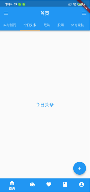
下面写一个Scaffold包裹的页面
实现一些基本的演示功能:
import 'package:flutter/material.dart';
void main() {runApp(MaterialApp(title: "首页",home: CustomScaffold(),));
}class CustomScaffold extends StatefulWidget {const CustomScaffold({Key? key}) : super(key: key);State<StatefulWidget> createState() => _CustomScaffoldState();
}// AppBar 默认的实例,有状态
class _CustomScaffoldState extends State with SingleTickerProviderStateMixin {final List<String> tabs = const ['实时新闻', '今日头条', '经济', '股票', '体育竞技', '国际风云'];int _position = 0;final Map<String,IconData> iconsMap = {"首页": Icons.home,"动态": Icons.toys,"收藏": Icons.favorite,"图鉴": Icons.class_,"我的": Icons.account_circle,};final List<Color> _colors = [Colors.blue,Colors.red,Colors.yellow,Colors.green,Colors.purple,];late TabController _tabController;void initState() {super.initState();_tabController = TabController(vsync: this, length: tabs.length);}void dispose() {_tabController.dispose();super.dispose();}Widget build(BuildContext context) {return SizedBox(width: MediaQuery.of(context).size.width,height: MediaQuery.of(context).size.height - 300,child: Scaffold(floatingActionButtonLocation: FloatingActionButtonLocation.endFloat,floatingActionButton: FloatingActionButton(child: const Icon(Icons.add),onPressed: () {},),drawer: _buildLeftDrawer(),endDrawer: _buildLeftDrawer(),appBar: AppBar(title: const Text('首页'),backgroundColor: Colors.blue,centerTitle: true,bottom: _buildTabBar(),),body: _buildTableBarView(),bottomNavigationBar: _buildBottomNavigationBar(),),);}Drawer _buildLeftDrawer() => Drawer(elevation: 1,child: Image.network('https://gimg2.baidu.com/image_search/src=http%3A%2F%2Fc-ssl.duitang.com%2Fuploads%2Fitem%2F201907%2F22%2F20190722235951_J3aVw.thumb.1000_0.jpeg&refer=http%3A%2F%2Fc-ssl.duitang.com&app=2002&size=f9999,10000&q=a80&n=0&g=0n&fmt=auto?sec=1684313785&t=63178f27b92b3cfc174d8354fe203c94',fit: BoxFit.cover,),);PreferredSizeWidget _buildTabBar() => TabBar(isScrollable: true,controller: _tabController,indicatorColor: Colors.orangeAccent,tabs: tabs.map((e) => Tab(text: e)).toList(),);Widget _buildBottomNavigationBar() => BottomNavigationBar(onTap: (position) => setState(() => _position = position),currentIndex: _position,elevation: 1,backgroundColor: Colors.white,iconSize: 25,selectedLabelStyle: const TextStyle(fontWeight: FontWeight.bold),showUnselectedLabels: false,showSelectedLabels: true,items: iconsMap.keys.map((key) => BottomNavigationBarItem(label: key,icon: Icon(iconsMap[key]),backgroundColor: _colors[_position])).toList(),);Widget _buildTableBarView() => TabBarView(controller: _tabController,children: tabs.map((e) => Center(child: Text(e,style: const TextStyle(color: Colors.blue, fontSize: 20),))).toList());
}效果如下:
资料分享
最后给大家推荐一个不错的项目:
Flutter_unit
大部分的组件都可以在这个项目里面学习
里面不仅仅有组件的介绍,还有实实在在的代码和效果演示
还有一个网站也可以学习到更多的组件:
Flutter | 老孟