前言
系列专栏:机器学习:高级应用与实践【项目实战100+】【2024】✨︎
在本专栏中不仅包含一些适合初学者的最新机器学习项目,每个项目都处理一组不同的问题,包括监督和无监督学习、分类、回归和聚类,而且涉及创建深度学习模型、处理非结构化数据以及指导复杂的模型,如卷积神经网络、门控循环单元、大型语言模型和强化学习模型
在文本中,我们将探索股市数据,特别是一些科技股(苹果、亚马逊、谷歌和微软)。我们将探讨如何使用yfinance来获取股票信息,并使用Seaborn和Matplotlib可视化其中的不同特征。我们将根据股票之前的表现历史,研究几种分析股票风险的方法。我们还将通过长短期记忆(LSTM)方法预测未来股价!
在此过程中,我们将回答以下问题:
- 随着时间的推移,股票价格的变化是什么?
- 股票的平均日收益是多少?
- 各种股票的移动平均数是多少?
- 不同股票之间的相关性是什么?
- 我们投资一只特定的股票会有多大的风险?
- 我们如何尝试预测未来的股票行为?(使用LSTM预测APPLE公司的收盘价股票价格)
目录
- 1. 相关库和数据集
- 1.1 相关库介绍
- 1.2 数据集介绍
- 1.3 描述性统计
- 1.4数据的信息
- 2. 探索性数据分析
- 2.1 股票的收盘价
- 2.2 股票的交易量
- 2.3 股票的移动平均值
- 2.4 股票的平均日收益
- 2.5 股票的平均回报率
- 2.6 不同股票收盘价格之间的相关性
- 2.7 我们投资于某只股票的风险价值
- 3. 预测 APPLE 公司股票的收盘价
- 4. 数据建模()
- 4.1 数据准备(拆分为训练集和测试集)
1. 相关库和数据集
1.1 相关库介绍
Python 库使我们能够非常轻松地处理数据并使用一行代码执行典型和复杂的任务。
Pandas– 该库有助于以 2D 数组格式加载数据框,并具有多种功能,可一次性执行分析任务。Numpy– Numpy 数组速度非常快,可以在很短的时间内执行大型计算。Matplotlib/Seaborn– 此库用于绘制可视化效果,用于展现数据之间的相互关系。Keras– 这是一个用于机器学习和人工智能的开源库,并提供一系列功能,只需一行代码即可实现复杂的功能
import pandas as pd
import numpy as npimport matplotlib.pyplot as plt
import seaborn as sns
%matplotlib inline# For reading stock data from yahoo
from pandas_datareader.data import DataReader
import yfinance as yf
from pandas_datareader import data as pdr# For time stamps
from datetime import datetimeimport warnings
warnings.filterwarnings('ignore')
1.2 数据集介绍
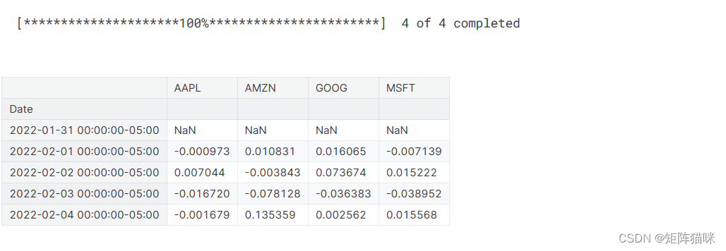
首先,获取数据并将其加载到内存中。我们将从雅虎财经网站获取我们的股票数据。雅虎金融是一个丰富的金融市场数据资源和工具,以寻找有吸引力的投资。为了从雅虎金融获得数据,我们将使用yfinance库,该库提供了一种线程化和Python化的方式从雅虎下载市场数据。查看本文了解更多关于yfnance的信息:使用Python可靠地下载历史市场数据
yf.pdr_override()# The tech stocks we'll use for this analysis
tech_list = ['AAPL', 'GOOG', 'MSFT', 'AMZN']# Set up End and Start times for data grab
tech_list = ['AAPL', 'GOOG', 'MSFT', 'AMZN']end = datetime.now()
start = datetime(end.year - 1, end.month, end.day)for stock in tech_list:globals()[stock] = yf.download(stock, start, end)company_list = [AAPL, GOOG, MSFT, AMZN]
company_name = ["APPLE", "GOOGLE", "MICROSOFT", "AMAZON"]for company, com_name in zip(company_list, company_name):company["company_name"] = com_namedf = pd.concat(company_list, axis=0)
df.tail(10)
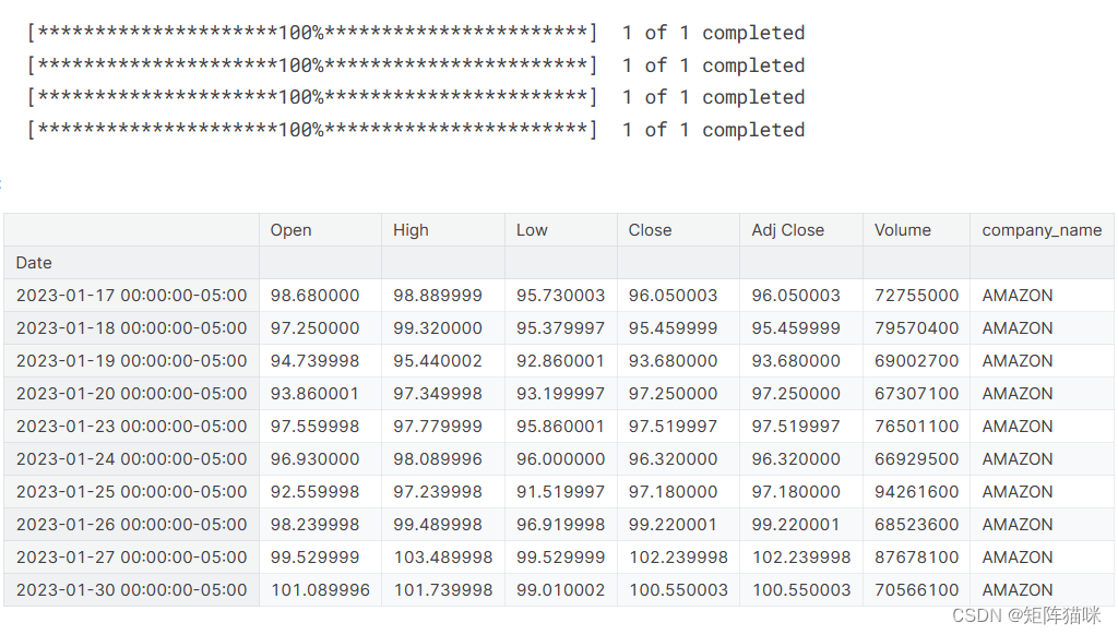
回顾我们数据的内容,我们可以看到数据是数字,日期是数据的索引。还请注意,数据中缺少周末。
快速提示:使用
globals()是设置DataFrame名称的一种草率方法,但它很简单。现在我们有了数据,让我们进行一些基本的数据分析并检查我们的数据。
1.3 描述性统计
.describe()生成描述性统计信息。描述性统计包括总结数据集分布的中心趋势、分散度和形状的统计,不包括NaN值。
分析数字序列和对象序列,以及混合数据类型的DataFrame列集。输出将根据所提供的内容而变化。有关更多详细信息,请参阅以下注释。
# Summary Stats
AAPL.describe()
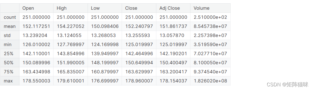
我们一年中只有255条记录,因为数据中不包括周末。
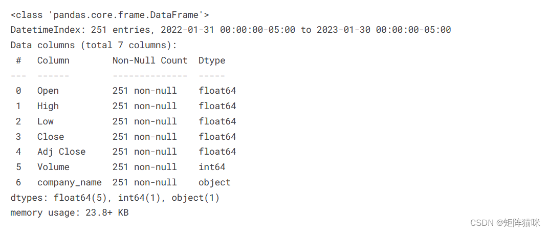
1.4数据的信息
.info()方法打印有关DataFrame的信息,包括索引dtype和列、非null值以及内存使用情况。
# General info
AAPL.info()
2. 探索性数据分析
2.1 股票的收盘价
收盘价是股票在正常交易日交易的最后价格。股票的收盘价是投资者用来跟踪其长期表现的标准基准。
sns.set_style('whitegrid')
plt.style.use("fivethirtyeight")
# Let's see a historical view of the closing price
plt.figure(figsize=(15, 10))
plt.subplots_adjust(top=1.25, bottom=1.2)for i, company in enumerate(company_list, 1):plt.subplot(2, 2, i)company['Adj Close'].plot()plt.ylabel('Adj Close')plt.xlabel(None)plt.title(f"Closing Price of {tech_list[i - 1]}")plt.tight_layout()

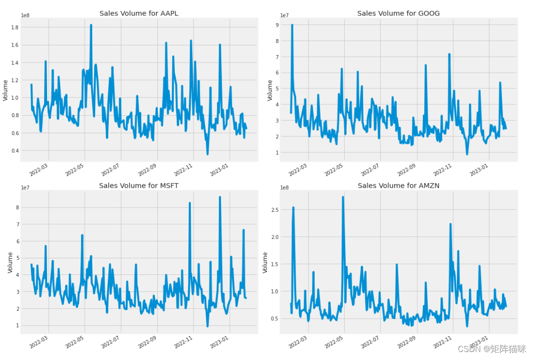
2.2 股票的交易量
交易量是指一段时间内(通常是一天内)易手的资产或证券的数量。例如,股票交易量是指每天开盘和收盘之间交易的证券股票数量。交易量以及交易量随时间的变化是技术交易者的重要输入。
# Now let's plot the total volume of stock being traded each day
plt.figure(figsize=(15, 10))
plt.subplots_adjust(top=1.25, bottom=1.2)for i, company in enumerate(company_list, 1):plt.subplot(2, 2, i)company['Volume'].plot()plt.ylabel('Volume')plt.xlabel(None)plt.title(f"Sales Volume for {tech_list[i - 1]}")plt.tight_layout()
现在我们已经看到了收盘价和每天交易量的可视化,让我们继续计算股票的移动平均线。
2.3 股票的移动平均值
移动平均线(MA)是一种简单的技术分析工具,通过创建不断更新的平均价格来平滑价格数据。平均值是在特定的时间段内得出的,如10天、20分钟、30周或交易员选择的任何时间段。
ma_day = [10, 20, 50]for ma in ma_day:for company in company_list:column_name = f"MA for {ma} days"company[column_name] = company['Adj Close'].rolling(ma).mean()fig, axes = plt.subplots(nrows=2, ncols=2)
fig.set_figheight(10)
fig.set_figwidth(15)AAPL[['Adj Close', 'MA for 10 days', 'MA for 20 days', 'MA for 50 days']].plot(ax=axes[0,0])
axes[0,0].set_title('APPLE')GOOG[['Adj Close', 'MA for 10 days', 'MA for 20 days', 'MA for 50 days']].plot(ax=axes[0,1])
axes[0,1].set_title('GOOGLE')MSFT[['Adj Close', 'MA for 10 days', 'MA for 20 days', 'MA for 50 days']].plot(ax=axes[1,0])
axes[1,0].set_title('MICROSOFT')AMZN[['Adj Close', 'MA for 10 days', 'MA for 20 days', 'MA for 50 days']].plot(ax=axes[1,1])
axes[1,1].set_title('AMAZON')fig.tight_layout()
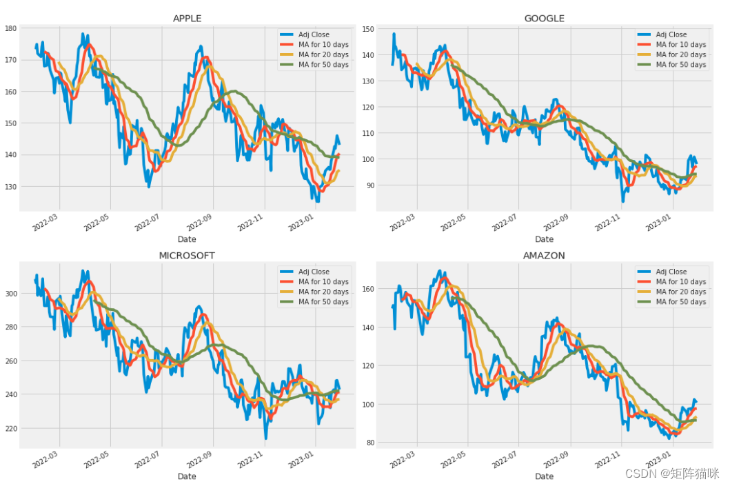
我们在图中看到,测量移动平均值的最佳值是10天和20天,因为我们仍然可以在没有噪声的情况下捕捉数据中的趋势。
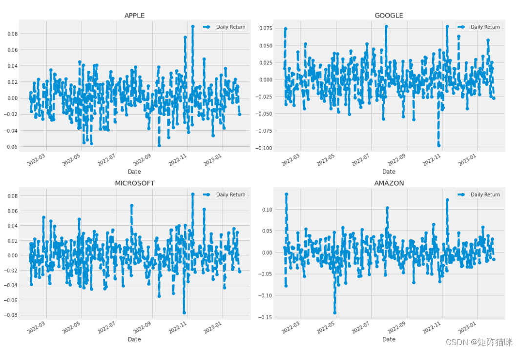
2.4 股票的平均日收益
现在我们已经做了一些基线分析,让我们继续深入研究。我们现在要分析股票的风险。为了做到这一点,我们需要更仔细地观察股票的每日变化,而不仅仅是其绝对值。让我们继续使用pandas来检索苹果股票的每日回报。
# We'll use pct_change to find the percent change for each day
for company in company_list:company['Daily Return'] = company['Adj Close'].pct_change()# Then we'll plot the daily return percentage
fig, axes = plt.subplots(nrows=2, ncols=2)
fig.set_figheight(10)
fig.set_figwidth(15)AAPL['Daily Return'].plot(ax=axes[0,0], legend=True, linestyle='--', marker='o')
axes[0,0].set_title('APPLE')GOOG['Daily Return'].plot(ax=axes[0,1], legend=True, linestyle='--', marker='o')
axes[0,1].set_title('GOOGLE')MSFT['Daily Return'].plot(ax=axes[1,0], legend=True, linestyle='--', marker='o')
axes[1,0].set_title('MICROSOFT')AMZN['Daily Return'].plot(ax=axes[1,1], legend=True, linestyle='--', marker='o')
axes[1,1].set_title('AMAZON')fig.tight_layout()
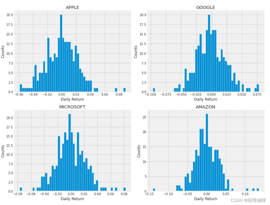
2.5 股票的平均回报率
现在让我们使用直方图来全面了解平均每日回报率。我们将使用seaborn在同一个图上创建直方图和kde图。
plt.figure(figsize=(12, 9))for i, company in enumerate(company_list, 1):plt.subplot(2, 2, i)company['Daily Return'].hist(bins=50)plt.xlabel('Daily Return')plt.ylabel('Counts')plt.title(f'{company_name[i - 1]}')plt.tight_layout()
2.6 不同股票收盘价格之间的相关性
在金融和投资行业中,相关性是一种衡量两个变量相对于彼此移动程度的统计数据,其值必须介于-1.0和+1.0之间。相关性衡量关联,但不显示 x 是否导致 y,反之亦然,或者关联是否由第三个因素引起。1
现在,如果我们想分析列表中所有股票的回报率,该怎么办?让我们继续构建一个DataFrame,其中包含每个股票数据帧的所有[‘Close’]列。
# Grab all the closing prices for the tech stock list into one DataFrameclosing_df = pdr.get_data_yahoo(tech_list, start=start, end=end)['Adj Close']# Make a new tech returns DataFrame
tech_rets = closing_df.pct_change()
tech_rets.head()
现在我们可以比较两只股票的每日百分比回报率,以检查其相关性。首先,让我们来看看一只股票与自身的比较。
# Comparing Google to itself should show a perfectly linear relationship
sns.jointplot(x='GOOG', y='GOOG', data=tech_rets, kind='scatter', color='seagreen')
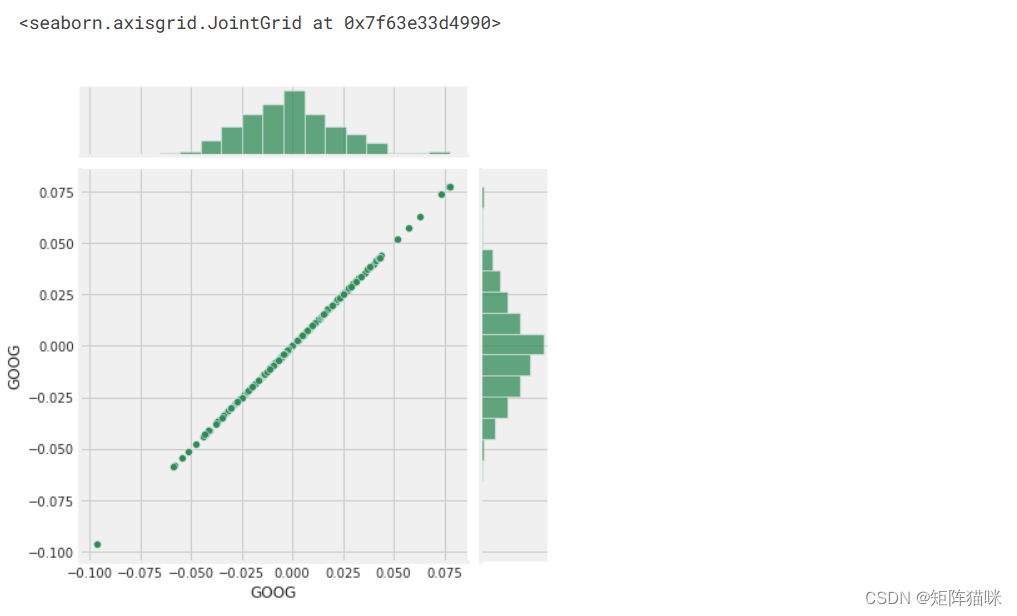
# We'll use joinplot to compare the daily returns of Google and Microsoft
sns.jointplot(x='GOOG', y='MSFT', data=tech_rets, kind='scatter')
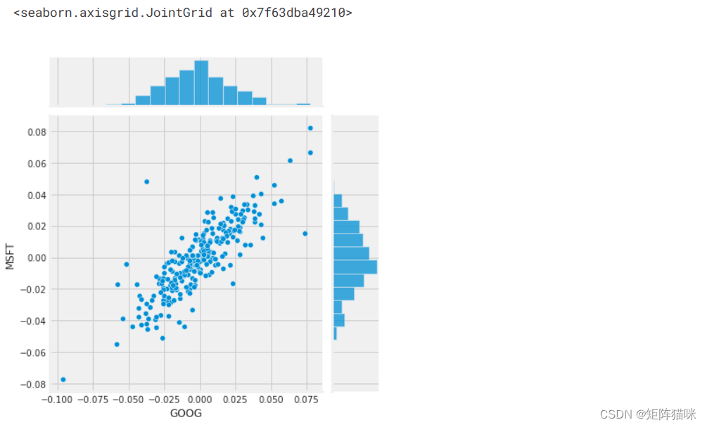
因此,现在我们可以看到,如果两只股票完全(并且正)相互关联,那么它们的日回报值之间应该存在线性关系。
Seaborn和pandas使得对技术股票代码列表中所有可能的股票组合进行重复比较分析变得非常容易。我们可以使用sns.pairplot()自动创建此图
# We can simply call pairplot on our DataFrame for an automatic visual analysis
# of all the comparisons
sns.pairplot(tech_rets, kind='reg')
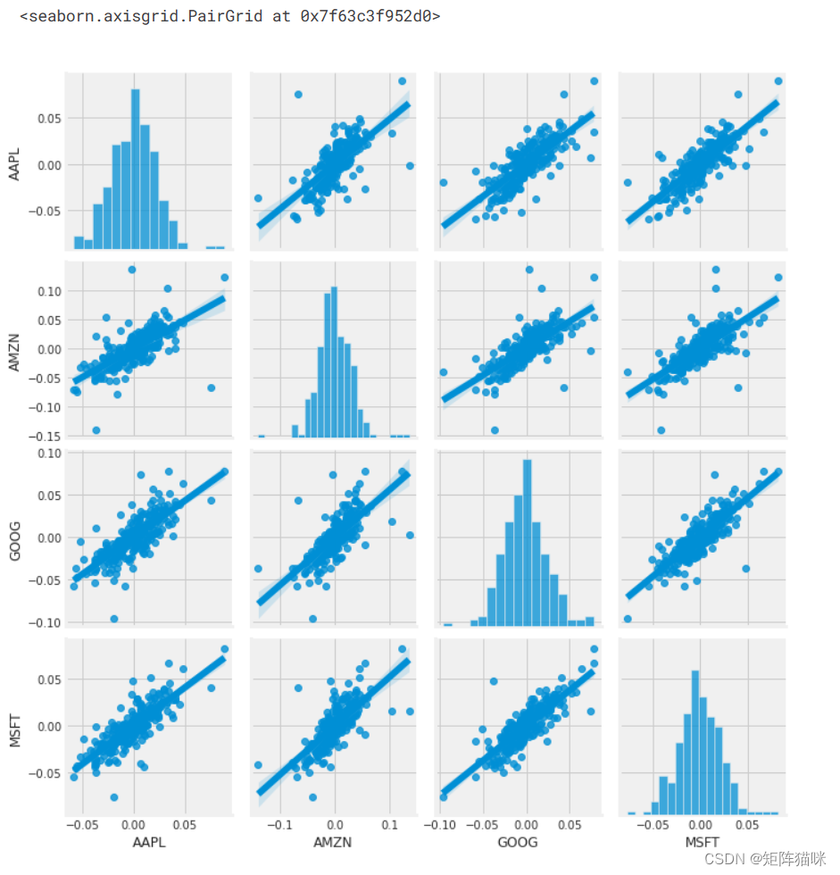
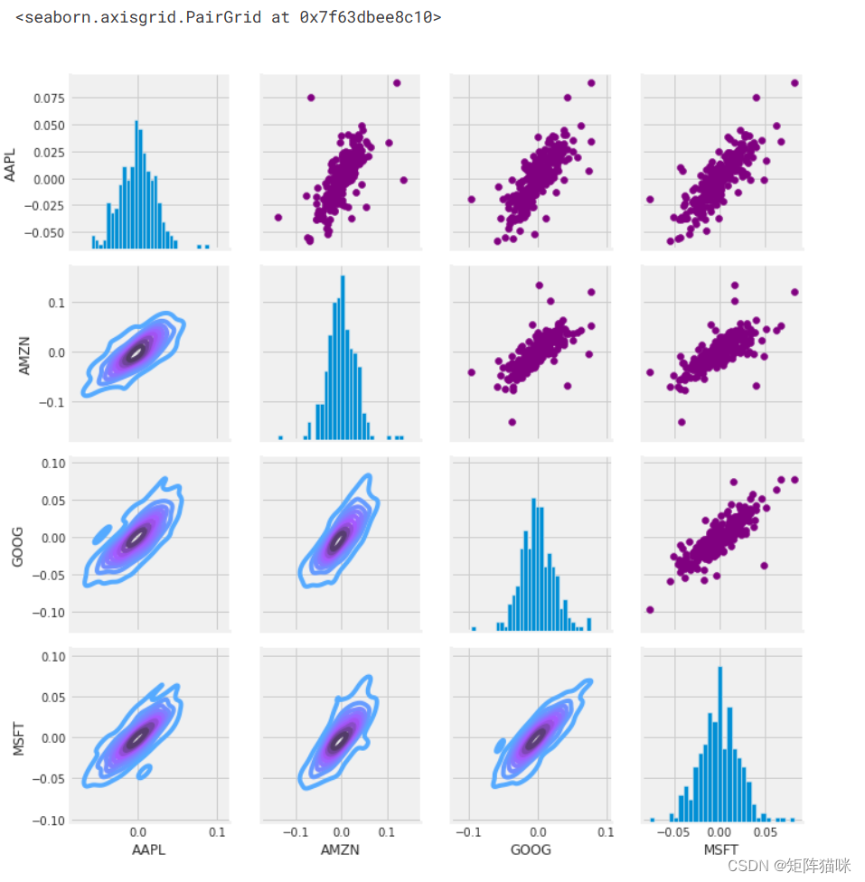
上面我们可以看到所有股票之间每日回报的所有关系。虽然只简单调用 sns.pairplot() ,但我们也可以使用 sns.PairGrid() 来完全控制图形,包括对角线、上三角和下三角中的绘图类型。下面是一个利用 seaborn 的全部功能来实现这一结果的示例。
# Set up our figure by naming it returns_fig, call PairPLot on the DataFrame
return_fig = sns.PairGrid(tech_rets.dropna())# Using map_upper we can specify what the upper triangle will look like.
return_fig.map_upper(plt.scatter, color='purple')# We can also define the lower triangle in the figure, inclufing the plot type (kde)
# or the color map (BluePurple)
return_fig.map_lower(sns.kdeplot, cmap='cool_d')# Finally we'll define the diagonal as a series of histogram plots of the daily return
return_fig.map_diag(plt.hist, bins=30)
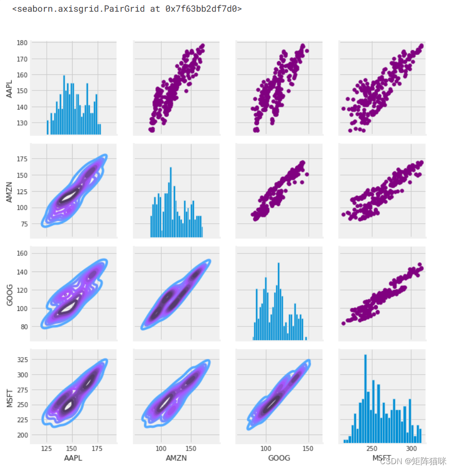
# Set up our figure by naming it returns_fig, call PairPLot on the DataFrame
returns_fig = sns.PairGrid(closing_df)# Using map_upper we can specify what the upper triangle will look like.
returns_fig.map_upper(plt.scatter,color='purple')# We can also define the lower triangle in the figure, inclufing the plot type (kde) or the color map (BluePurple)
returns_fig.map_lower(sns.kdeplot,cmap='cool_d')# Finally we'll define the diagonal as a series of histogram plots of the daily return
returns_fig.map_diag(plt.hist,bins=30)
最后,我们还可以做一个相关图,以获得股票每日回报值之间相关性的实际数值。通过比较收盘价,我们看到微软和苹果之间存在有趣的关系。
plt.figure(figsize=(12, 10))plt.subplot(2, 2, 1)
sns.heatmap(tech_rets.corr(), annot=True, cmap='summer')
plt.title('Correlation of stock return')plt.subplot(2, 2, 2)
sns.heatmap(closing_df.corr(), annot=True, cmap='summer')
plt.title('Correlation of stock closing price')
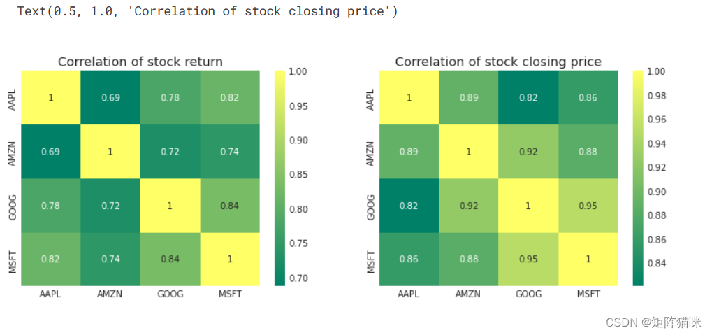
正如我们在 "配对图 "中猜测的那样,我们可以从数字和视觉上看到,微软和亚马逊的每日股票回报率相关性最强。同样有趣的是,所有科技公司都呈正相关。
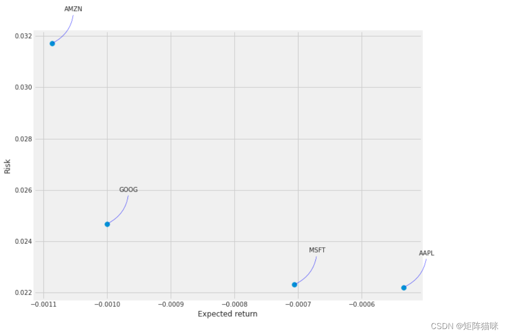
2.7 我们投资于某只股票的风险价值
量化风险的方法有很多,其中一种最基本的方法是利用我们收集到的每日百分比收益信息,将预期收益与每日收益的标准差进行比较。
rets = tech_rets.dropna()area = np.pi * 20plt.figure(figsize=(10, 8))
plt.scatter(rets.mean(), rets.std(), s=area)
plt.xlabel('Expected return')
plt.ylabel('Risk')for label, x, y in zip(rets.columns, rets.mean(), rets.std()):plt.annotate(label, xy=(x, y), xytext=(50, 50), textcoords='offset points', ha='right', va='bottom', arrowprops=dict(arrowstyle='-', color='blue', connectionstyle='arc3,rad=-0.3'))
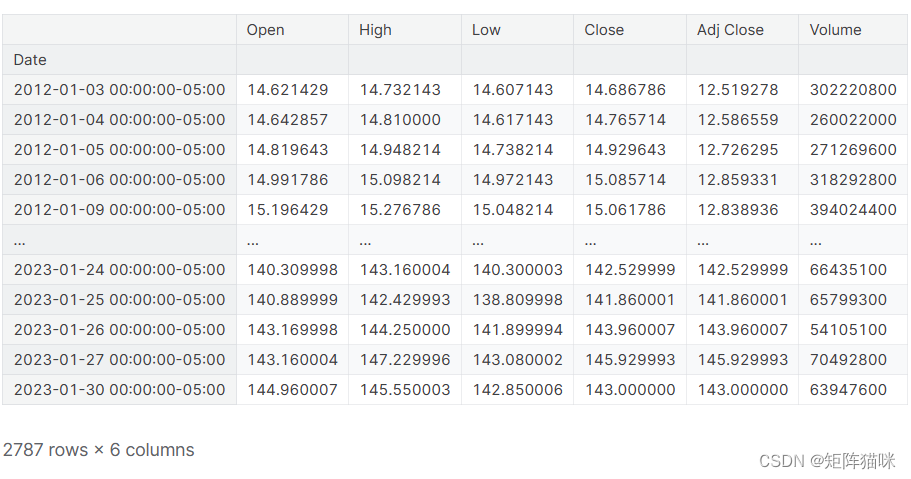
3. 预测 APPLE 公司股票的收盘价
# Get the stock quote
df = pdr.get_data_yahoo('AAPL', start='2012-01-01', end=datetime.now())
# Show teh data
df
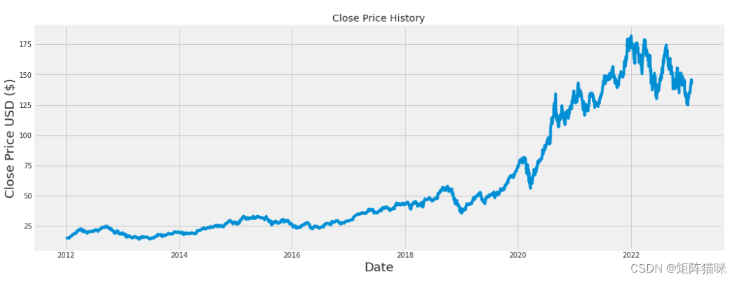
plt.figure(figsize=(16,6))
plt.title('Close Price History')
plt.plot(df['Close'])
plt.xlabel('Date', fontsize=18)
plt.ylabel('Close Price USD ($)', fontsize=18)
plt.show()
# Create a new dataframe with only the 'Close column
data = df.filter(['Close'])
# Convert the dataframe to a numpy array
dataset = data.values
# Get the number of rows to train the model on
training_data_len = int(np.ceil( len(dataset) * .95 ))training_data_len
2648
# Scale the data
from sklearn.preprocessing import MinMaxScalerscaler = MinMaxScaler(feature_range=(0,1))
scaled_data = scaler.fit_transform(dataset)scaled_data
array([[0.00439887],[0.00486851],[0.00584391],...,[0.7735962 ],[0.78531794],[0.767884 ]])
4. 数据建模()
4.1 数据准备(拆分为训练集和测试集)
# Create the training data set
# Create the scaled training data set
train_data = scaled_data[0:int(training_data_len), :]
# Split the data into x_train and y_train data sets
x_train = []
y_train = []for i in range(60, len(train_data)):x_train.append(train_data[i-60:i, 0])y_train.append(train_data[i, 0])if i<= 61:print(x_train)print(y_train)print()# Convert the x_train and y_train to numpy arrays
x_train, y_train = np.array(x_train), np.array(y_train)# Reshape the data
x_train = np.reshape(x_train, (x_train.shape[0], x_train.shape[1], 1))
# x_train.shape
from keras.models import Sequential
from keras.layers import Dense, LSTM# Build the LSTM model
model = Sequential()
model.add(LSTM(128, return_sequences=True, input_shape= (x_train.shape[1], 1)))
model.add(LSTM(64, return_sequences=False))
model.add(Dense(25))
model.add(Dense(1))# Compile the model
model.compile(optimizer='adam', loss='mean_squared_error')# Train the model
model.fit(x_train, y_train, batch_size=1, epochs=1)

# Create the testing data set
# Create a new array containing scaled values from index 1543 to 2002
test_data = scaled_data[training_data_len - 60: , :]
# Create the data sets x_test and y_test
x_test = []
y_test = dataset[training_data_len:, :]
for i in range(60, len(test_data)):x_test.append(test_data[i-60:i, 0])# Convert the data to a numpy array
x_test = np.array(x_test)# Reshape the data
x_test = np.reshape(x_test, (x_test.shape[0], x_test.shape[1], 1 ))# Get the models predicted price values
predictions = model.predict(x_test)
predictions = scaler.inverse_transform(predictions)# Get the root mean squared error (RMSE)
rmse = np.sqrt(np.mean(((predictions - y_test) ** 2)))
rmse
4.982936594544208
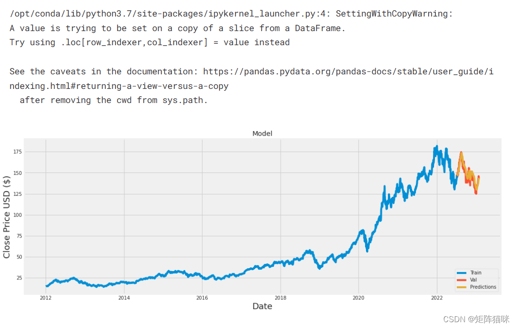
# Plot the data
train = data[:training_data_len]
valid = data[training_data_len:]
valid['Predictions'] = predictions
# Visualize the data
plt.figure(figsize=(16,6))
plt.title('Model')
plt.xlabel('Date', fontsize=18)
plt.ylabel('Close Price USD ($)', fontsize=18)
plt.plot(train['Close'])
plt.plot(valid[['Close', 'Predictions']])
plt.legend(['Train', 'Val', 'Predictions'], loc='lower right')
plt.show()
# Show the valid and predicted prices
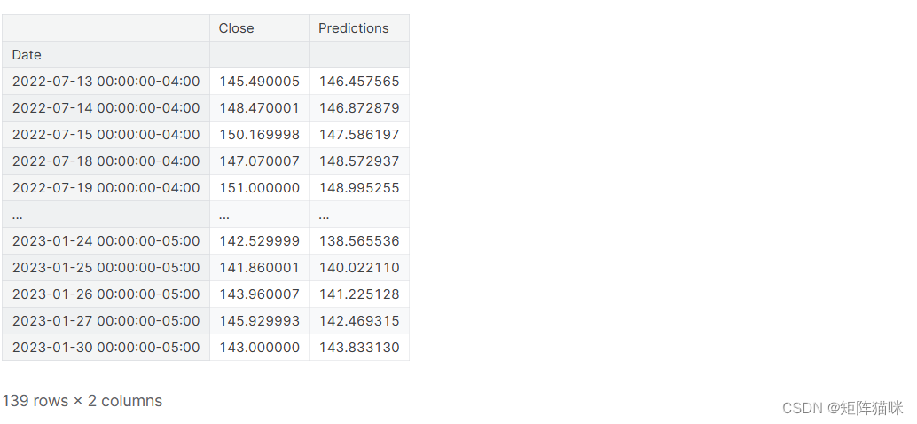
valid
Correlation: What It Means in Finance and the Formula for Calculating It ↩︎