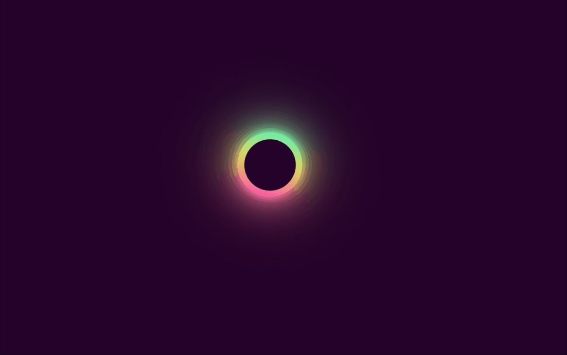
效果图
代码示例
<!DOCTYPE html>
<html lang="en"><head><meta charset="UTF-8"><meta http-equiv="X-UA-Compatible" content="IE=edge"><meta name="viewport" content="width=device-width, initial-scale=1.0"><title>旋转霓虹圆圈</title><style>body {margin: 0;padding: 0;display: flex;justify-content: center;align-items: center;height: 100vh;background-color: #240229;}.loader {position: relative;width: 100px;height: 100px;border-radius: 50%;background: linear-gradient(#14ffe9, #ffeb3b, #ff00e0);animation: animate 0.5s linear infinite;}@keyframes animate {from {transform: rotate(0deg);}to {transform: rotate(360deg);}}.loader span {position: absolute;width: 100%;height: 100%;border-radius: 50%;background: linear-gradient(#14ffe9, #ffeb3b, #ff00e0);/* animation: animate 0.5s linear infinite; */}.loader span:nth-child(1) {filter: blur(5px);}.loader span:nth-child(2) {filter: blur(10px);}.loader span:nth-child(3) {filter: blur(25px);}.loader span:nth-child(4) {filter: blur(50px);}.loader::after {content: "";position: absolute;top: 10px;left: 10px;right: 10px;bottom: 10px;background-color: #240229;border-radius: 50%;}</style>
</head><body><div class="loader"><span></span><span></span><span></span><span></span></div>
</body></html>