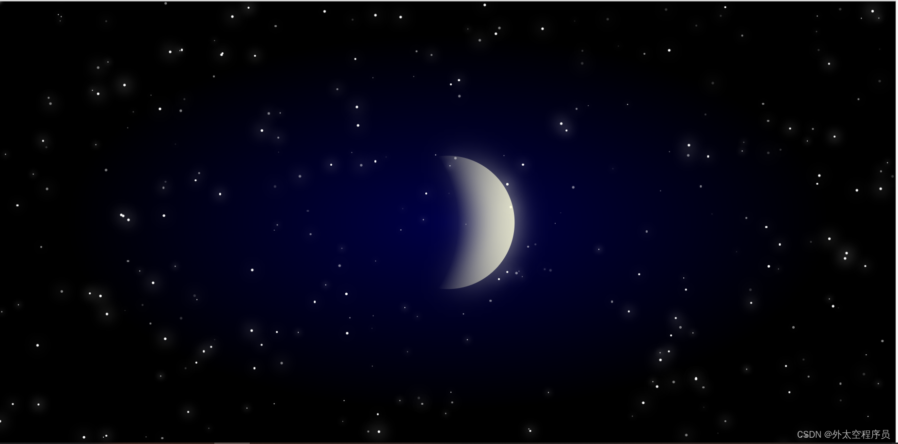
1.程序代码
<!DOCTYPE HTML PUBLIC "-//W3C//DTD HTML 4.0 Transitional//EN">
<HTML>
<HEAD><TITLE> New Document </TITLE><META NAME="Generator" CONTENT="EditPlus"><META NAME="Author" CONTENT=""><META NAME="Keywords" CONTENT=""><META NAME="Description" CONTENT=""><style>body,html {margin: 0;height: 100%;width: 100%;overflow: hidden;position: relative;background: -webkit-radial-gradient(center, #000046 0%, #000 60%);}::after,::before {content: " ";display: block;}::after,::before,.moon,.sky,.star,.asteroid {position: absolute;}.moon {color: #ffd;background: radial-gradient(circle at -30% 50%, rgba(0, 0, 0, 0) 175px, currentColor 100%);z-index: 999;border-radius: 50%;height: 200px;width: 200px;left: 50%;top: 50%;transform: translate(-50%, -50%);filter: drop-shadow(0 0 20px currentColor);}.sky {left: 0;top: 0;width: 100%;height: 100%;animation: rotate 400s infinite linear;}.star {width: 3px;height: 3px;background-color: white;border-radius: 50%;animation: shine 800s infinite linear;}.star.scale1 {transform: scale(1);}.star.scale2 {transform: scale(0.5);}.star.scale3 {transform: scale(1.3);}.star.animate1 {animation-duration: 0.5s;}.star.animate2 {animation-duration: 1s;}.star.animate3 {animation-duration: 1.5s;}.star.animate4 {animation-duration: 2s;}.star.opacity1 {opacity: 1;}.star.opacity2 {opacity: 0.5;}.star.opacity3 {opacity: 0.2;}.asteroid {top: -200px;left: -200px;width: 200px;height: 200px;opacity: 0.8;animation-name: assteroid;animation-timing-function: linease-inear;animation-iteration-count: infinite;animation-duration: 7s;animation-delay: 2s;}.asteroid:before {width: 10px;height: 10px;background: #fff;-webkit-border-radius: 50%;-moz-border-radius: 50%;border-radius: 50%;-moz-background-clip: padding;-webkit-background-clip: padding-box;background-clip: padding-box;-webkit-box-shadow: 0px 0px 7px 2px #fff;-moz-box-shadow: 0px 0px 7px 2px #fff;box-shadow: 0px 0px 7px 2px #fff;bottom: 0;right: 0;}.asteroid:after {width: 0;height: 0;border-left: 3px solid transparent;border-bottom: 200px solid #fff;border-right: 3px solid transparent;bottom: -22px;right: 75px;-webkit-transform: rotate(-45deg);-moz-transform: rotate(-45deg);transform: rotate(-45deg);-o-transform: rotate(-45deg);filter: progid:DXImageTransform.Microsoft.BasicImage(rotation=-1deg);}@keyframes shine {0% {box-shadow: 0 0 15px 0px rgba(255, 255, 255, 0.05);}50% {box-shadow: 0 0 15px 4px rgba(255, 255, 255, 0.4);}100% {box-shadow: 0 0 15px 0px rgba(255, 255, 255, 0.05);}}@-webkit-keyframes shine {0% {box-shadow: 0 0 15px 0px rgba(255, 255, 255, 0.05);}50% {box-shadow: 0 0 15px 4px rgba(255, 255, 255, 0.4);}100% {box-shadow: 0 0 15px 0px rgba(255, 255, 255, 0.05);}}@keyframes rotate {0% {-webkit-transform: rotate(0deg);}100% {-webkit-transform: rotate(360deg);}}@keyframes rotate {0% {-webkit-transform: rotate(0deg);}100% {-webkit-transform: rotate(360deg);}}@keyframes assteroid {0% {top: -200px;left: -200px;filter: alpha(opacity=80);opacity: 0.8;}10% {top: 200px;left: 200px;filter: alpha(opacity=0);opacity: 0;}100% {filter: alpha(opacity=0);opacity: 0;}}@-webkit-keyframes assteroid {0% {top: -200px;left: -200px;filter: alpha(opacity=80);opacity: 0.8;}10% {top: 200px;left: 200px;filter: alpha(opacity=0);opacity: 0;}100% {filter: alpha(opacity=0);opacity: 0;}}</style>
</HEAD><BODY><div class="sky"></div>
<div class="moon"></div>
<div class="asteroid"></div>
<script src="https://cdn.bootcss.com/jquery/1.12.4/jquery.min.js"></script>
<script>/*===============================================================Barev and welcome to my little playground!My name is Ani and I'm a Web Developer from Yerevan. Here you will find some of my personal experiments. Feel free to use them for whatever you want.===============================================================*/function init(){var styles = ["animate4", "animate1", "animate2", "animate3"];var scales = ["scale1", "scale2", "scale3"];var opacities = ["opacity1", "opacity1", "opacity1", "opacity2", "opacity2", "opacity3"];function rand(min, max) {return Math.floor(Math.random() * (max - min)) + min;}var stars = "";var count = 300;var widthWindow = window.innerWidth;var heightWindow = window.innerHeight;for (var i = 0; i < count; i++) {stars += "<span class='star " + styles[rand(0, 4)] + " " + opacities[rand(0, 6)] + " "+ scales[rand(0, 3)] + "' style='animation-delay: ." + rand(0, 9)+ "s; left: "+ rand(0, widthWindow) + "px; top: " + rand(0, heightWindow) + "px;'></span>";}document.querySelector(".sky").innerHTML = stars;}window.onload = init;window.onresize = init;
</script>
</BODY>
</HTML>
2.效果图