插画惯用风格
重点 (Top highlight)
I have to confess… I’m an illustration junkie. Hours disappear when I’m swimming through the endless stream of talented artists that post online. The art form of illustration has become a mainstay of landing pages, getting more unique and colorful with each passing year. It provides customers a friendly introduction to brands and can become an essential component of all your customer-facing imagery. While there are now many repositories of free or low-cost illustrations available online, there is something to be said for the use of unique imagery that is designed to represent a single brand’s identity and message.
我不得不承认……我是一个插画迷。 当我在网上发布的无数才华横溢的艺术家中游泳时,时间消失了。 插图的艺术形式已成为登陆页面的Struts,并且随着时间的流逝越来越独特和丰富多彩。 它为客户提供了一个友好的品牌介绍,并且可以成为您所有面向客户的图像的重要组成部分。 尽管现在有许多免费或低价插图的在线存储库,但对于使用独特图像来表示单个品牌的身份和信息却要说些什么。
The stock photo styles of the 90’s have lost their appeal. Although we’re seeing a new era of stock image quality emerge on sites like Unsplash, it’s difficult for many brands to properly utilize those kinds of images to strong affect.
90年代的照片风格已失去吸引力。 尽管我们看到像Unsplash这样的网站上出现了库存图像质量的新时代,但许多品牌很难正确地利用这些图像来产生强烈的影响。
Illustrations are a perfect go between — able to provide the emotion and human connection of photos, while distilling the imagery to a neutral flavor which can be used in a much wider range of possibilities. As art becomes more intertwined with the brands and products we build, it’s important that we have a reference point when looking for an artist.
插图是两者之间的完美结合—能够提供照片的情感和人与人之间的联系,同时将图像提炼成中性的味道,可以在更广泛的可能性中使用。 随着艺术与我们所建立的品牌和产品的交织越来越紧密,寻找艺术家时必须有一个参考点。
Here, I’ve curated a few of my favorite illustration styles, highlighting some particularly stellar examples of each. In the lack of specific stylistic definitions, I’m using my own categorizations to define each style.
在这里,我策划了一些我最喜欢的插画风格,并突出了每种风格的一些特别出色的例子。 在缺乏特定的样式定义的情况下,我使用自己的分类来定义每种样式。
I hope this list will serve as both a style reference and a directory of talent to contact when building your next great brand.
我希望这份清单既可以作为样式参考,也可以作为建立下一个伟大品牌时联系的人才目录。
Thank you to all the artists who gave permission to share their incredible work.
感谢所有允许分享他们不可思议的作品的艺术家。
#1单位 (#1 Flat)
Flat is iconic and timeless, conveying incredible depth in just a few colors.
Flat具有标志性和永恒性,仅用几种颜色即可传达令人难以置信的深度。
由Malika Favre (by Malika Favre)
You’ve undoubtedly encountered Malika Favre’s work in The New Yorker, Sephora, and on a host of book covers. Her minimalistic style often features imagery of empowered woman or emotional views into the female experience. I’m a huge fan.
毫无疑问,您已经在丝芙兰的《纽约客》和许多书籍封面上见过马利卡·法夫尔(Malika Favre)的作品。 她的简约风格通常带有受权妇女的形象或对女性体验的情感看法。 我是忠实粉丝。
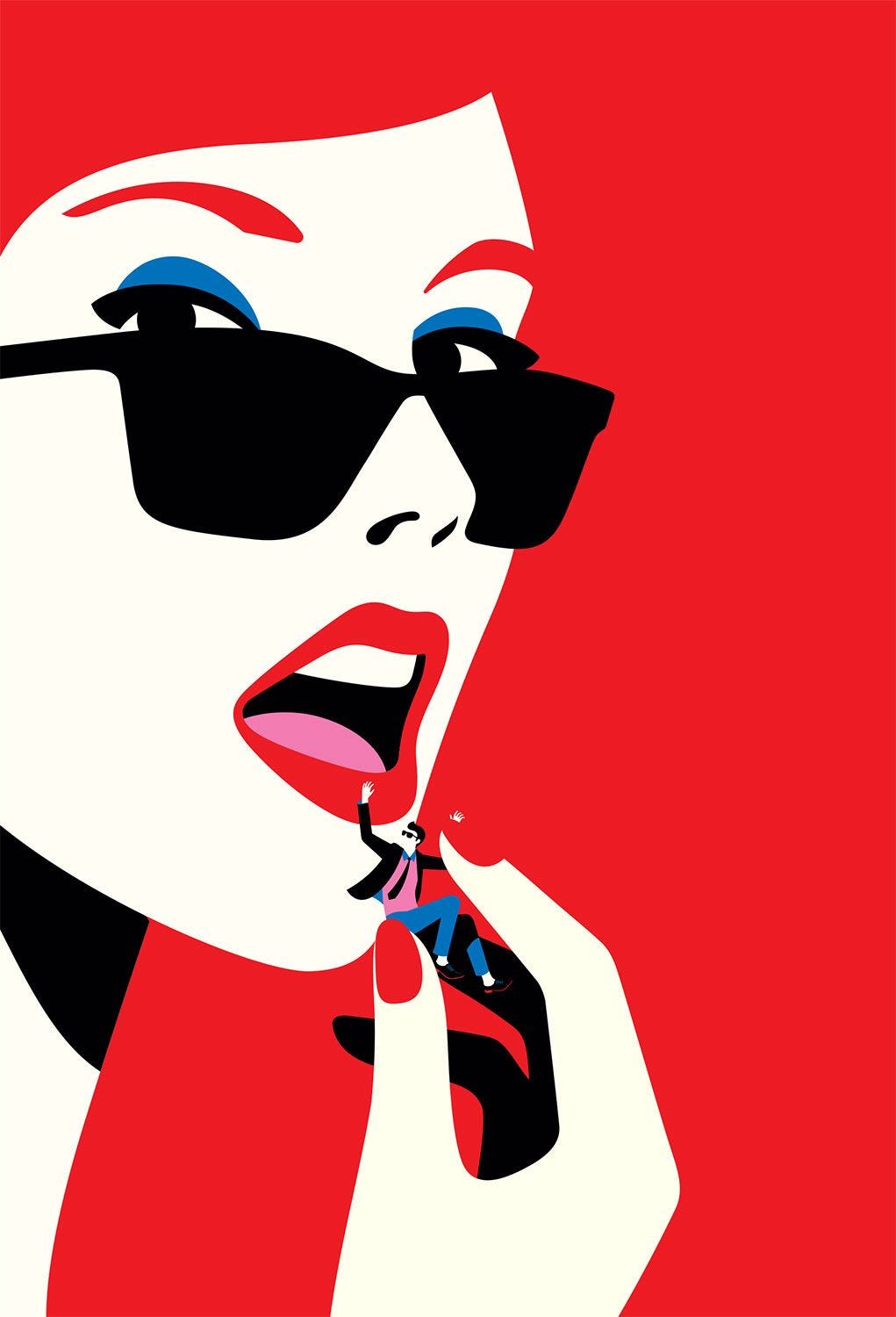
Animations bring Malika’s characters off the page and into our hearts. You can almost feel her characters staring back at you.
动画使Malika的角色脱颖而出并进入我们的心灵。 您几乎可以感觉到她的角色正凝视着您。

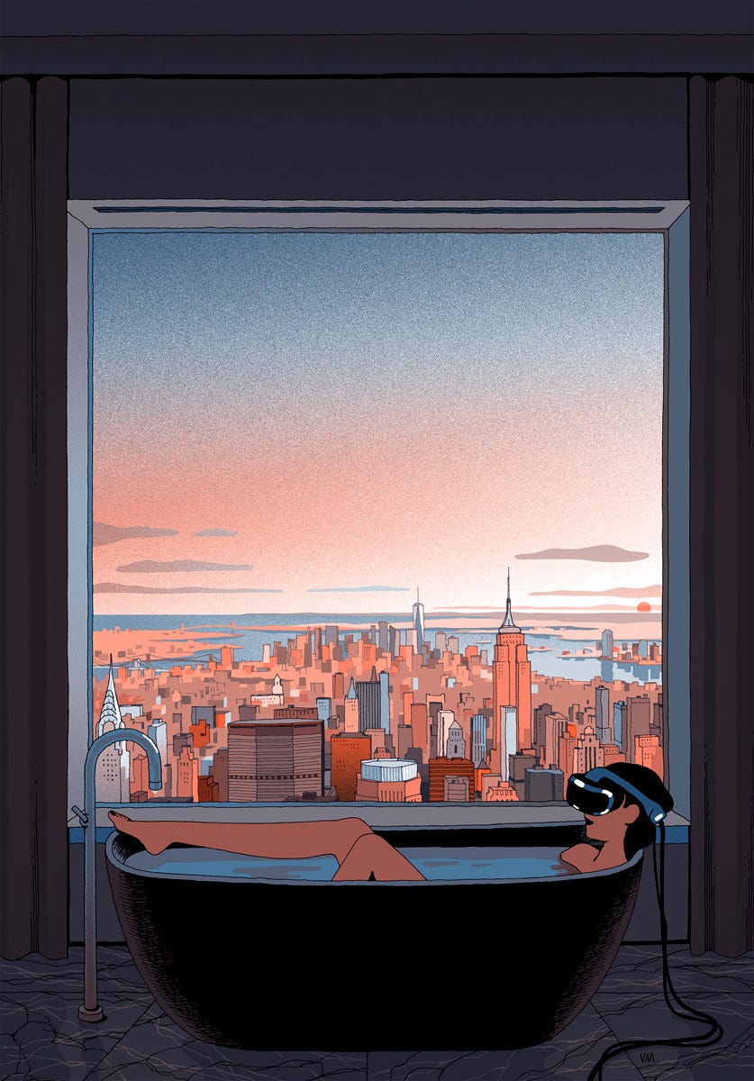
由Levente Szabo (by Levente Szabo)
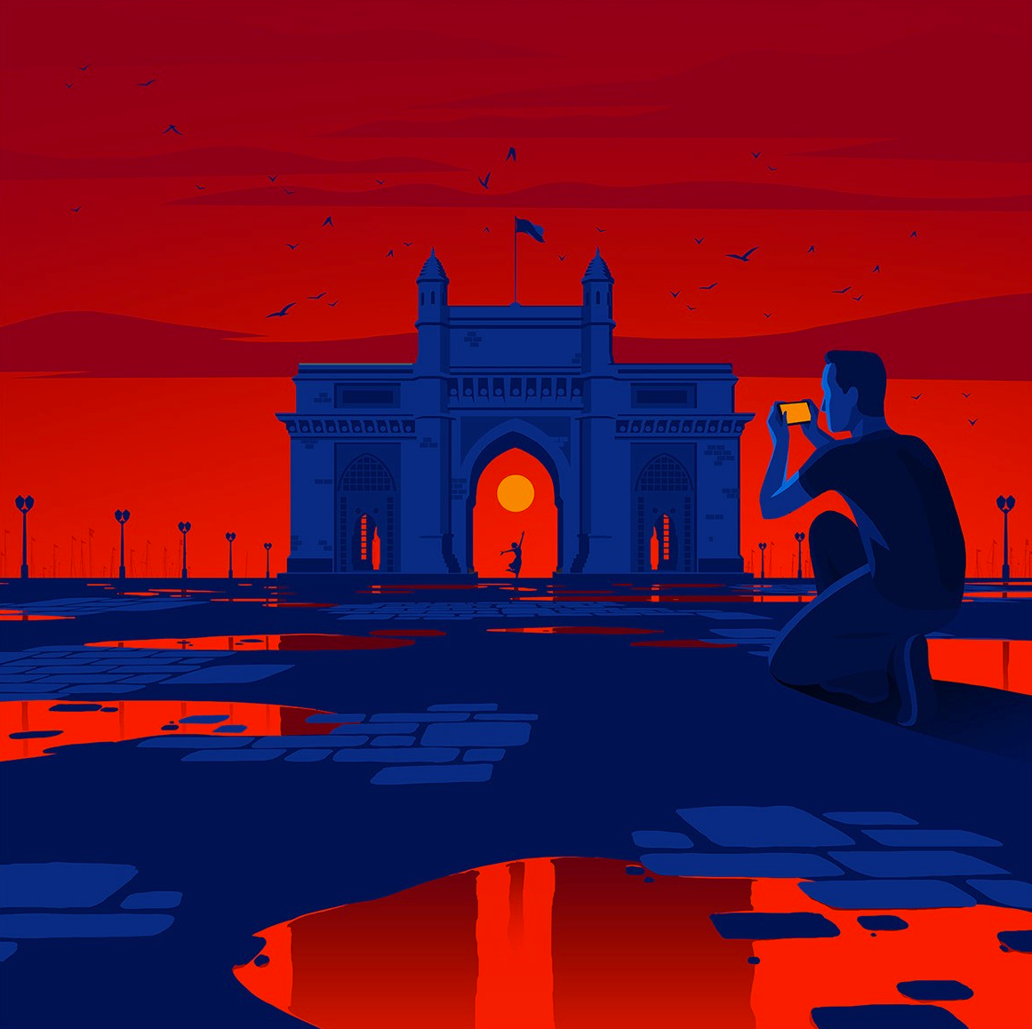
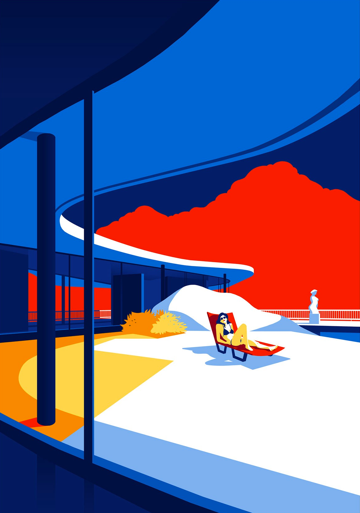
With a focus on architecture and our experience around it, Levente composes incredible color palettes that conjure memories of an amber sky at dusk and the feeling of the summer sun warming your back.
Levente着眼于建筑学和我们在建筑方面的经验,创作出令人难以置信的调色板,让人联想起黄昏时琥珀色的天空以及夏天温暖的阳光。
Conveying emotion through imagery that hooks into our own memories is a fantastic way to connect with customers. We all have similar experiences, but to display them in a way that people feel is the mark of great art.
通过图像传达情感,并融入我们自己的记忆中,是与客户建立联系的绝佳方式。 我们都有相似的经历,但是以人们认为的方式展示它们是伟大艺术的标志。

由Coen Pohl (by Coen Pohl)
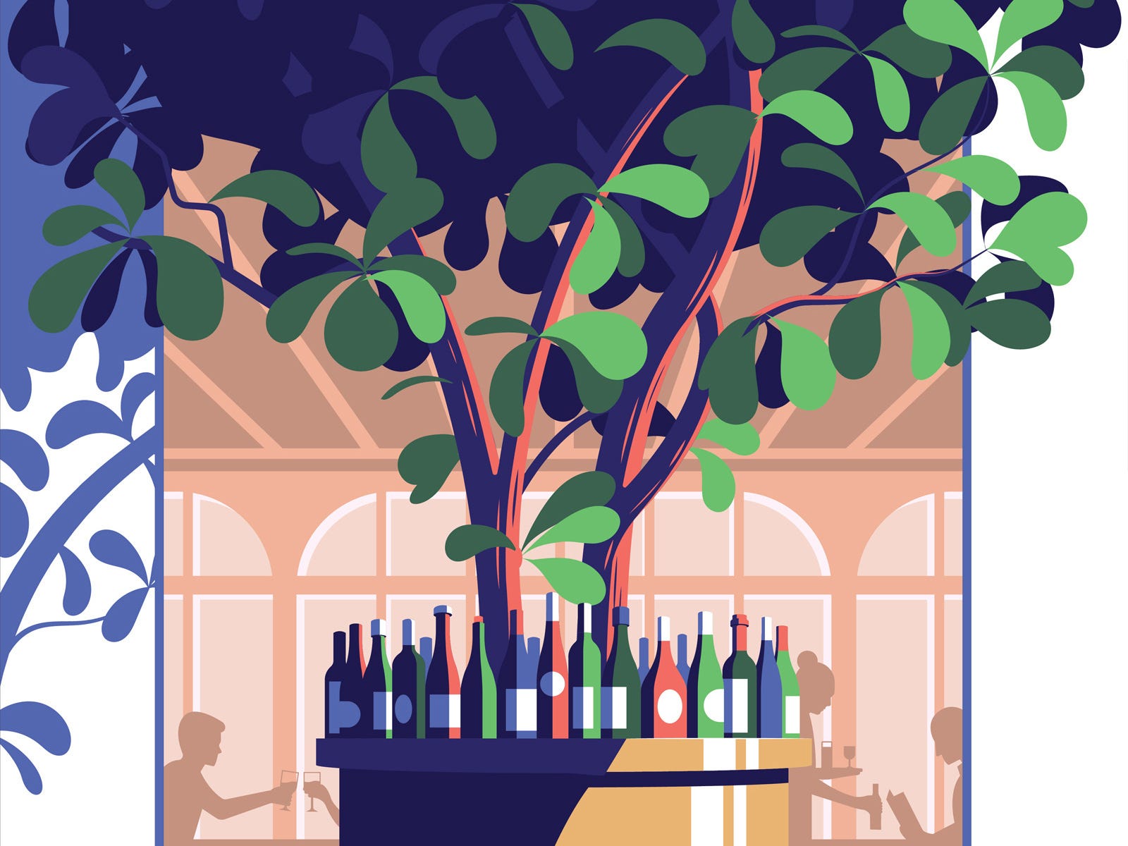
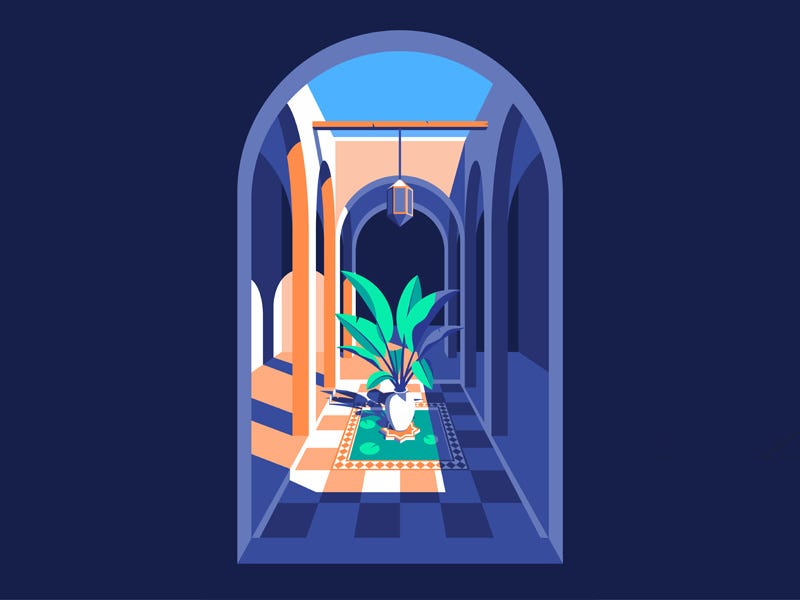
Coen continues a long trend of flat art but adds a more realistic perspective by combining shadow, angle, and framing in a way that makes his work uniquely noteworthy. His use of pastel color palettes also softens the scenes and invites us into their spaces.
Coen延续了扁平艺术的长期趋势,但通过将阴影,角度和取景结合在一起以使其作品特别引人注目,从而增加了更逼真的视角。 他使用柔和的调色板也使场景变得柔和,并邀请我们进入它们的空间。

#2颗粒渐变 (#2 Granular Gradients)
Although an obvious off-split from flat, I think the differences here are worth defining. The addition of gradients and granular texture among flat colors softens the surfaces, greatly changing the overall feeling of the style.
尽管明显偏离单位,但我认为这里的差异值得定义。 在单色中添加渐变和粒状纹理可以使表面柔化,从而极大地改变了样式的整体感觉。
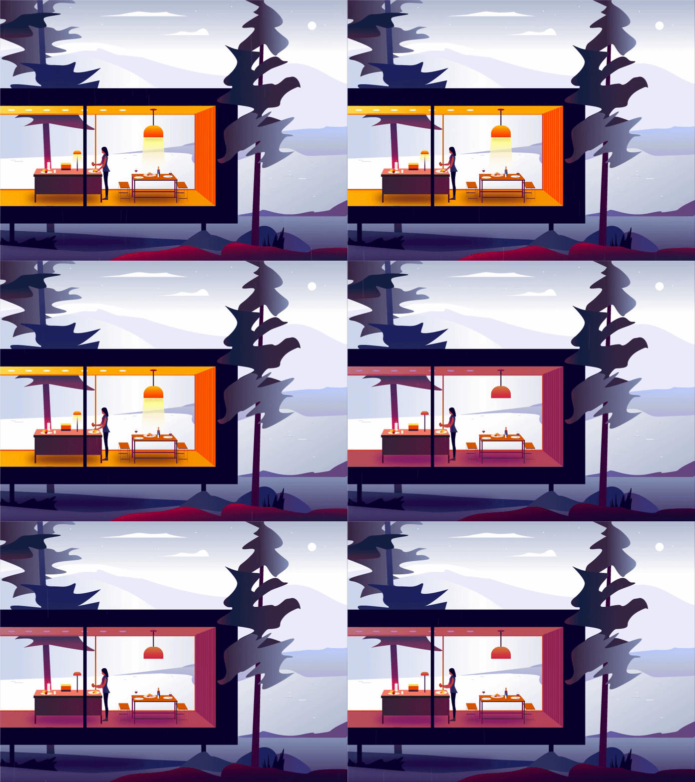
When combined with a bit of animation, a mood is suddenly created which puts you inside the scene. You’re right there in the cold winter wind and the rainy drizzle of these pieces in a way that just isn’t possible with the purely flat style. Just stare a few minutes and you’ll want to curl up next to a fireplace with a good book.
当结合一些动画时,会突然产生一种情绪,使您进入场景。 您正好在寒冷的冬季风和这些小雨的细雨中就在那儿,这是纯粹的平面样式无法做到的。 只要凝视几分钟,您就会想curl缩在壁炉旁,那里拿着一本好书。
The traditional process of creating Japanese block prints limited the amount of colors that could be used by masters like Hiroshige, Utagawa and others. They were a huge inspiration of the Japanese cartoon (manga) style, and traces of their work can be seen in these modern takes on landscapes and life scenes. Just as block printers found a way to add more colors by layering them into gradients, so also do modern illustrators use this technique to pull us deeper into their world.
创建日文版画的传统过程限制了诸如广重,歌川和其他大师之类的大师可以使用的颜色数量。 它们是日本卡通风格的巨大灵感,在这些现代风景和生活场景中可以看到他们的作品痕迹。 正如活字印刷商找到了一种通过将颜色分层成渐变来添加更多颜色的方法一样,现代插画家也使用此技术将我们带入了更深的世界。
按人群 (by Outcrowd)

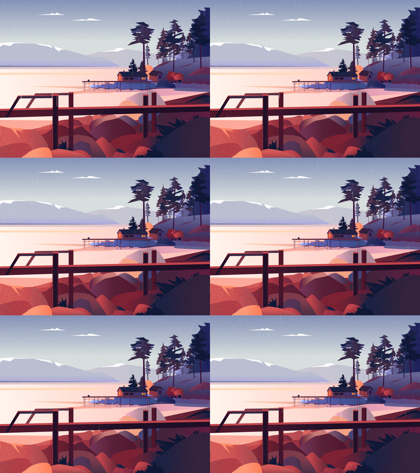

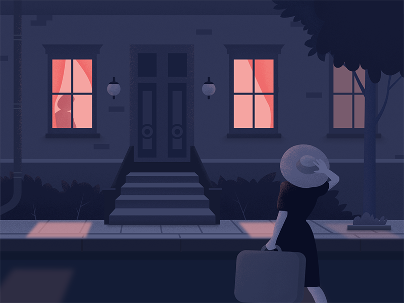
拉娜·马兰迪娜 ( Lana Marandina) (by Lana Marandina)
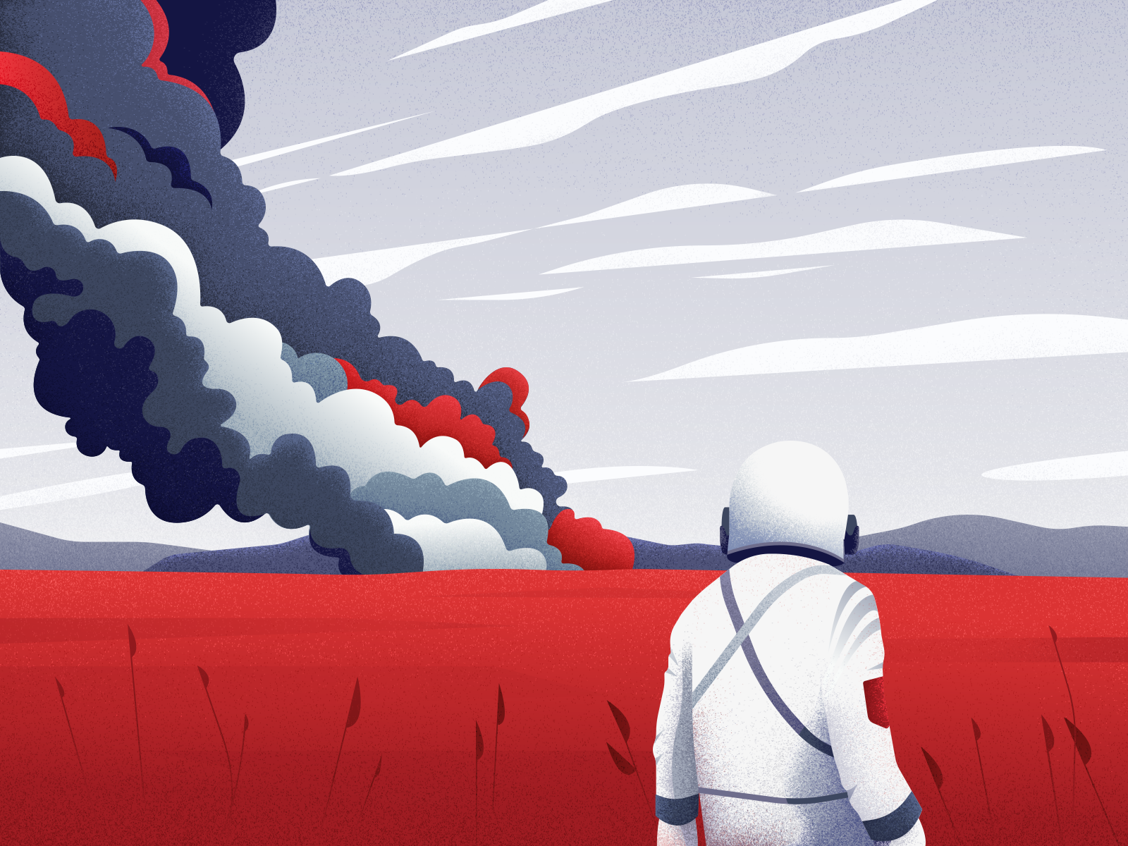
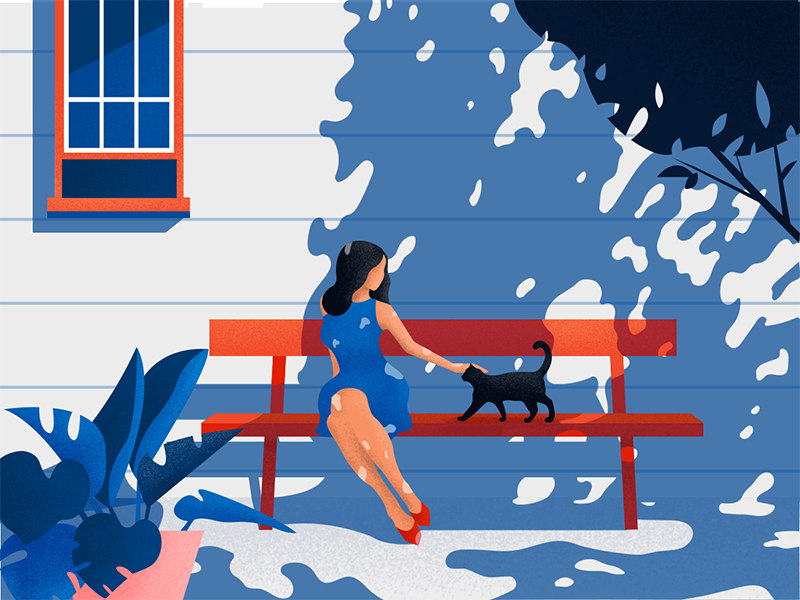
I love the color palettes that Lana uses in her work, but it’s the uniquely human moments she captures which makes her art so inspirational, dropping you in amongst characters whose emotions are complex and can be understood from a variety of perspectives.
我喜欢Lana在她的作品中使用的调色板,但正是她捕捉到的独特的人类瞬间使她的艺术如此鼓舞人心,将您带入了情感复杂且可以从多种角度理解的角色中。
Her selection of these well-considered moments, and the framing of each scene is what makes the work come alive in a way that sets her apart from other artists.
她从这些经过深思熟虑的时刻中进行选择,并为每个场景定格,这是使该作品充满活力的方式,使她与其他艺术家脱颖而出。

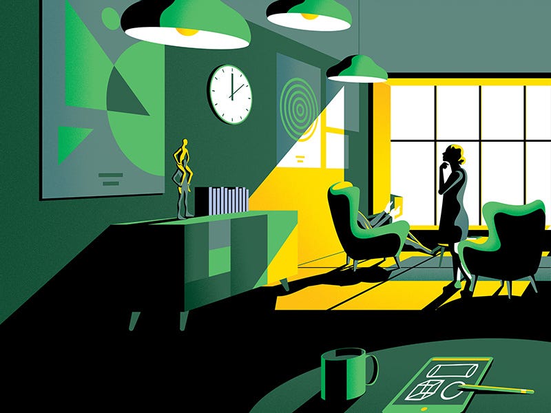
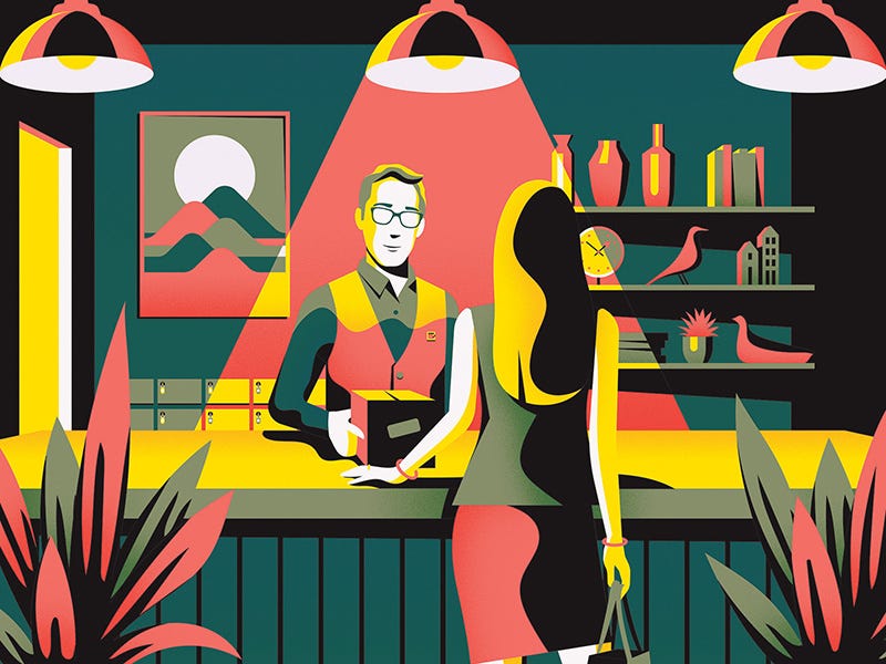
杰克·戴利 ( Jack Daly) (by Jack Daly)
Jack’s work uses a tight palette of complimentary colors that emphasizes the flow of light into each space. His minimal use of gradients and granular texture gives each piece a classic and retro feel that I personally find very appealing.
杰克的作品使用紧密的互补色调色板来强调光线在每个空间中的流动。 他极少使用渐变色和颗粒状纹理,使每件作品都具有经典和复古的感觉,我个人觉得很有吸引力。

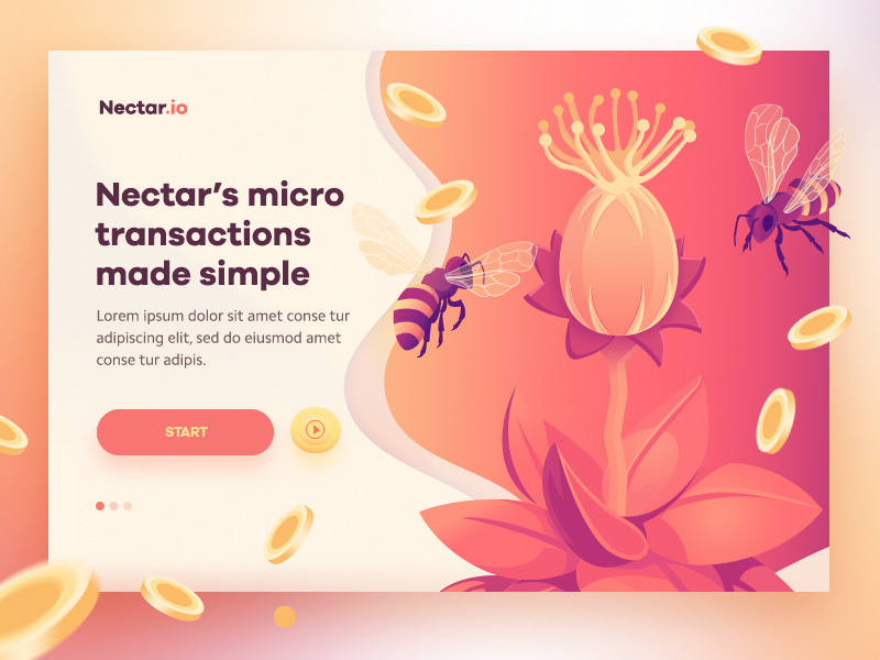
通过Walid Beno (by Walid Beno)
Walid is a master of product landing page illustrations, and expertly selects color shades to create a unique mood in every piece. I’ve referenced his design examples on many of my own personal projects, and continue to be inspired by his choice of color palettes and clean use of gradients to emphasize shadows.
瓦利德(Walid)是产品着陆页插图的大师,并且熟练地选择颜色阴影以在每件作品中营造出独特的氛围。 我在许多个人项目中都引用了他的设计示例,并且继续受到他对调色板的选择以及对阴影的强调使用的启发。

由Febin Raj为Fireart Studio设计 (by Febin Raj for Fireart Studio)
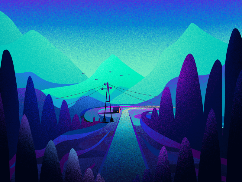
When used to a heavier degree, the grainy gradient texture takes over the work in a way that further changes the feel, almost making each a window into the scene rather than putting us in amongst them. The grain seems to remove some of the realism, but also brings a somewhat fantastical view to the work that I think is worth noting.
当用于较重的程度时,粒状渐变纹理会以一种可以进一步改变感觉的方式接管工作,几乎使每个窗口成为场景的窗口,而不是将我们置于其中。 粗糙的外观似乎消除了一些现实主义,但也为我认为值得一提的作品带来了一些奇幻的观点。

通过Demet Tombul (by Demet Tombul)
Demet’s work moves this style beyond its origin and into something entirely new. She takes granular gradients and combines them with more complex line work to create a truly surreal perspective.
Demet的作品将这种风格超越了它的起源,并进入了全新的领域。 她采用了精细的渐变,并将它们与更复杂的线条结合起来,以创建真正超现实的视角。
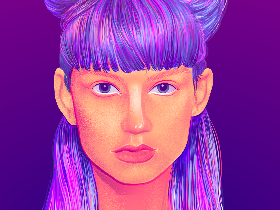
#3阴影超现实主义 (#3 Shadowed Surrealism)
Add a bit of depth to the shadows, then layer in more texture and we get something that I’ll call shadowed surrealism. Squint a bit and you might think you’re looking at a photograph.
给阴影增加一些深度,然后添加更多纹理,我们将获得一些我称之为阴影超现实主义的东西。 稍稍蹲下,您可能会觉得自己在看照片。
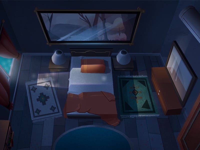
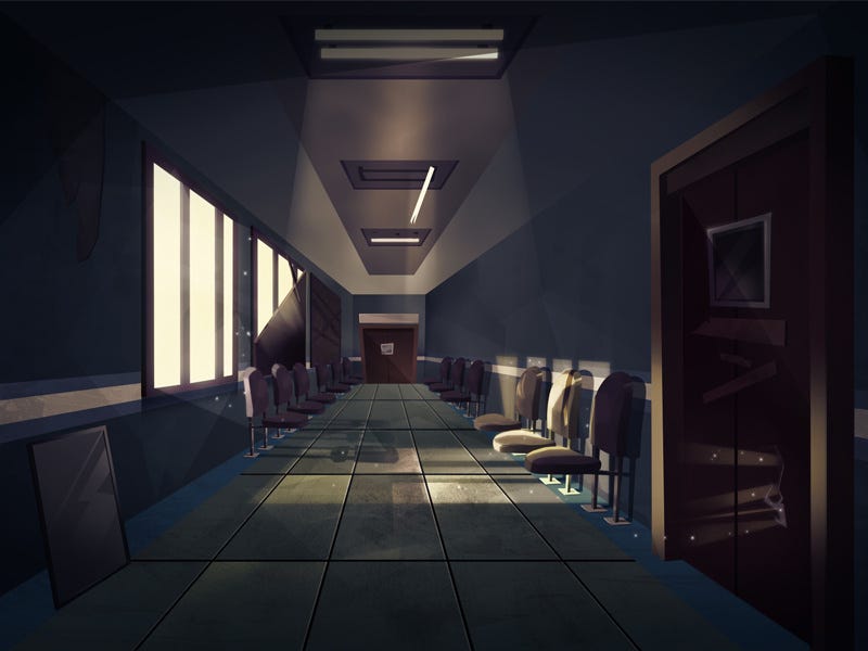
通过Ahmet Iltas (by Ahmet Iltas)
Ahmet’s worlds are more realistic because they are less than perfect. The tassels of the rug are allowed to fall this way and that. Dust seems to float in the air of the lit hallway. Somehow, we know these spaces as places we’ve seen somewhere but can’t quite place.
艾哈迈德(Ahmet)的世界更现实,因为它们并不完美。 地毯的流苏可以这种方式掉落。 灰尘似乎漂浮在点燃的走廊的空气中。 不知何故,我们知道这些空间是我们在某个地方见过的地方,但是却不是一个地方。

#4线条与阴影的真实感 (#4 Line & Shadow Realism)
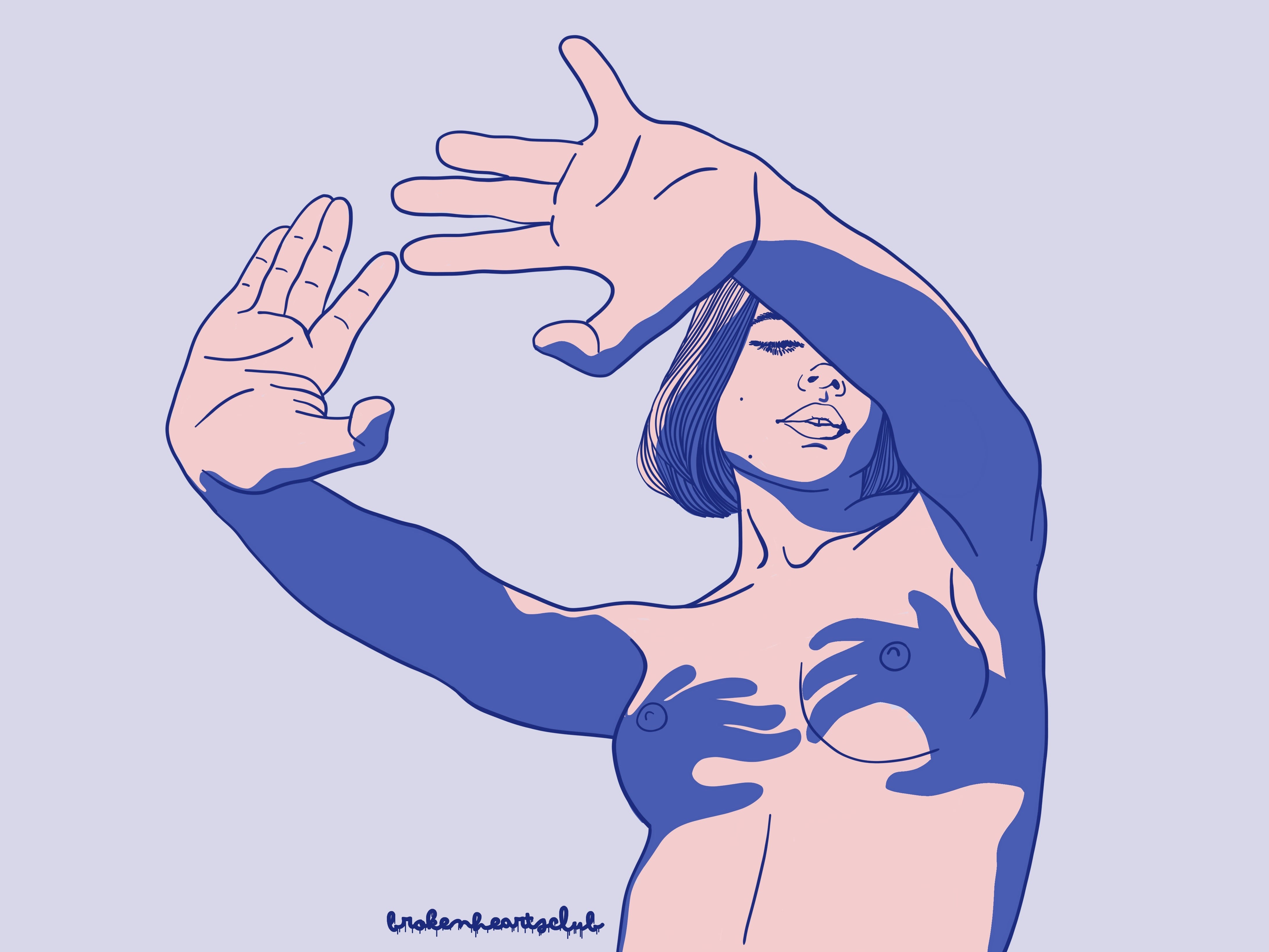
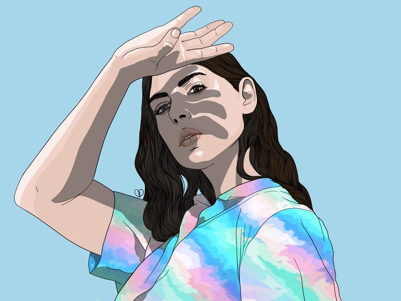
Less is more, more or less. Regardless of the imagery you’re trying to capture, it can be conveyed to a highly realistic degree, even with just a few colors and a bit of line work.
少即是多多少少。 无论您要捕获的图像是什么,即使只有几种颜色和一些线条,也可以将其传达到非常真实的程度。
通过埃勒·肖 (by Elle Shaw)
www.eleashaw.com
www.eleashaw.com
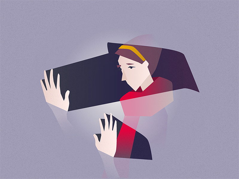
Elle’s work is marked by simplistic, singular forms on a flat background. Her use of hands and facial expressions connect the viewer to the character, and shadows seem to oppress the subjects.
埃勒(Elle)的作品以平坦的背景上简单,单一的形式为标志。 她使用手和面部表情将观看者与角色联系起来,阴影似乎压迫了主体。
She frames our perspective like a snapshot of an intimate conversation with a close friend, perhaps taken at a moment when we’ve just said the wrong thing.
她将我们的观点描绘成与密友进行亲密交谈的快照,也许是在我们刚刚说错了话的瞬间拍摄的。

#5霓虹灯 (#5 Neon Fluid)
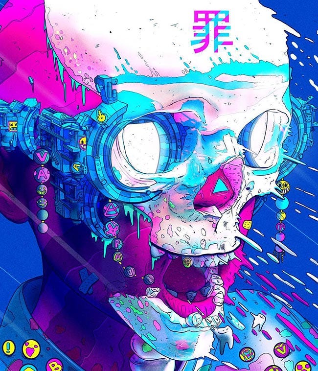
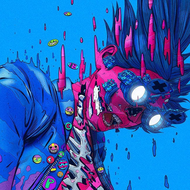
Expressing movement through fluid goop is a highlight of this growing trend. It can be seen in the work of Beeple and is hidden amongst the portfolios of many a Dribbbler.
通过流动胶水表达运动是这一增长趋势的一大亮点。 在Beeple的作品中可以看到它,并且隐藏在许多Dribbbler的作品集中。
由Xsullu (Nick Sullo ) (by Xsullu (Nick Sullo))
Xsullo’s work almost always includes a neon color palette, skulls and a reference to virtual reality that appears to be very much inspired by the illustrator Josan Gonzalez and his Brazillian cover of Neuromancer, William Gibson’s classic sci-fi novel.
Xsullo的作品几乎总是包含霓虹色调色板,头骨和对虚拟现实的引用,这似乎受到插画家Josan Gonzalez的启发 以及威廉·吉布森(William Gibson)的经典科幻小说《神经法师》的巴西封面 。
The detail is almost overwhelming, creating an overall surrealistic feel combined with cartoonistic tones and movement. I’m not sure what he’s trying to tell us about the future of human experience in VR, but I’m definitely listening.
细节几乎是压倒性的,结合了卡通色调和运动感,营造出整体超现实主义的感觉。 我不确定他在试图告诉我们关于人类在VR中的未来体验的尝试,但是我肯定在听。
#6半扁平,半现实主义 (#6 Semi-flat, Semi-realism)
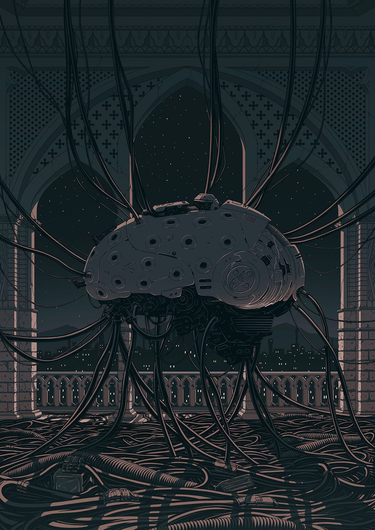
This bridges the gap between the flat style and more realistic approaches. We see more line and texture details in this style than the typical flat which highlights textural features like material imperfections or weathered surfaces.
这弥合了平面样式和更逼真的方法之间的鸿沟。 与典型的平面突出显示纹理特征(例如材料缺陷或风化表面)相比,这种样式的线条和纹理细节更多。
瓦莱里·扎里托夫斯基 (by Valeri Zarytovski)
Almost a throwback to the classic Japanese anime styles seen in films like Akira, the illustrations of Valeri Zarytovski inspire us to imagine what kind of bizarre futures these scenes could have come from.
Valeri Zarytovski的插图几乎可以追溯到诸如Akira之类的电影中所看到的日本经典动漫风格,这激发了我们去想象这些场景可能来自什么样的奇异未来。
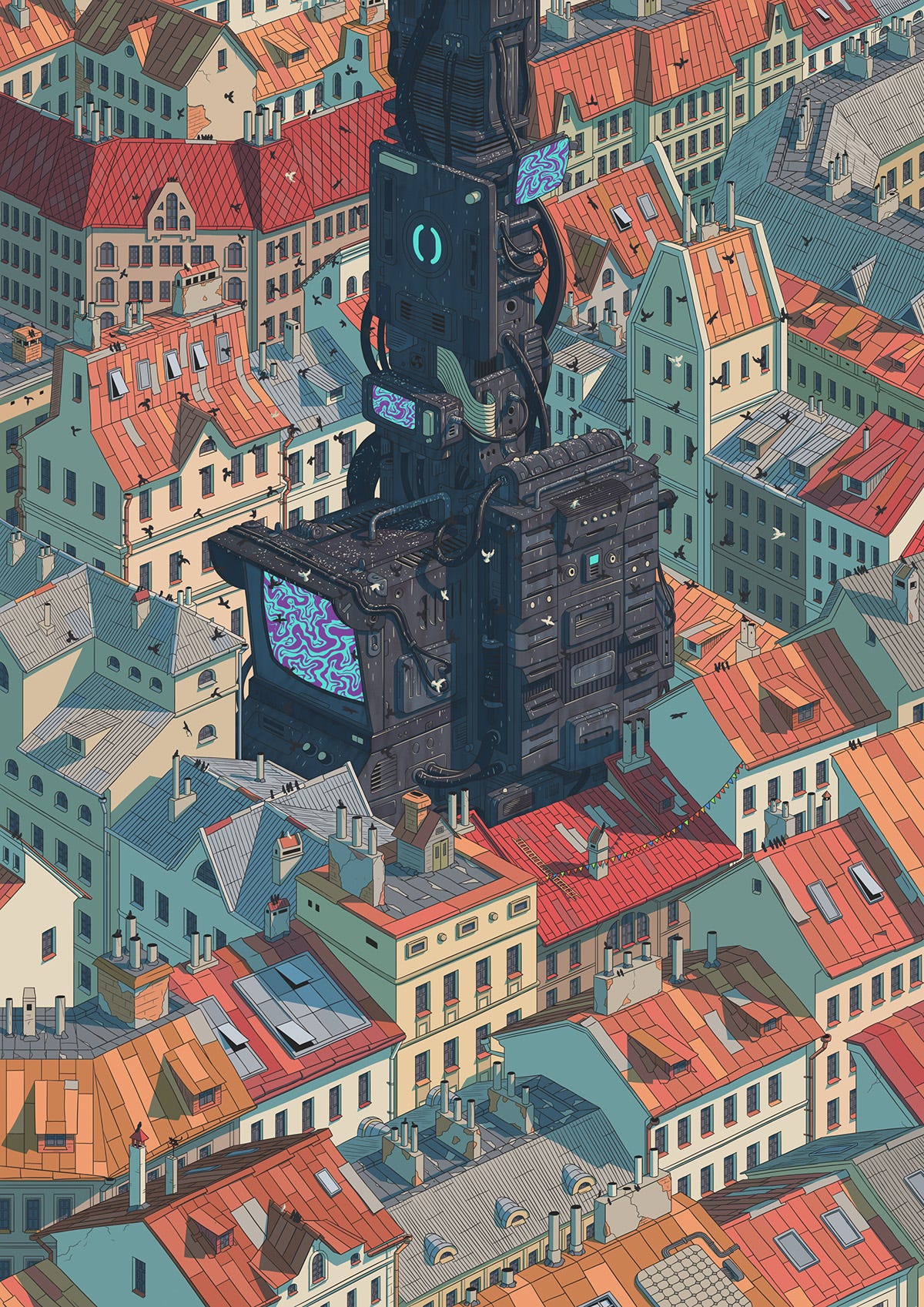
文森特·马埃(VincentMahé) (by Vincent Mahé)
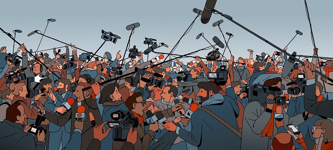
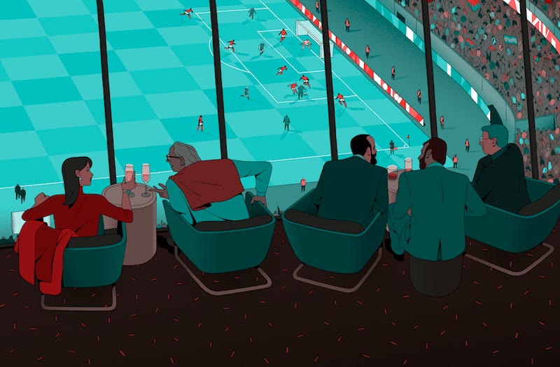
With imagery that is more centered in the real world, Vincent gives realistic depth to his scenes through emphasizing the distance between foreground and background elements. His use of strong detail in mechanical and scene objects really makes the work live in a realistic, modern world.
通过在现实世界中更加集中的图像,文森特通过强调前景元素和背景元素之间的距离,为场景提供了真实的深度。 他在机械物体和场景物体中使用强细节,确实使作品活在了现实的现代世界中。
#7调色刀 (#7 Palette Knife)
As if slathered on with a palette knife or streaked with a fat-tipped marker, this style creates hard edges to compose the form.
就像用调色刀刮擦或用肥尖的笔刷划痕一样,此样式会创建硬边缘以构成表格。
While most brands choose a more simplistic approach, style choices are bound to expand to a range of directions in the near future. Taking traditional approaches and converting them to digital can bring much more depth and emotion into the image than flatter styles ever could.
尽管大多数品牌选择了更为简单的方法,但在不久的将来,款式的选择必然会扩展到一系列方向。 采用传统方式并将其转换为数字方式,比以往任何一种扁平风格都能给图像带来更多的深度和情感。
I hope we see brands begin to utilize more concepts like this in the future.
我希望我们看到品牌将来会开始使用更多类似的概念。
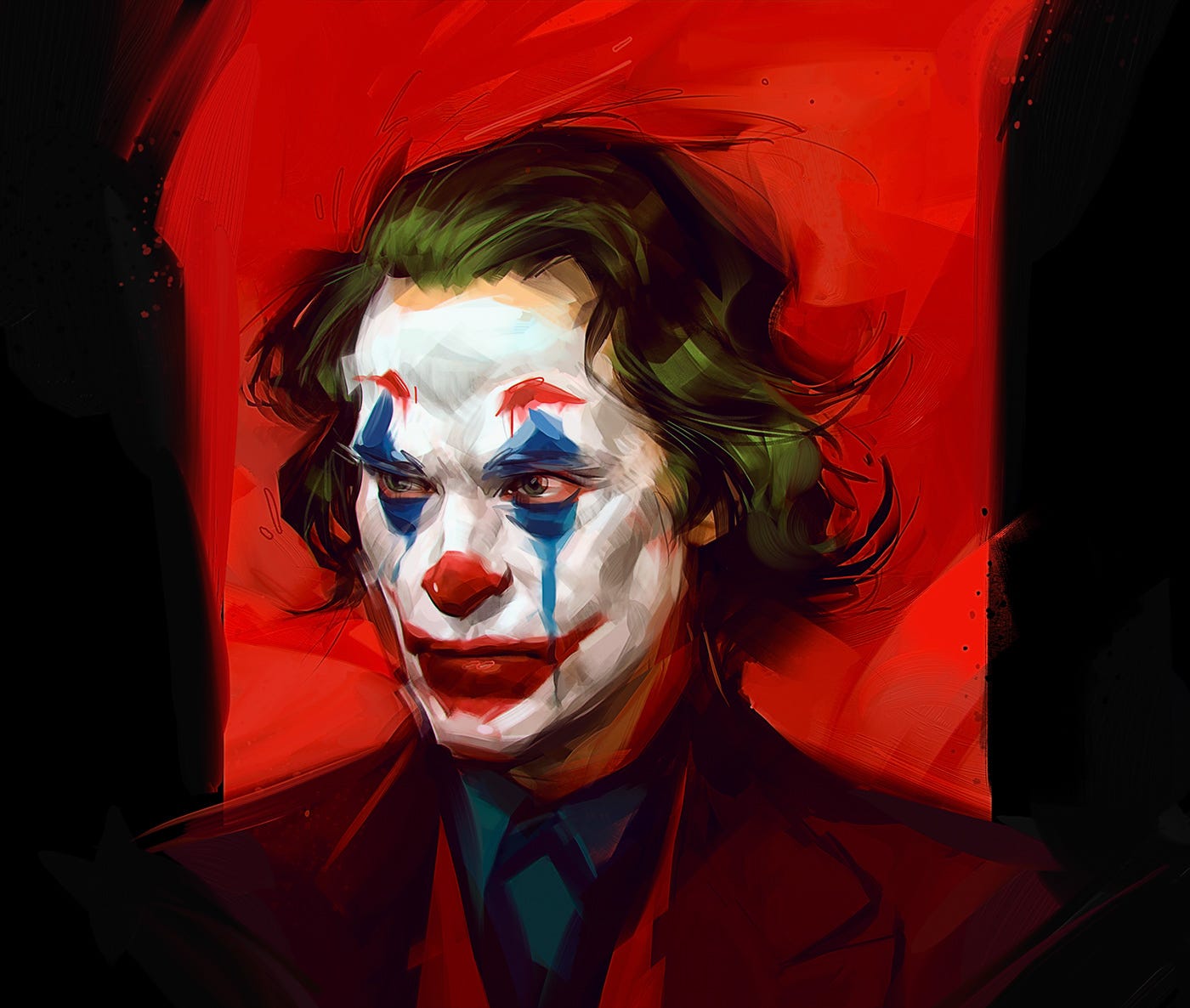
通过维克多·米勒·高萨 ( Viktor Miller-Gausa) (by Viktor Miller-Gausa)
Viktor’s digital paintings use a brilliant combination of color, texture, movement, and even subtle hallucination. His joker is as hard-edged as his style, but with further inspection we see his eyes are filled with tears, and in that instant our view of his demeanor drastically shifts.
Viktor的数字绘画将色彩,纹理,运动甚至微妙的幻觉完美地结合在一起。 他的小丑像他的风格一样刻板,但经过进一步的检查,我们看到他的眼睛充满了眼泪,在那一刻,我们对他的举止的看法发生了巨大变化。
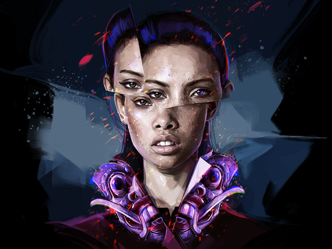
I’m a big fan of the way he manipulates eyes, and in turn manipulates the facial recognition part of our brains so that we struggle to find a place to focus our gaze. It’s bewildering in a way that makes you smile. This eye trickery makes his work timeless in a way other art simply isn’t capable of.
我非常喜欢他操纵眼睛的方式,并反过来操纵我们大脑的面部识别部分,因此我们很难找到一个可以集中注意力的地方。 它令人迷惑,使您微笑。 这种眼花trick乱的工作使他的作品永不过时,这是其他艺术根本无法做到的。
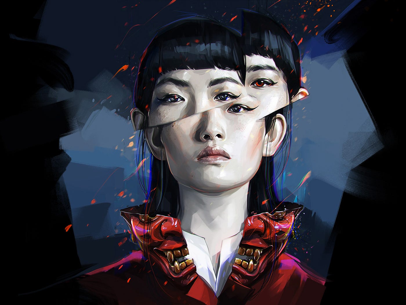
And then again here, where a closer look rewards the viewer.
然后再来一次,近距离观察会给观众带来奖励。
#8 Fleischer风格 (#8 The Fleischer Style)
We’ve seen a slight resurgence of the classic black and white cartoon style that originated in Fleischer Studios and was soon after emulated by Disney.
我们已经看到经典的黑白卡通风格略有复兴,这种风格起源于Fleischer Studios ,并很快被迪士尼模仿。
If you haven’t had the pleasure of seeing this scene with Koko the Clown from Betty Boop: Snow White (1933), get ready to be blown away.
如果您不愿意和Betty Boop的小丑Koko一起看这个场景:白雪公主(1933) ,请准备好被吹走。
演示地址
Koko was the first character to originate from Max Fleischer’s invention of the Rotoscope, a device that allowed for animation to be more lifelike by tracing motion picture footage of human movement.
Koko是Max Fleischer发明的Rotoscope的第一个角色,Rotoscope是一种设备,通过追踪人类运动的电影画面,动画变得更加逼真。
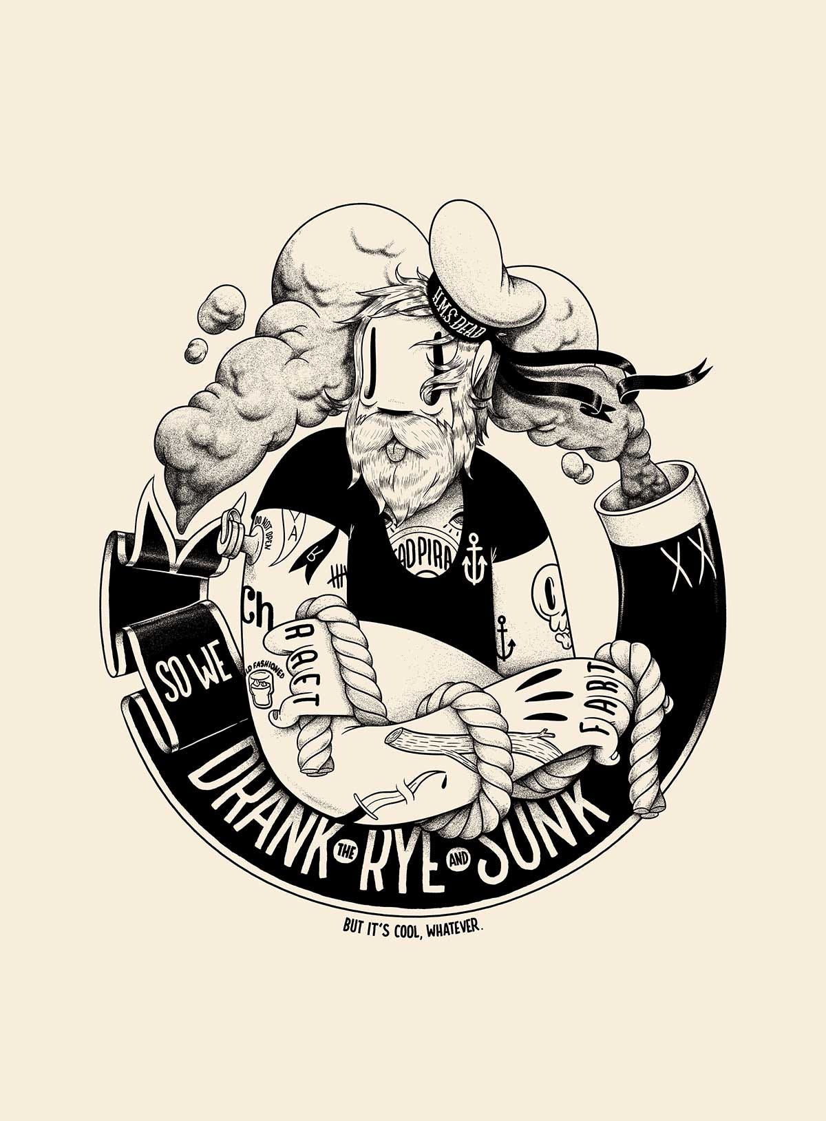
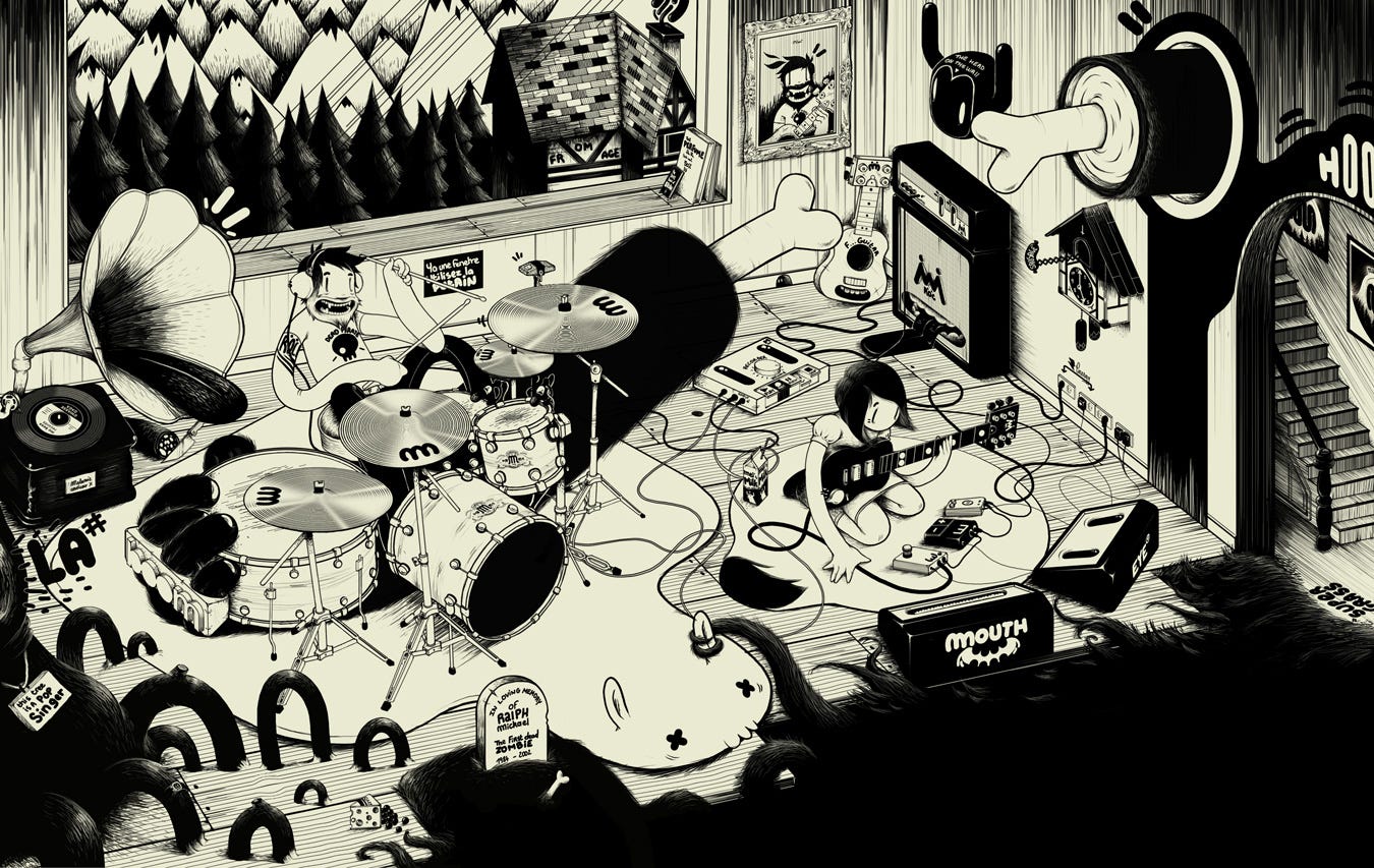
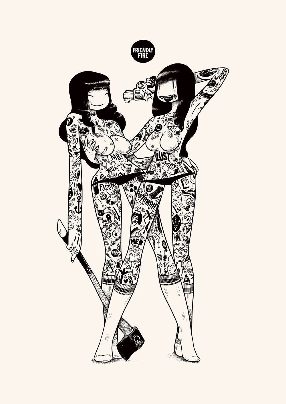
通过mcBess (by mcBess)
Relighting the torch on this classic style and pushing it into the future is one of my all-time favorite artists; mcBess (Matthieu Bessudo). I look back at his work often and even recreated one of his pieces on the bottom of my longboard.
我一直以来最喜欢的艺术家之一就是重燃这种经典风格的火炬并将其推向未来。 mcBess(Matthieu Bessudo)。 我经常回头看他的工作,甚至在我的退潮板底部再造他的作品之一。
Mcbess has many recurring themes in his work. Most notable of them being rock music (used in tandem with his band The Dead Pirates), raw meat, axes, nautical imagery, demons, tattoos, and seductively dangerous girls.
麦克布斯在他的作品中有许多重复出现的主题。 其中最著名的是摇滚音乐(与他的乐队The Dead Pirates结合使用 ),生肉,斧头,航海影像,恶魔,纹身和诱人的危险女孩。
演示地址
#9机械现实主义 (#9 Mechanical Realism)
金正基 (by Kim Jung Gi)
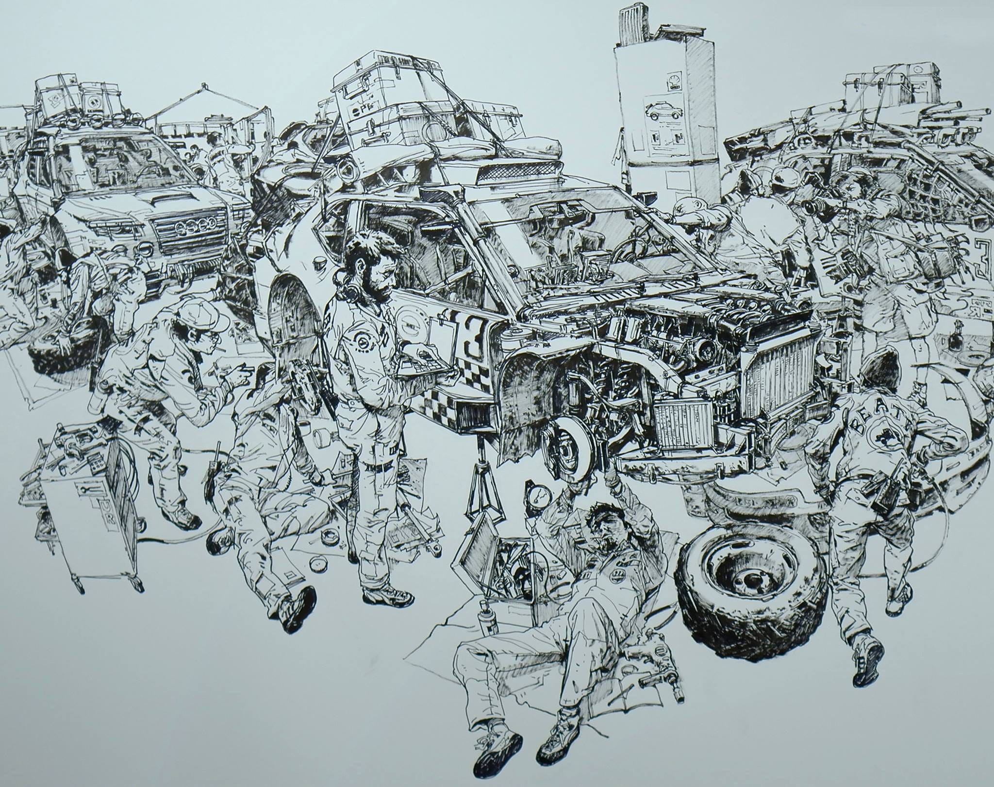
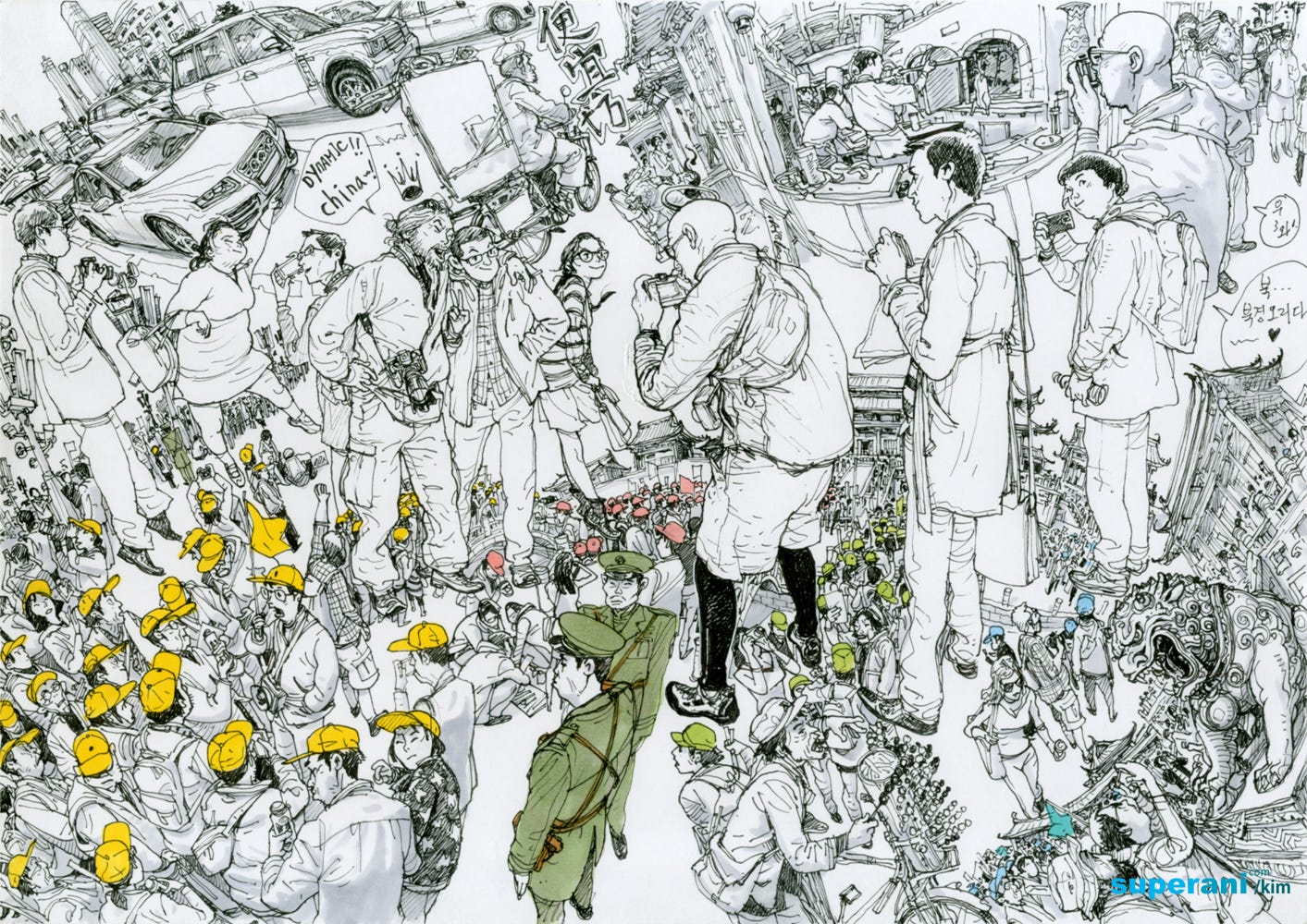
A master of perspective and mechanical detail, Kim Jung Gi is able to unite hundreds of characters and objects together into a unique symphony of lines.
Kim Jung Gi精通透视图和机械细节,能够将数百个角色和对象组合成独特的线条交响曲。
There is an excellent YouTube interview about Jung Gi’s process, and how he developed his style. Representing objects in a highly realistic manner while still remaining friendly definitely has advantages for brand usage.
YouTube上有一次关于Jung Gi的创作过程以及他如何发展自己的风格的精彩访谈 。 在保持友好的同时以高度逼真的方式呈现对象绝对有利于品牌使用。
I can think of a variety of branded products that could greatly benefit from adding detail. Just imagine the image below on a bottle of engine oil. I bet you’d spend a few minutes appreciating the brand’s choice of imagery, and that time could soon evolve into brand loyalty through differentiated imagery.
我可以想到各种各样的品牌产品,这些产品可以通过添加细节而大大受益。 试想一下下面的图像在一瓶机油上。 我敢打赌,您会花几分钟的时间来了解品牌对图像的选择,而这段时间很快就会通过差异化图像发展为品牌忠诚度。
#10超现实主义 (#10 Hyper Realism)
At some point, we’re crossing the line (no pun intended) from illustration into digital painting and the obvious and arguable differences that define these two categories.
在某些时候,我们正在从插图过渡到数字绘画(没有双关语),并且界定了这两个类别的明显和可争论的差异。
I haven’t seen brands pick up realistic imagery like this, but I have a feeling it will soon become a popular trend. With the birth of digital supermodels like Shudu, paired with increasingly realistic AI personalities, I can imagine a future where our main contact with brands are the fully-digital personalities they choose to represent them.
我还没有看到品牌像这样拾取逼真的图像,但是我觉得它很快就会成为流行趋势。 随着像Shudu这样的数字超级名模的诞生,再加上越来越现实的AI个性,我可以想象到一个未来,我们与品牌的主要接触者是他们选择代表他们的全数字个性。
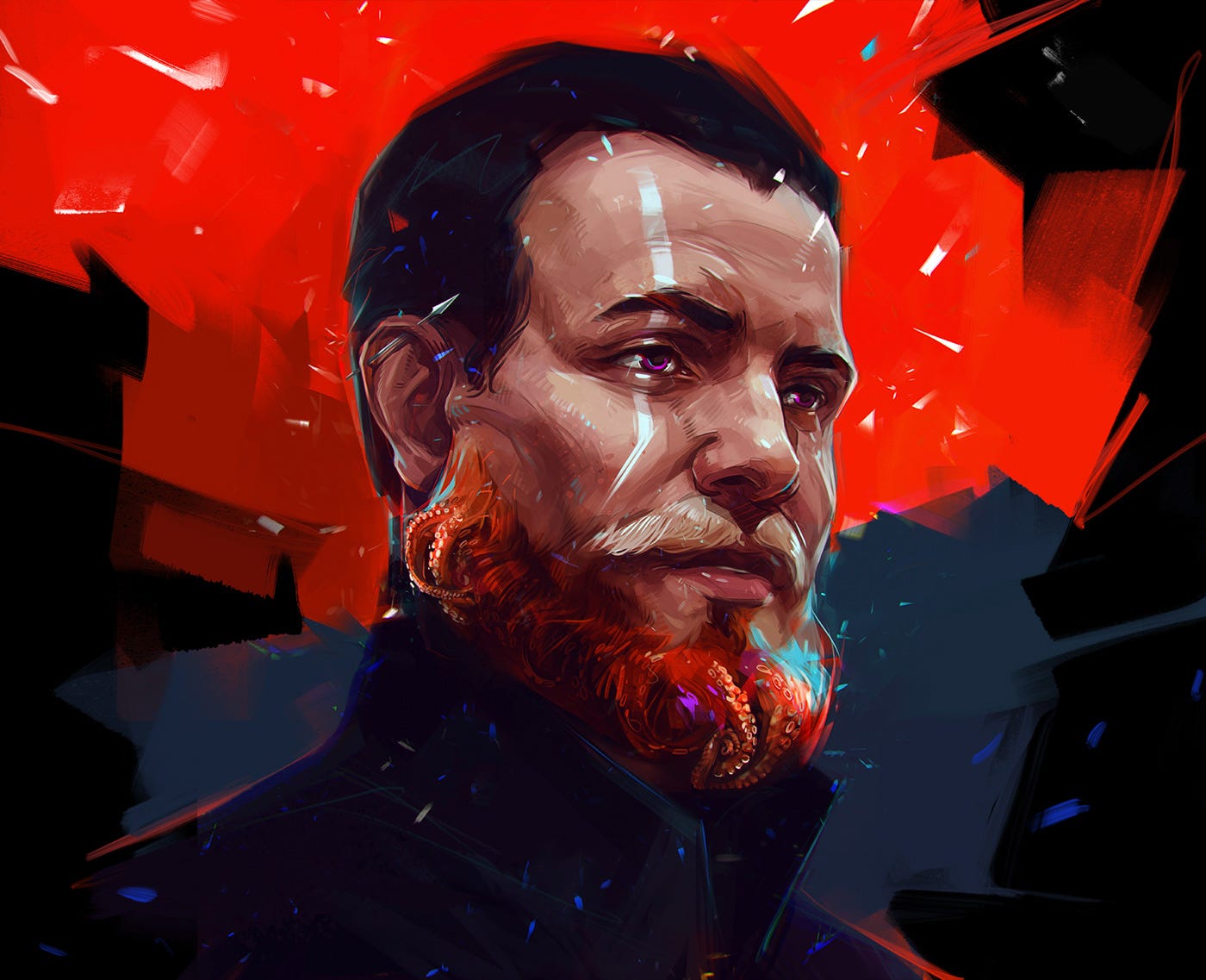
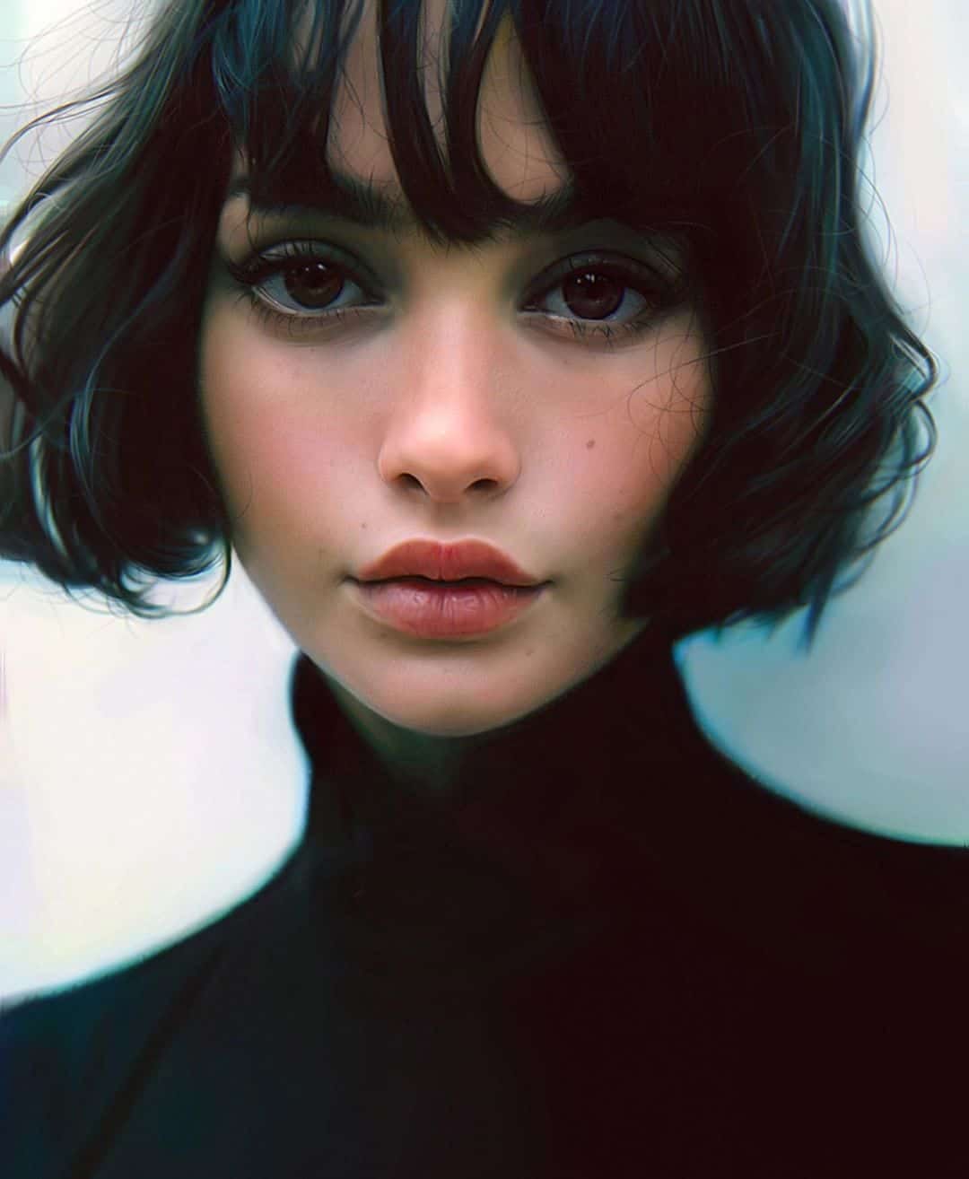
由伊拉克里·纳达尔 ( Irakli Nadar) (by Irakli Nadar)
Irakli crosses more than just lines — he crosses the uncanny valley when it comes to reproducing the human form. He uses imperfections to make his images believable, and believe them we do.
伊拉克利(Irakli)跨越的不仅仅是线条-在复制人类形态时,他跨越了神秘的山谷。 他利用瑕疵来使自己的形象可信,并相信我们会做到。
Closer inspection of the first image and you’ll notice his process in the minor details of the hairline or sweater neck, an almost watercolor feeling in how he paints digitally. Though, you’ll find it difficult to uncover traces of his process in most of his other pieces as they resemble the simple snap of a shutter.
仔细检查第一个图像,您会注意到他在发际线或毛衣脖子的次要细节中的处理方式,这几乎是他在数字化绘画方式中的水彩感觉。 但是,您会发现很难在他的其他大部分作品中发现他的创作过程的痕迹,因为它们类似于百叶窗的简单捕捉。
I can’t fathom how he is so perfectly able to convey emotion, but also recreate an infinite range of textures and lighting. His talent is truly remarkable.
我无法理解他如何如此完美地传达情感,而且还能重现无限范围的纹理和灯光。 他的才华确实非凡。

I hope these images inspire you to take a step beyond what has been, and look at what could be when it comes to representing your brand and products.
我希望这些图像能激发您迈出更大的一步,并探讨代表品牌和产品的可能。
It’s the details that make a company feel more like a friend than a soulless corporate entity, and illustration is one way we can take a step in the right direction as part of a holistic customer-facing strategy.
细节使公司更像朋友而不是毫无生气的公司实体,而插图是我们朝着正确的方向迈出的一种方法,这是整体面向客户战略的一部分。
Be sure to follow these talented artists and their creative journey. If you have any additional styles or artists that you think deserve to be here, please add them in the comments.
请务必关注这些才华横溢的艺术家及其创作旅程。 如果您认为还有其他样式或艺术家应该在此处,请在评论中添加它们。
翻译自: https://uxdesign.cc/10-inspiring-illustration-styles-from-the-best-illustrators-of-2020-89b42f08ba81
插画惯用风格
