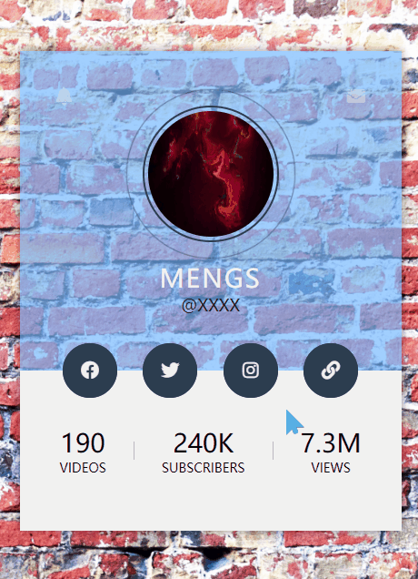
个性个人资料卡
教程地址:原文地址(YouTube)
B站教程:原文转载(bilibili)
两个视频的内容相同,第二个为转载
效果图
代码区
以下代码为本人填写,转载请注明教程地址和本贴地址
html
<!DOCTYPE html>
<html lang="en">
<head><meta charset="UTF-8"><meta name="viewport" content="width=device-width, initial-scale=1.0"><meta http-equiv="X-UA-Compatible" content="ie=edge"><title>Document</title><link rel="stylesheet" href="css/style.css"><!-- <script src="js/all.js"></script> --><link rel="stylesheet" href="https://cdnjs.cloudflare.com/ajax/libs/font-awesome/5.11.2/css/all.css"/>
</head>
<body><div class="profile-card"><div class="top-section"> <!--头部--><i class="message fas fa-envelope"></i> <!--左图标--><i class="notif fas fa-bell"></i>  <!--右图标--><div class="pic"> <!--头像--><img src="img/pic.jpg"  alt="Error"></div><div class="name">MengS</div><div class="tag">@XXXX</div></div><div class="bottom-section"> <!--下部--><div class="social-media"> <!--4个标签--><a href="#"><i class="fab fa-facebook"></i></a><a href="#"><i class="fab fa-twitter"></i></a><a href="#"><i class="fab fa-instagram"></i></a><a href="#"><i class="fas fa-link"></i></a></div><div class="videos">190 <span>Videos</span></div> <!--下部-个人介绍--><div class="border"></div>        <!--竖线--><div class="subscribers">240k <span>subscribers</span></div><div class="border"></div>  <div class="videws">7.3M <span>Views</span></div></div></div>
</body>
</html>
CSS
*{padding: 0; /*内边距*/margin: 0; /*外边距*/box-sizing: border-box; /*宽度定位*/text-decoration: none; /*字体样式*/
}
body{font-family: sans-serif; /*字体*/background: url('../img/bg.jpg'); /*背景图片*/background-size: cover; /*背景大小,此处为适应百分比*/display: flex; /*盒模型*/align-items: center; /*子元素对齐方式*/justify-content: center; /*主轴*/min-height: 100vh; /*最小高度*/
}
.profile-card{ /*主卡片*/position: relative; /*相对定位*/overflow: hidden; /*溢出隐藏*/text-align: center; /*文字居中*/box-shadow: 0 0 10px #00000070; /**/
}
.top-section{ /*上部*/padding:60px 40px;background: #74b9ffaa;
}
.message,.notif{ /*上部两个图标*/position: absolute; /*绝对定位*/top: 40px; /*距上部*/font-size: 20px;cursor: pointer; /*鼠标样式*/color: #ffffff50; /*颜色*/
}
.message{right: 40px;
}
.notif{left:40px;
}
.pic{position: relative;width: 150px;height: 150px;margin: auto auto 20px auto;padding: 4px;border: 2px solid #6a89cc; /*边框*/border-radius: 50%; /*圆角*/
}
.pic img{width: 100%;height: 100%;border-radius: 50%;
}
.pic::before{ /*之前添加*/content: ""; /*内容*/width: 100%;height: 100%;position:absolute; /*绝对定位*/border: 1px solid #3c6382;left: 0;top: 0;box-sizing: border-box;border-radius: 50%;animation: wava 1.5s infinite linear; /*动画 无限重复 */
}
@keyframes wava{to{transform: scale(1.5); /*放大*/opacity: 0; /*透明度*/}
}
.name{color:#f1f1f1; /*字体颜色*/font-size: 28px; /*字体大小*/letter-spacing: 2px; /*字符间距*/text-transform: uppercase; /*字体大写*/
}
.tag{font-size: 18px;color: #222;
}
.bottom-section{position: relative;display: flex;align-items: center;justify-content: center;background-color: #f1f1f1;padding: 60px 40px;font-size: 28px;text-transform: uppercase;
}
.border{ /*竖线*/width: 1px;height: 20px;background: #bbb;margin: 0 30px;
}
.bottom-section span{font-size: 14px;display: block;
}
.social-media{position: absolute;width: 100%;top: -30px;left: 0;z-index: 1; /*z轴定位*/
}
.social-media i{width: 60px;height: 60px;background: #2980b9;border-radius: 50%;color: #f1f1f1;font-size: 20px;line-height: 60px !important; /*行高*/margin: 0 10px;position: relative;
}
.social-media i::after{ /*之后添加*/content: "";width: 100%;height: 100%;position: absolute;border: 1px solid #e74c3c;left:0;top: 0;box-sizing: border-box;border-radius: 50%;z-index: -1;transform: scale(0.99);transition: 0.4s linear;
}
.social-media i:hover:after{ /*悬停时*/transform: scale(1.4); /*放大*/opacity: 0;
}
JS
教程地址:原文地址(YouTube)
B站教程:原文转载(bilibili)