Vue插槽(Slots)的完全指南
- 插槽的作用
- 插槽的基本使用
- 具名插槽
- 作用域插槽(难点)
插槽的作用
在开发中,我们会经常封装一个个可复用的组件:
- 前面我们会
通过props传递给组件一些数据,让组件来进行展示; - 但是为了让这个组件具备
更强的通用性,我们不能将组件中的内容限制为固定的div、span等等这些元素; - 比如某种情况下我们使用组件,希望组件显示的是
一个按钮,某种情况下我们使用组件希望显示的是一张图片; - 我们应该让使用者可以决定
某一块区域到底存放什么内容和元素;
假如我们定制一个通用的导航组件–NavBar:
- 这个组件分成三块区域:
左边-中间-右边,每块区域的内容是不固定; - 左边区域可能显示一个菜单图标,也可能显示一个返回按钮,可能什么都不显示;
- 中间区域可能显示一个搜索框,也可能是一个列表,也可能是一个标题,等等;
- 右边可能是一个文字,也可能是一个图标,也可能什么都不显示;
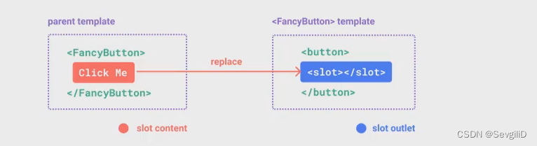
这个时候我们就可以来定义插槽slot:
- 插槽的使用过程其实是
抽取共性、预留不同; - 我们会将
共同的元素、内容依然在组件内进行封装; - 同时会
将不同的元素使用slot作为占位,让外部决定到底显示什么样的元素;
如何使用slot呢?
- Vue中将
<slot>元素作为承载分发内容的出口; - 在封装组件中,使用
特殊的元素<slot>就可以为封装组件开启一个插槽; - 该插槽
插入什么内容取决于父组件如何使用;
插槽的基本使用
基本插槽,也称为匿名插槽,是使用时不需要为插槽指定名称的插槽。使用基本插槽的方式非常简单,可以直接在组件内部使用<slot></slot>来定义一个匿名插槽:
<template><h2>{{ title }}</h2><div class="content"><slot>我是插槽默认内容</slot></div>
</template><script>
export default {props: {title: {type: String,default: "我是标题"}}
}
</script>
在上面的例子中,我们在子组件ShowMessage中定义了一个匿名插槽。当父组件使用时,插槽将会被替换为组件的内容。
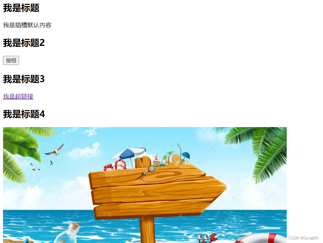
<template><div id="app"><show-message title="我是标题"></show-message><show-message title="我是标题2"><button>按钮</button></show-message><show-message title="我是标题3"><a href="#">我是超链接</a></show-message><show-message title="我是标题4"><img src="@/IMG/noteBorad.png" alt=""></show-message></div>
</template><script>
import ShowMessage from "./components/ShowMessage.vue";export default {components: {ShowMessage}
}
</script>
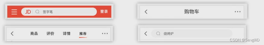
在这个例子中,使用子组件时按钮,超链接,图片将分别作为插槽的内容被嵌入到组件中,效果如下:
但如果同时有多个插槽,如左中右区域都留有插槽,我们该如何分别将内容插入到对应的插槽中呢,这时候就需要使用具名插槽。
具名插槽
释义:具名插槽是指为插槽赋予名称,以便使用者可以向指定的插槽中插入内容。
使用具名插槽的方式是给<slot>元素添加一个name属性,如下所示:
<template><div class="nav-bar"><!-- 同时预留多个插槽时,在每一个插槽行内使用name为其编写唯一值 --><div class="left"><slot name="left">leftcontent</slot></div><div class="center"><slot name="center">centercontent</slot></div><div class="right"><slot name="right">rightcontent</slot></div></div>
</template>
在上面的例子中,我们定义了一个NavBar组件并在其中定义了名为“left”,"center"和"right"的三个具名插槽。并分别给了默认内容leftcontent,centercontent,rightcontent
当在父组件使用时,可以使用<template>元素和v-slot指令来向插槽中插入内容,如下所示:
<template><div id="app"><!-- 多个插槽使用是,采用v-slot:name确认使用哪个插槽 --><nav-bar><template v-slot:left><button>左边按钮</button></template><!-- v-slot:name可以简写为#name -->    <template #center><a href="#">中间链接</a></template><template v-slot:right><i>右边i元素</i></template></nav-bar><hr><!-- 只使用一个插槽时:其他插槽会使用默认值 --><nav-bar><template v-slot:right><button>右边按钮</button></template></nav-bar></div>
</template>
运行效果如下:

作用域插槽(难点)
认识作用域插槽:
但是有时候我们希望插槽可以访问到子组件中的内容是非常重要的:
- 当一个组件被用来渲染一个
数组元素时,我们使用插槽,并且希望插槽中没有显示每项的内容; - 这个Vue给我们提供了
作用域插槽;
比如,在下面这个组间通信案例选项卡模拟案例中:
-
tabControl是独立的组件,在父组件中使用时传递参数来显示对于内容
-
点击哪个标题则展示对应内容
-
可以通过下方代码部分看到
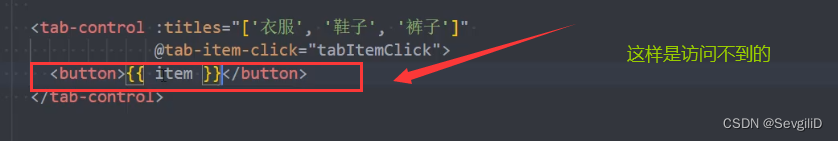
tabControl部分使用的时候里面的item始终都是被包裹在span元素里的, -
如果
想自己决定使用的时候包裹item的是什么元素呢,比如button,比如a标签
代码部分:
-tabControl.vue:
<template><div class="tabControl"><template v-for="(item, index) in titles" :key="item"><div class="tabControl-item" @click="itemClick(index)" :class="{ active: index === currentIndex }"><!-- 此处!!!!!!!!!!!!!!! --><span>{{ item }}</span></div></template></div>
</template><script>export default {props: {titles: {type: Array,default: () => []}},data() {return {currentIndex: 0}},emits: ["tabitemClick"],methods: {itemClick(index) {this.currentIndex = index;this.$emit("tabitemClick", index)}}}
</script>
App.vue:
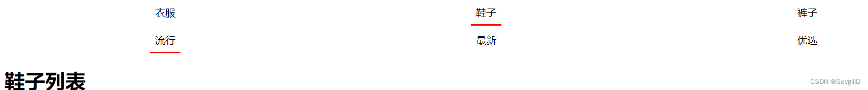
<template><div id="app"><!-- tab control --><TabControl :titles="['衣服', '鞋子', '裤子']" @tabitem-click="tabcardSwitch"></TabControl><TabControl :titles="['流行', '最新', '优选']"></TabControl><!-- 展示内容 --><h1>{{ pageContents[currentIndex] }}</h1></div>
</template><script>
import TabControl from './components/TabControl.vue';export default {components: {TabControl},data() {return {// 写二维数组时就是选项卡的切换了,现在是便于理解pageContents: ["衣服列表", "鞋子列表", "裤子列表"],currentIndex: 0}},methods: {tabcardSwitch(index) {console.log("app:", index);this.currentIndex = index}}}
</script>
我们可以通过预留插槽的方式来解决,但直接使用插槽的话, 会让我们数据固定, 不能动态展示;
那像下面这样使用呢 ?
由于vue中渲染作用域的存在,像上面这样的做法显然是不行的
而我们希望的仅是span改变,而里面的内容仍是item这样不固定的数据,所以这时候就需要用到作用域插槽
(1)子组件中在插槽中传递出要使用的数据:
<template><div class="tabControl"><!-- template写成了temolate,导致遍历出的item多了一个父级元素,难怪flex:1不生效 --><template v-for="(item, index) in titles" :key="item"><div class="tabControl-item" @click="itemClick(index)" :class="{ active: index === currentIndex }"><!-- 需求:可以由父组件决定是span或者说按钮等内容:未填充时是默认值span --><!-- 在插槽上写: 用:绑定一个属性传递出去 :item=“要传递的属性” --><slot :item="item"><span>{{ item }}</span></slot></div></template></div>
</template>
(2)父组件使用v-slot:插槽名=接收数据变量名来进行接收, 此时可以将span元素换成其他元素进行替换
<template><div class="app"><TabControl :titles="['无敌', 'NB', '666']"><!-- 1.<slot>为单独设置name属性值时,默认名字为default;2.这里的props非固定(可以用其他命名)--><template #default="props"><button>{{ props.item }}</button></template></TabControl></div>
</template>