Vue-CLI + Vue3 + Vue-Router4 实现tabbar小案例
tabbar导航栏案例:该案例实现了基础的组件封装,编程式路由,以及插槽的使用,对于我们日常组件化开发有着很大的启示作用,主要效果是点击下方的导航栏链接,上方内容区显示对应的组件内容,就如果我们常用的手机App一样。
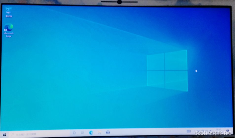
效果图:

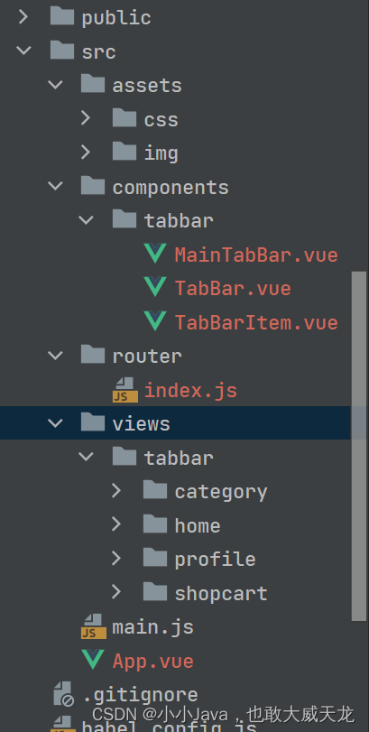
项目结构图:
svg图片资源下载:点击下载图片资源
1、 使用Vue-CLI新建tabbar工程,删除不必要的vue组件,并且取消代码检查:lintOnSave:false
2、 在assets文件夹下建立css和img文件夹,存放静态资源,将图片复制到img文件夹中的tabbar子文件夹中
3、 在css文件夹中建立base.css文件:
body{padding: 0;margin: 0;
}
/*然后在App.vue组件的style中引入css/base文件:@import "assets/css/base.css",此处不建议在main.js中引入*/
4、 修改App.vue的内容:
<template><div id="app"><div id="tab-bar"><div class="tab-bar-item">首页</div><div class="tab-bar-item">分类</div><div class="tab-bar-item">购物车</div><div class="tab-bar-item">我的</div></div></div>
</template><script>export default {name:'App',}
</script><style>
@import "assets/css/base.css";
#tab-bar{display: flex; /* 弹性盒子布局 */background-color: #f1f1f1;position: fixed;left: 0;right: 0;bottom: 0;height: 50px;box-shadow: 0 -2px 2px rgba(100,100,100,0.2);
}
.tab-bar-item{flex: 1; /* 对多项内容等分排列 */text-align: center;height: 49px;font-size: 14px;
}
</style>
5、 将导航栏封装成TabBar和TarBarItem两个组件,步骤如下:
//1. 把id为tab-bar的层及相应的css代码等封装在一起,作为一个组件
//2. 在components文件夹中建立一个名为tabbar的子文件夹,单独存放tabbar组件相关的组件,不要把所有的组件都直接放在components文件夹下,便于管理。[项目越大,组件越多]
//3. 在tabbar文件夹中建立名为TabBar.vue文件,把App.vue文件中的内容复制到TabBar.vue中
//4. 在TabBar.vue中,有四项内容,由于每一项在后期显示时有图片和文字,所以把TabBar.vue中的每一项封装成一个组件:TabBarItem.vue,考虑到TabBar.vue中使用的TabBarItem子组件数量是不固定的,所以要用到插槽。
//代码如下:
TabBar.vue内容:
<template><div id="tab-bar"><!-- 使用插槽,让App.vue根据需要,插入内容 --><slot></slot></div>
</template><script>
export default {name: "TabBar"
}
</script><style scoped>
#tab-bar{display: flex; /* 弹性盒子布局 */background-color: #f1f1f1;position: fixed;left: 0;right: 0;bottom: 0;height: 50px;box-shadow: 0 -2px 2px rgba(100,100,100,0.2);
}
</style>
TabBarItem.vue内容:
<template><div class="tab-bar-item"><img src="../../assets/img/tabbar/home.svg" alt="" /><div>首页</div></div>
</template><script>
export default {name: "TabBarItem"
}
</script><style scoped>
.tab-bar-item {flex: 1; /* 对多项内容等分排列 */text-align: center;height: 49px;font-size: 14px;
}.tab-bar-item img{width: 24px;height: 24px;margin-top: 3px;margin-bottom: 2px;vertical-align: middle;
}
</style>
App.vue内容:
<template><div id="app"><tab-bar><!-- 根据需要在插槽位置插入4个子组件TabBarItem[数量可变] --><tab-bar-item></tab-bar-item><tab-bar-item></tab-bar-item><tab-bar-item></tab-bar-item><tab-bar-item></tab-bar-item></tab-bar></div>
</template><script>//导入TabBar组件import TabBar from "./components/tabbar/TabBar";//导入TabBarItem组件import TabBarItem from "./components/tabbar/TabBarItem";export default {name:'App',components:{TabBarItem,TabBar}}
</script><style>
@import "assets/css/base.css";
</style>
6、 测试运行…界面会出现四个子组件,但内容都一样,而我们要实现的是显示不同内容的4个组件,所以就可以在TabBarItem中也使用插槽(上方显示图片,下方显示文字):
<template><div class="tab-bar-item"><!--  如果使用多个插槽,要使用具名插槽  --><slot name="item-icon"></slot><slot name="item-text"></slot></div>
</template>
7、 修改App.vue,将TabBarItem中的插槽填满,把其中对于img的样式放到App.vue中:
<template><div id="app"><tab-bar><!-- 根据需要在插槽位置插入4个子组件TabBarItem[数量可变] --><tab-bar-item><template #item-icon><img src="./assets/img/tabbar/home.svg" alt=""></template><template #item-text><div>首页</div></template></tab-bar-item><tab-bar-item><template #item-icon><img src="./assets/img/tabbar/category.svg" alt=""></template><template #item-text><div>分类</div></template></tab-bar-item><tab-bar-item><template #item-icon><img src="./assets/img/tabbar/shopcart.svg" alt=""></template><template #item-text><div>购物车</div></template></tab-bar-item><tab-bar-item><template #item-icon><img src="./assets/img/tabbar/profile.svg" alt=""></template><template #item-text><div>我的</div></template></tab-bar-item></tab-bar></div>
</template>
<style>
@import "assets/css/base.css";
.tab-bar-item img {width: 24px;height: 24px;margin-top: 3px;margin-bottom: 2px;vertical-align: middle;
}
</style>
接下来实现点击TabBarItem时,显示红色图片且红色文字。先给TabBarItem组件增加一个插槽,专门显示活跃图片,原来那个显示图片的插槽显示非活跃的;当组件被点击时,判断它是否为活跃状态,是就显示红色图片,否则显示黑色图片,文字也是如此…
8、 在TabBar组件的template中增加一个插槽,用来显示活跃图片:
<template><div class="tab-bar-item"><!--  如果使用多个插槽,要使用具名插槽  --><slot name="item-icon"></slot><slot name="item-icon-active"></slot><slot name="item-text"></slot></div>
</template>
9、 对App.vue进行修改,给每个tab-bar-item中插入一张活跃图片,然后运行测试,发现有两个svg图片,也就是说三个插槽都显示出来了:
<tab-bar-item><template #item-icon><img src="./assets/img/tabbar/home.svg" alt=""></template><template #item-icon-active><img src="./assets/img/tabbar/home_active.svg" alt=""></template><template #item-text><div>首页</div></template>
</tab-bar-item>
10、 对TabBarItem组件进行修改,实现两个图片插槽只显示一个,使用v-if与v-else实现:
<template><div class="tab-bar-item"><!--  如果使用多个插槽,要使用具名插槽  --><div v-if="!isActive"><slot name="item-icon"></slot></div><div v-else><slot name="item-icon-active"></slot></div><div :style="activeStyle"><slot name="item-text"></slot></div></div>
</template><script>
export default {name: "TabBarItem",data(){return{isActive:false}},computed:{activeStyle(){return this.isActive ? {color:'#ff5777'}:{}}}
}
</script><style scoped>
.tab-bar-item {flex: 1; /* 对多项内容等分排列 */text-align: center;height: 49px;font-size: 14px;
}
</style>
接下来实现路由:点击tabbar导航栏中某一项,就显示相应的组件。
在view文件夹中存放页面级别的组件,比如说路由跳转的组件,在component文件夹中存放可复用的组件。
11、 在views文件夹中创建四个子文件夹(home/category/shopcart/profile),在子文件夹中分别建立相对应的vue文件(HomeView/CategoryView/ShopCartView/ProfileView),文件中显示一些简单文字用以区分即可:
<template><div><h2>这是首页组件</h2></div>
</template>
12、 在index.js配置文件中添加路由配置信息:
{path: '/',redirect: '/home'
},
{path: '/home',name: 'home',component: () => import('../views/tabbar/home/HomeView')
},
{path: '/category',name: 'category',component: () => import('../views/tabbar/category/CategoryView')
},
{path: '/shopcart',name: 'shopcart',component: () => import('../views/tabbar/shopcart/ShopCartView')
},
{path: '/profile',name: 'profile',component: () => import('../views/tabbar/profile/ProfileView')
},
13、 在TabBarItem中添加点击事件与路由结合起来,用来显示正确的组件:
<script>
export default {name: "TabBarItem",props:{path:String,activeColor:String},data(){return{isActive:false}},computed:{activeStyle(){return this.isActive ? {color:this.activeColor}:{}}},methods:{itemClick(){this.$router.replace(this.path)}}
}
</script>
14、 对App.vue进行修改,在tab-bar-item上增加path参数(分别为:/home,/category,/shopcart,/profile),和activeColor参数(值为活跃时的颜色),然后在根模板下添加router-view输出组件,运行测试,此时就可以切换组件视图了:
<tab-bar-item path="/home" active-color="#ff5577">
15、 在TabBarItem中修正显示的颜色,当前点击项显示红色,其它项为默认颜色(黑色),在computed中增加isActive属性(实现活跃验证),将data()中的isActive删掉,然后运行测试:
isActive(){// === -1:表示当前路由中的路径不包含父组件传递过来的路径return this.$route.path.indexOf(this.path) !== -1
}
16、 继续提取出一个组件(MainTabBar.vue),放在components文件夹下的tabbar文件夹中,把App.vue文件内容复制到MainTabBar中,以便提取修改:
MainTabBar:
<template><div id="app"><tab-bar><!-- 根据需要在插槽位置插入4个子组件TabBarItem[数量可变] --><tab-bar-item path="/home" active-color="#ff5577"><template #item-icon><img src="../../assets/img/tabbar/home.svg" alt=""></template><template #item-icon-active><img src="../../assets/img/tabbar/home_active.svg" alt=""></template><template #item-text><div>首页</div></template></tab-bar-item><tab-bar-item path="/category" active-color="#ff5577"><template #item-icon><img src="../../assets/img/tabbar/category.svg" alt=""></template><template #item-icon-active><img src="../../assets/img/tabbar/category_active.svg" alt=""></template><template #item-text><div>分类</div></template></tab-bar-item><tab-bar-item path="/shopcart" active-color="#ff5577"><template #item-icon><img src="../../assets/img/tabbar/shopcart.svg" alt=""></template><template #item-icon-active><img src="../../assets/img/tabbar/shopcart_active.svg" alt=""></template><template #item-text><div>购物车</div></template></tab-bar-item><tab-bar-item path="/profile" active-color="#ff5577"><template #item-icon><img src="../../assets/img/tabbar/profile.svg" alt=""></template><template #item-icon-active><img src="../../assets/img/tabbar/profile_active.svg" alt=""></template><template #item-text><div>我的</div></template></tab-bar-item></tab-bar></div>
</template><script>
//导入TabBar组件
import TabBar from "./TabBar";
//导入TabBarItem组件
import TabBarItem from "./TabBarItem";
export default {name:'MainTabBar',components:{TabBarItem,TabBar}
}
</script><style>
.tab-bar-item img {width: 24px;height: 24px;margin-top: 3px;margin-bottom: 2px;vertical-align: middle;
}
</style>
App.vue:
<template><div id="app"><router-view/><main-tab-bar></main-tab-bar></div>
</template><script>
//导入MainTabBar组件
import MainTabBar from "@/components/tabbar/MainTabBar";
export default {name:'App',components:{MainTabBar}
}
</script><style>
@import "assets/css/base.css";
</style>