要使用 React 绘制一个结合线状图和柱状图的图表,你可以使用 react-chartjs-2 库,它是基于 Chart.js 的 React 封装。以下是一个示例代码,展示如何实现这个需求:
1. 安装依赖
首先,你需要安装 react-chartjs-2 和 chart.js:
npm install react-chartjs-2 chart.js
2. 创建图表组件
接下来,创建一个 React 组件来绘制图表:
import React from 'react';
import { Chart as ChartJS, CategoryScale, LinearScale, BarElement, LineElement, PointElement, Title, Tooltip, Legend } from 'chart.js';
import { Bar, Line } from 'react-chartjs-2';ChartJS.register(CategoryScale,LinearScale,BarElement,LineElement,PointElement,Title,Tooltip,Legend
);const CombinedChart = () => {const data = {labels: ['1月', '2月', '3月', '4月', '5月', '6月', '7月', '8月', '9月', '10月', '11月', '12月'],datasets: [{type: 'bar',label: '销售目标量',data: [120, 150, 180, 200, 220, 250, 280, 300, 320, 350, 380, 400],backgroundColor: 'rgba(54, 162, 235, 0.6)',borderColor: 'rgba(54, 162, 235, 1)',borderWidth: 1,yAxisID: 'y1',borderRadius: 4, // 为柱状图添加圆角},{type: 'bar',label: '销售完成量',data: [100, 140, 170, 190, 210, 240, 270, 290, 310, 340, 370, 390],backgroundColor: 'rgba(75, 192, 192, 0.6)',borderColor: 'rgba(75, 192, 192, 1)',borderWidth: 1,yAxisID: 'y1',borderRadius: 4, // 为柱状图添加圆角},{type: 'line',label: '完成率',data: [83, 93, 94, 95, 95, 96, 96, 97, 97, 97, 97, 97.5],borderColor: 'rgba(255, 99, 132, 1)',backgroundColor: 'rgba(255, 99, 132, 0.2)',yAxisID: 'y2',tension: 0.4, // 调整曲线的光滑度pointStyle: 'circle', // 设置数据点的样式pointRadius: 6, // 设置数据点的半径pointHoverRadius: 8, // 设置鼠标悬停时数据点的半径},],};const options = {responsive: true,plugins: {legend: {position: 'top',display: true,labels: {color: '#333', // 设置图例文字颜色},},tooltip: {mode: 'index',intersect: false,backgroundColor: '#fff', // 设置提示框的背景颜色titleColor: '#000', // 设置提示框标题颜色bodyColor: '#000', // 设置提示框主体内容颜色borderColor: '#ccc', // 设置提示框边框颜色borderWidth: 1, // 设置提示框边框宽度caretSize: 5, // 设置提示框箭头大小caretPadding: 10, // 设置提示框箭头与内容的间距},},scales: {x: {ticks: {color: '#555', // 设置X轴刻度文字颜色},grid: {color: '#e5e5e5', // 设置X轴网格颜色},},y1: {type: 'linear',display: true,position: 'left',title: {display: true,text: '销售数量',color: '#333', // 设置Y轴标题颜色},ticks: {color: '#555', // 设置Y轴刻度文字颜色},grid: {color: '#e5e5e5', // 设置Y轴网格颜色},},y2: {type: 'linear',display: true,position: 'right',title: {display: true,text: '完成率 (%)',color: '#333', // 设置Y轴标题颜色},ticks: {color: '#555', // 设置Y轴刻度文字颜色},grid: {drawOnChartArea: false,color: '#e5e5e5', // 设置Y轴网格颜色},},},};return (<div style={{ position: 'relative', height: '300px' }}><Bar data={data} options={options} /></div>);
};export default CombinedChart;
3. 使用组件
在你的应用中,你可以像这样使用 CombinedChart 组件:
import React from 'react';
import ReactDOM from 'react-dom';
import CombinedChart from './CombinedChart';function App() {return (<div className="App"><h1>销售数据图表</h1><CombinedChart /></div>);
}ReactDOM.render(<App />, document.getElementById('root'));
4. 运行应用
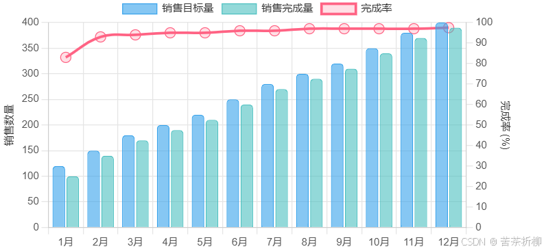
确保你的开发服务器正在运行,然后你应该能够看到一个结合了柱状图和线状图的图表,左边是销售数量,右边是完成率,下面是月份。
解释
data.labels: X 轴的标签,表示月份。datasets: 包含三个数据集,两个柱状图数据集(销售目标量和销售完成量)和一个线状图数据集(完成率)。yAxisID: 用于指定数据集使用哪个 Y 轴。y1是左边的销售数量轴,y2是右边的完成率轴。options.scales: 配置了两个 Y 轴,分别用于销售数量和完成率。
效果图