Vue简单使用Echart图表柱形图 vue使用柱形图 vue使用 echart图表柱形图 vue使用柱形图
- 1、安装依赖
- 2、页面Demo使用
- 3、效果图
1、安装依赖
官方文档:https://echarts.apache.org/zh/option.html#title
官方在线示例:https://echarts.apache.org/examples/zh/index.html
npm i echarts
2、页面Demo使用
<template><div class="main-div"><!-- 图表渲染的DIV --><div id="normal" /></div>
</template><script>
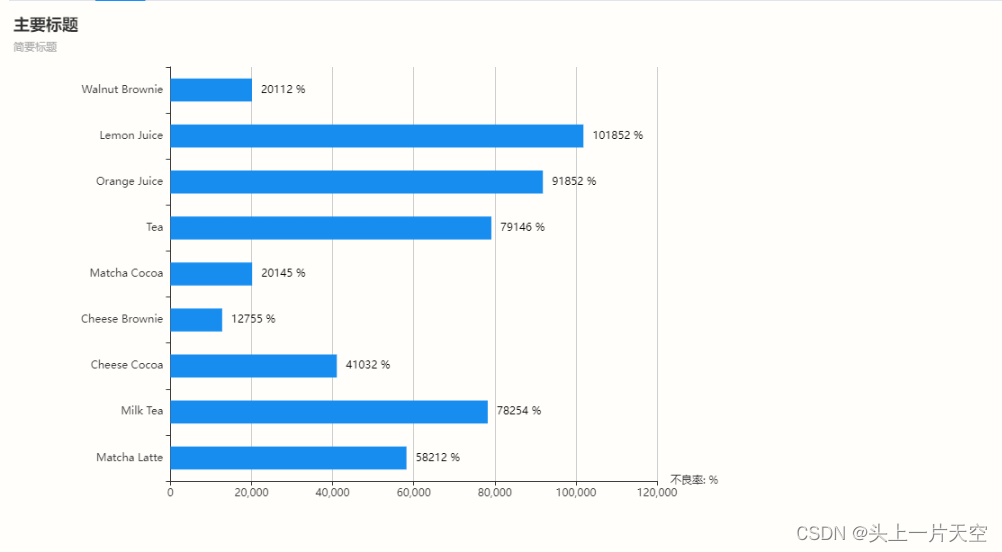
import echarts from 'echarts'export default {// 组件名称name: 'Index',// import引入的组件需要注入到对象中才能使用components: {},// 父组件传递值props: {},data() {// 这里存放数据return {normal: null}},// 监听属性 类似于data概念computed: {},// 监控data中的数据变化watch: {},// 生命周期 - 创建完成(可以访问当前this实例)created() {},// 生命周期 - 挂载完成(可以访问DOM元素)mounted() {// 初始化一个 柱形图 Demo传参示例 - 不建议在 Vue生命周期加载中初始化图表,性能影响很大,建议懒加载,手动点击然后初始化const data = [['value', 'title'],[58212, 'Matcha Latte'],[78254, 'Milk Tea'],[41032, 'Cheese Cocoa'],[12755, 'Cheese Brownie'],[20145, 'Matcha Cocoa'],[79146, 'Tea'],[91852, 'Orange Juice'],[101852, 'Lemon Juice'],[20112, 'Walnut Brownie']]this.initChart('主要标题', '简要标题', data, document.getElementById('normal'))},beforeCreate() { }, // 生命周期 - 创建之前beforeMount() { }, // 生命周期 - 挂载之前beforeUpdate() { }, // 生命周期 - 更新之前updated() { }, // 生命周期 - 更新之后beforeDestroy() { }, // 生命周期 - 销毁之前destroyed() { }, // 生命周期 - 销毁完成activated() { },// 方法集合methods: {/*** 初始化图表* @param title 图表主要标题* @param subtext 图表简介标题* @param data 数据列表 - 格式为 二维数组* @param chartDom 要渲染图表 的DOM元素: document.getElementById('')* 示例:value 表示X轴的数据, title表示 Y轴的标题* ['value', 'title'],[58212, 'Matcha Latte'],[78254, 'Milk Tea'],[41032, 'Cheese Cocoa'],[12755, 'Cheese Brownie'],[20145, 'Matcha Cocoa'],[79146, 'Tea'],[91852, 'Orange Juice'],[101852, 'Lemon Juice'],[20112, 'Walnut Brownie']*/initChart(title, subtext, data, chartDom) {// 计算图表容器高度,自动根据数据大小改变而改变let containerWidth = 200if (data.length <= 1) {containerWidth = 200} else {containerWidth = data.length * 40 // 假设每个柱形的宽度/高度为 20}// 销毁 已经初始化的元素try {// 如果需要同时处理多个echart实例,需要增加额外处理逻辑if (this.normal !== null) {this.echart.dispose()}} catch (error) {console.info('如果是第一次初始化,全局实例是null,销毁会异常')}this.normal = echarts.init(chartDom, { devicePixelRatio: 1 }, {renderer: 'svg ', // 使用 svg 渲染可能比使用 canvas 渲染更高效,svg渲染比canvas生成的图表清晰width: 800,height: containerWidth})const option = {animation: false, // 禁用动画效果title: {text: title,subtext: subtext},dataset: {source: data},grid: { containLabel: true },xAxis: { name: '不良率: %' },yAxis: { type: 'category' },series: [{type: 'bar',barWidth: '50%',barCategoryGap: 10, // 原理是减小柱状图的宽度encode: {// Map the "value" column to X axis.x: 'value',// Map the "amount" column to Y axis.y: 'title'},label: {show: true, // 设置为 true 显示标签position: 'top', // 设置标签位置,可以是 'top', 'insideTop', 'insideBottom' 等color: 'black', // 设置标签颜色distance: 0, // 距离图形元素的距离。formatter: function(params) {// 格式化 数值内容return params.data[0] + ' %'},padding: [4, 5],lineHeight: 26,// eslint-disable-next-line no-dupe-keysposition: 'right',// eslint-disable-next-line no-dupe-keysdistance: 5,fontSize: 12},showBackground: true,itemStyle: {color: new echarts.graphic.LinearGradient(0, 0, 0, 1, [{ offset: 0, color: '#188df0' },{ offset: 0.5, color: '#188df0' },{ offset: 1, color: '#188df0' }])}}]}option && this.normal.setOption(option)}}
}
</script>
3、效果图