VUE学习大屏自适应的几种方法
1.自适屏幕,始终保持
16:9的比例<!-- 大屏固定比例16:9自适应 --> <template><div class="container"><div class="content" :style="getAspectRatioStyle"><!-- 数据展示内容 --></div></div></template><script setup lang="ts">import { ref, onMounted, onBeforeUnmount, computed } from 'vue';const contentWidth = ref(0);const contentHeight = ref(0);const calculateAspectRatio = () => {const container = document.querySelector('.container');// const containerWidth = container.offsetWidth;const containerWidth: number = (<HTMLElement>container).offsetWidth;// const containerHeight = container.offsetHeight;const containerHeight: number = (<HTMLElement>container).offsetHeight;const aspectRatio = 16 / 9; // 16:9 比例const containerAspectRatio = containerWidth / containerHeight;if (containerAspectRatio > aspectRatio) {// 以高度为基准,按比例计算宽度contentHeight.value = containerHeight;contentWidth.value = Math.floor(containerHeight * aspectRatio);} else {// 以宽度为基准,按比例计算高度contentWidth.value = containerWidth;contentHeight.value = Math.floor(containerWidth / aspectRatio);}console.log('contentWidth',contentWidth.value)console.log('contentHeight',contentHeight.value)};onMounted(() => {calculateAspectRatio();window.addEventListener('resize', calculateAspectRatio);});onBeforeUnmount(() => {window.removeEventListener('resize', calculateAspectRatio);});const getAspectRatioStyle = computed(() => ({width: `${contentWidth.value}px`,height: `${contentHeight.value}px`,margin: 'auto',background: 'gray'}));</script><style>.container {width: 100%;height: 100%;display: flex;align-items: center;justify-content: center;}.content {/* 根据计算得到的宽高样式设置 */}</style>2.使用CSS scale属性对大屏幕做自适应处理
<template>
<div class="login-container"><div class="login-main" ref="dataScreenRef"></div>
</div></template>
<script setup>
const dataScreenRef = ref(null);
const width = 1920;
const height = 1080;// 根据浏览器大小推断缩放比例
// 首先要确定设计稿尺寸,默认是 1920 x 1080
// 分别计算浏览器和设计图宽高比
// 如果浏览器的宽高比大于设计稿的宽高比,就取浏览器高度和设计稿高度之比
// 如果浏览器的宽高比小于设计稿的宽高比,就取浏览器宽度和设计稿宽度之比
const getScale = (w = width, h = height) => {let ww = window.innerWidth / w;let wh = window.innerHeight / h;return ww < wh ? ww : wh;
};
/* 浏览器监听 resize 事件 */
const resize = () => {if (dataScreenRef.value) {dataScreenRef.value.style.transform = `scale(${getScale()}) translate(-50%, -50%)`;}
};onMounted(() => {// 初始化时为外层盒子加上缩放属性,防止刷新界面时就已经缩放if (dataScreenRef.value) {dataScreenRef.value.style.transform = `scale(${getScale()}) translate(-50%, -50%)`;dataScreenRef.value.style.width = `${width}px`;dataScreenRef.value.style.height = `${height}px`;}window.addEventListener("resize", resize);
});</script>
<style scoped lang="scss">
.login-container {width: 100%;height: 100%;transform-origin: 0 0;position: relative;
}
.login-main {width: 100%;height: 100%;position: absolute;
}</style>
3.使用rem
(1)
npm下载插件,自动将px单位转换成rem单位npm install postcss-px2rem --save(2)在根目录src中新建util目录下新建rem.js等比适配文件
// rem等比适配配置文件
// 基准大小
const baseSize = 14
// 设置 rem 函数
function setRem () {// 当前页面宽度相对于 1920宽的缩放比例,可根据自己需要修改。const scale = document.documentElement.clientWidth / 1920// 设置页面根节点字体大小(“Math.min(scale, 2)” 指最高放大比例为2,可根据实际业务需求调整)document.documentElement.style.fontSize = baseSize * Math.min(scale, 2) + 'px'
}
// 初始化
setRem()
// 改变窗口大小时重新设置 `rem`
window.onresize = function () {setRem()
}
(3)在
main.js中引入适配文件import './util/rem'(4)到
vue.config.js中配置插件// 引入等比适配插件 const px2rem = require('postcss-px2rem')// 配置基本大小 const postcss = px2rem({// 基准大小 baseSize,需要和rem.js中相同// remUnit: 14 代表 1rem = 14px; 所以当你一个14px值时,它会自动转成 (14px/14)remremUnit: 14 })// 使用等比适配插件 module.exports = {lintOnSave: true,css: {loaderOptions: {less: {javascriptEnabled: true,},postcss: {plugins: [postcss,],},},}, }
VUE如何使得大屏自适应的几种方法?
news/2025/2/12 20:07:32/
相关文章
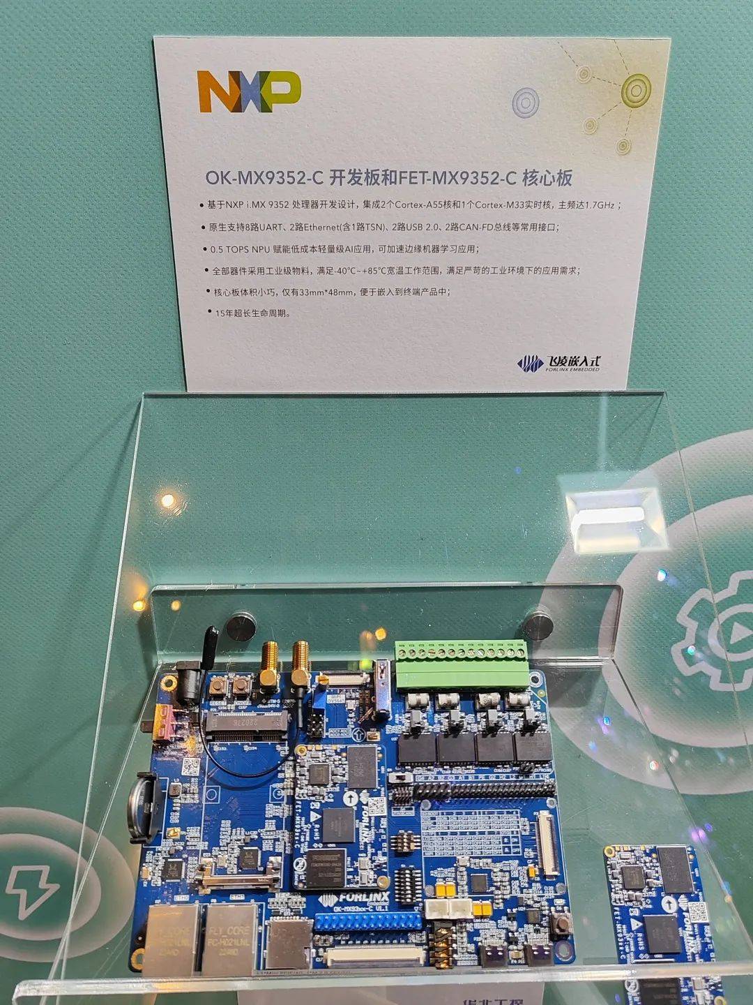
飞凌嵌入式受邀参加「NXP创新技术论坛」
2023年10月10日,「NXP创新技术论坛」在深圳湾万丽酒店举行,飞凌嵌入式作为NXP金牌合作伙伴受邀参加此次论坛,与众多智能工业行业的伙伴深入交流市场趋势与行业洞察,共同促进未来市场的发展。 本次论坛,飞凌嵌入式展示了…
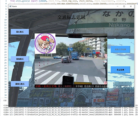
竞赛 深度学习 opencv python 实现中国交通标志识别
文章目录 0 前言1 yolov5实现中国交通标志检测2.算法原理2.1 算法简介2.2网络架构2.3 关键代码 3 数据集处理3.1 VOC格式介绍3.2 将中国交通标志检测数据集CCTSDB数据转换成VOC数据格式3.3 手动标注数据集 4 模型训练5 实现效果5.1 视频效果 6 最后 0 前言
🔥 优质…
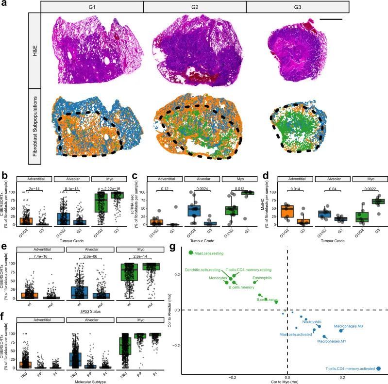
16+sci,多重免疫组织化学+CIBERSORTx 鉴定成纤维细胞亚群。
今天给同学们分享一篇单细胞多重免疫组织化学数字细胞学(CIBERSORTx)的生信文章“Single-cell analysis reveals prognostic fibroblast subpopulations linked to molecular and immunological subtypes of lung cancer”,这篇文章于2023年1…

零基础学python之数据类型
文章目录 1、数据类型1.1 编程规范注释标识符命名规则命名规则python命名规则关于代码规范编程习惯的重要性 输入输出与变量输出输入变量 1.2 数值类型int(整型)浮点型(float)类型转化 1.3 字符串字符串创建字符串格式化**format**%s**f** 案例ÿ…
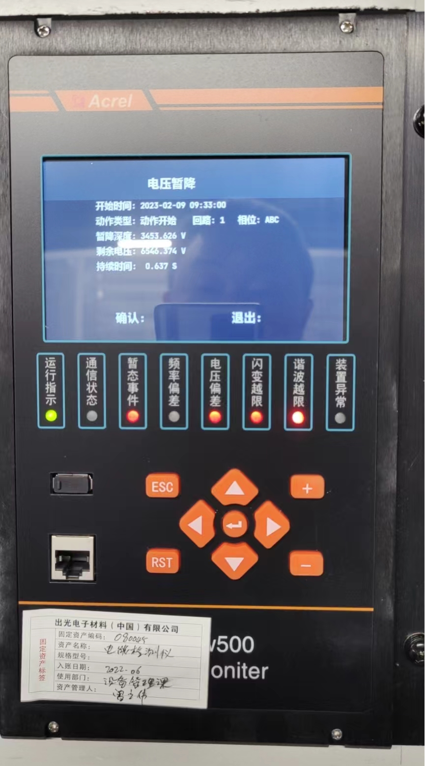
浅谈电能质量监测装置在某半导体公司的应用
摘 要:半导体生产制造业在国民经济中起着举足轻重的作用,相关企业的规模也越来越大。其供配电系统稳定、可靠的运维不仅是其安全生产的基本保证,还关系到产品质量和生产的顺利进行。而半导体行业中大部分工艺设备对电能质量比较敏感ÿ…
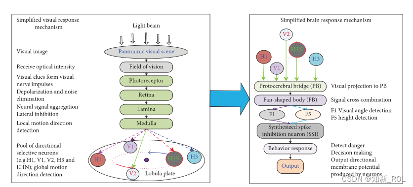
基于全景运动感知的飞行视觉脑关节神经网络全方位碰撞检测
https:/doi.org/10.1155/2023/5784720
摘要: 生物系统有大量的视觉运动检测神经元,其中一些神经元可以优先对特定的视觉区域做出反应。然而,关于如何使用它们来开发用于全向碰撞检测的神经网络模型,很少有人做过工作。为此&#…
【SMOKE-CMAQ实践技术】10天,从小白-精通一站式技能提升
大气污染物排放是空气污染的源头,气象因素是影响污染程度的重要因素,因此空气质量模式要求气象资料和污染物排放清单作为输入,其中由于大气污染源复杂性、数据滞后性、动态变化、规律性不明显等特点,使得大气污染源排放清单输入准…
上海亚商投顾:沪指冲高回落 医药、芯片股全天领涨
上海亚商投顾前言:无惧大盘涨跌,解密龙虎榜资金,跟踪一线游资和机构资金动向,识别短期热点和强势个股。 一.市场情绪
沪指昨日小幅反弹,创业板指盘中涨超1.6%,午后涨幅有所收窄。医药医疗股全线走强&#…