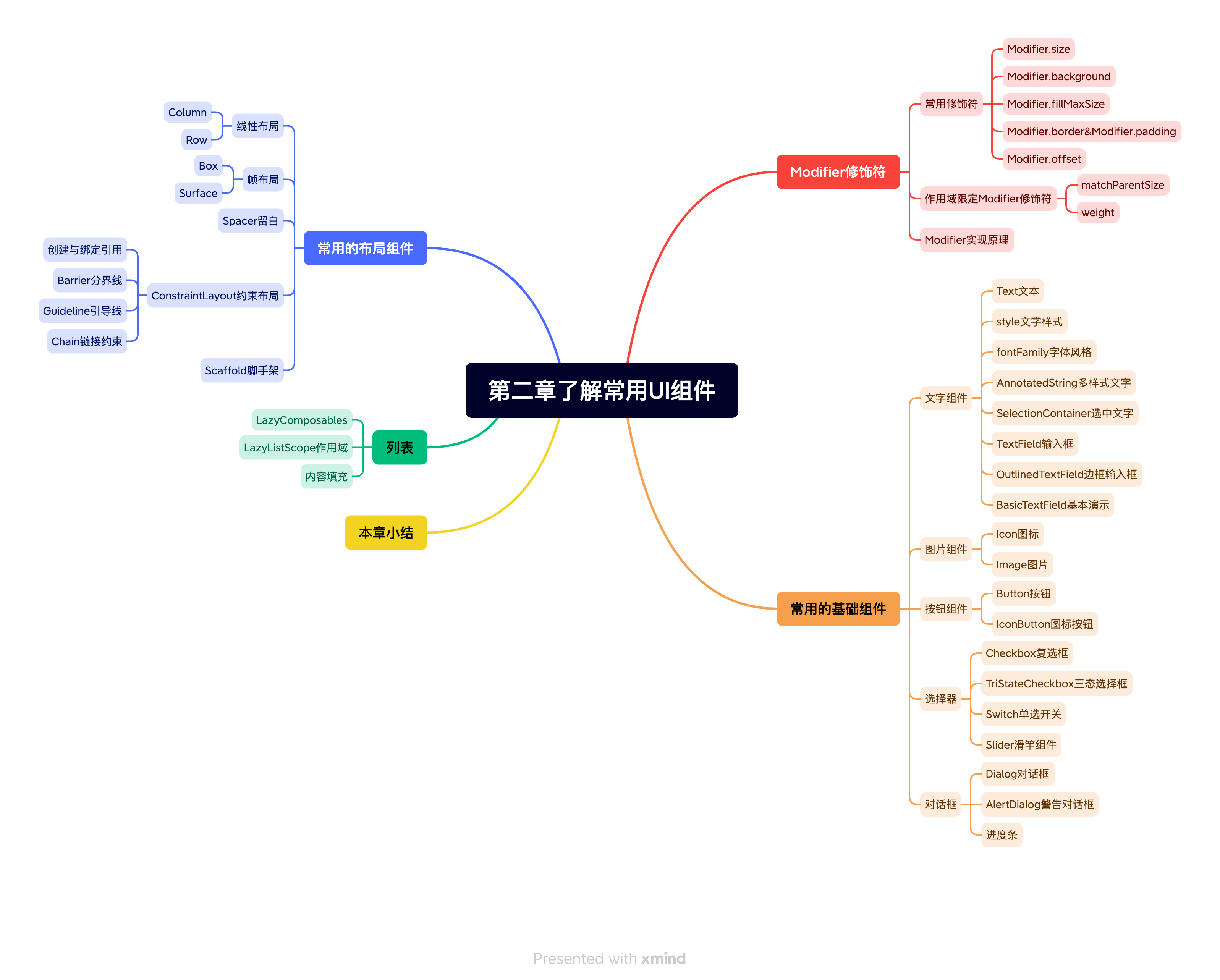
目录
- 常用的基础组件
- 文字组件
- 图片组件
- 按钮组件
- 选择器组件
- 对话框组件
- 进度条组件
- 常用的布局组件
- 布局
- Scaffold脚手架
- 列表
书附代码
Google的图标库
常用的基础组件
文字组件
@Composable
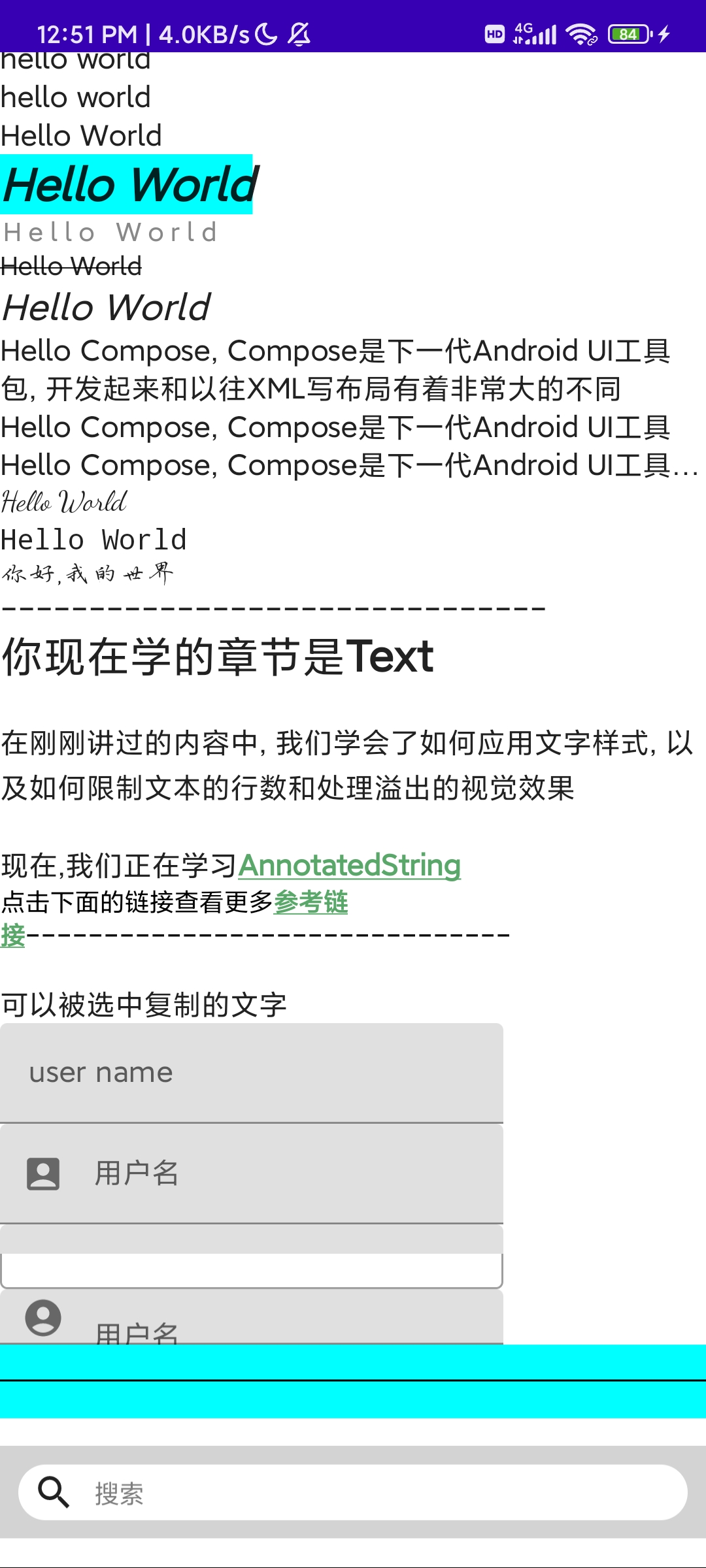
fun TestText() {Column(modifier = Modifier.verticalScroll(state = rememberScrollState())) {Text(text = "hello world")Text(text = "hello world")Text(text = "hello world")Text(text = stringResource(id = R.string.hello_world))Text(text = stringResource(id = R.string.hello_world),style = TextStyle(fontSize = 25.sp,//字体大小fontWeight = FontWeight.Bold,//字体粗细fontStyle = FontStyle.Italic,//斜体,background = Color.Cyan,lineHeight = 35.sp,//行高),)Text(text = stringResource(id = R.string.hello_world),style = TextStyle(color = Color.Gray, letterSpacing = 4.sp))Text(text = stringResource(id = R.string.hello_world),style = TextStyle(textDecoration = TextDecoration.LineThrough))Text(text = stringResource(id = R.string.hello_world),style = MaterialTheme.typography.h6.copy(fontStyle = FontStyle.Italic))Text(text = "Hello Compose, Compose是下一代Android UI工具包, 开发起来和以往XML写布局有着非常大的不同",style = MaterialTheme.typography.body1)Text(text = "Hello Compose, Compose是下一代Android UI工具包, 开发起来和以往XML写布局有着非常大的不同",style = MaterialTheme.typography.body1,maxLines = 1)Text(text = "Hello Compose, Compose是下一代Android UI工具包, 开发起来和以往XML写布局有着非常大的不同",style = MaterialTheme.typography.body1,maxLines = 1,overflow = TextOverflow.Ellipsis,)Text(text = stringResource(id = R.string.hello_world), fontFamily = FontFamily.Cursive)Text(text = stringResource(id = R.string.hello_world), fontFamily = FontFamily.Monospace)Text(text = "你好,我的世界", fontFamily = FontFamily(Font(R.font.test_font)))Text(text = buildAnnotatedString {appendLine("-------------------------------")withStyle(style = SpanStyle(fontSize = 24.sp)) {append("你现在学的章节是")}withStyle(style = SpanStyle(fontWeight = FontWeight.W900, fontSize = 24.sp)) {append("Text")}appendLine()withStyle(style = ParagraphStyle(lineHeight = 25.sp)) {append("在刚刚讲过的内容中, 我们学会了如何应用文字样式, 以及如何限制文本的行数和处理溢出的视觉效果")}appendLine()append("现在,我们正在学习")withStyle(style = SpanStyle(fontWeight = FontWeight.W900,textDecoration = TextDecoration.Underline,color = Color(0xFF59A869))) {append("AnnotatedString")}})val annotatedString = buildAnnotatedString {withStyle(style = ParagraphStyle()) {append("点击下面的链接查看更多")pushStringAnnotation(tag = "URL", annotation = "https://jetpackcompose.cn/docs/elements/text")withStyle(style = SpanStyle(fontWeight = FontWeight.W900,textDecoration = TextDecoration.Underline,color = Color(0xFF59A869))) {append("参考链接")}pop()//结束之前添加的样式appendLine("-------------------------------")}}val currentContext = LocalContext.currentClickableText(text = annotatedString, onClick = { offset ->annotatedString.getStringAnnotations(tag = "URL", start = offset, end = offset).firstOrNull()?.let { annotation ->val uri: Uri = Uri.parse(annotation.item)val intent = Intent(Intent.ACTION_VIEW, uri)startActivity(currentContext, intent, null)}})SelectionContainer {Text(text = "可以被选中复制的文字")}TestTextField()}
}@Composable
fun TestTextField() {var textFields by remember { mutableStateOf("") }TextField(value = textFields,onValueChange = { textFields = it },label = { Text(text = "user name") })var userName by remember {mutableStateOf("")}var password by remember {mutableStateOf("")}TextField(value = userName,onValueChange = { userName = it },label = { Text(text = "用户名") },leadingIcon = {Icon(imageVector = Icons.Filled.AccountBox, contentDescription = "username")})TextField(value = password,onValueChange = { password = it },label = { Text(text = "密码") },trailingIcon = {IconButton(onClick = {}) {Icon(painter = painterResource(id = R.drawable.visibility),contentDescription = "password")}})var outlinedTextFields by remember { mutableStateOf("Hello World") }OutlinedTextField(value = outlinedTextFields, onValueChange = { outlinedTextFields = it })//不是basicTextField,属性被material theme所限制,例如修改高度,输入区域会被截断,影响显示效果TextField(value = userName,onValueChange = { userName = it },label = { Text(text = "用户名") },leadingIcon = {Icon(imageVector = Icons.Filled.AccountCircle, contentDescription = null)},modifier = Modifier.height(30.dp))var basicTextFields by remember { mutableStateOf("") }BasicTextField(value = basicTextFields,onValueChange = { basicTextFields = it },decorationBox = { innerTextField ->Column {innerTextField.invoke()//innerTextField代表输入框开始输入的位置,需要在合适的地方调用Divider(thickness = 1.dp, modifier = Modifier.fillMaxWidth().background(Color.Black))}},modifier = Modifier.height(40.dp).background(Color.Cyan),)Spacer(modifier = Modifier.height(15.dp))SearchBar()Spacer(modifier = Modifier.height(15.dp))}@Composable
fun SearchBar() {var searchText by remember { mutableStateOf("") }Box(modifier = Modifier.fillMaxWidth().height(50.dp).background(Color(0xFFD3D3D3)),contentAlignment = Alignment.Center) {BasicTextField(value = searchText,onValueChange = { searchText = it },decorationBox = { innerTextField ->Row(verticalAlignment = Alignment.CenterVertically,modifier = Modifier.padding(vertical = 2.dp, horizontal = 8.dp)) {Icon(imageVector = Icons.Filled.Search, contentDescription = "")Box(modifier = Modifier.padding(horizontal = 10.dp).weight(1f),contentAlignment = Alignment.CenterStart) {if (searchText.isEmpty()) {Text(text = "搜索", style = TextStyle(color = Color(0, 0, 0, 128)))}innerTextField()}if (searchText.isNotEmpty()) {IconButton(onClick = { searchText = "" }, modifier = Modifier.size(16.dp)) {Icon(imageVector = Icons.Filled.Clear, contentDescription = "")}}}},modifier = Modifier.padding(horizontal = 10.dp).height(30.dp).fillMaxWidth().background(Color.White, CircleShape),)}
}
图片组件
@Composable
fun TestImage() {Column {//Material Icon默认的tint颜色会是黑色, 所以彩色的icon,也会变成黑色Icon(imageVector = ImageVector.vectorResource(id = R.drawable.collect),//xml svg矢量图contentDescription = "矢量图资源")//将tint设置为Color.Unspecified, 即可显示出多色图标Icon(imageVector = ImageVector.vectorResource(id = R.drawable.collect),//xml svg矢量图contentDescription = "矢量图资源", tint = Color.Unspecified)Icon(bitmap = ImageBitmap.imageResource(id = R.drawable.gallery), contentDescription = "图片资源"//加载jpg或png)Icon(painter = painterResource(id = R.drawable.visibility), contentDescription = "任意类型的资源")//任意类型的资源文件Image(imageVector = ImageVector.vectorResource(id = R.drawable.collect),//xml svg矢量图contentDescription = "矢量图资源")Image(bitmap = ImageBitmap.imageResource(id = R.drawable.gallery), contentDescription = "图片资源"//加载jpg或png)Image(painter = painterResource(id = R.drawable.visibility), contentDescription = "任意类型的资源")//任意类型的资源文件}
}
按钮组件
@Composable
fun TestButton() {Column {Button(onClick = {}, contentPadding = PaddingValues(2.dp)) {Text(text = "确认")}Button(onClick = {},contentPadding = PaddingValues(5.dp),colors = ButtonDefaults.buttonColors(backgroundColor = Color.Cyan, contentColor = Color.Gray)) {Icon(imageVector = Icons.Filled.Done,contentDescription = "",modifier = Modifier.size(ButtonDefaults.IconSize))Spacer(modifier = Modifier.width(ButtonDefaults.IconSpacing))Text(text = "确认")}val interactionSource = remember {MutableInteractionSource()}val isPressedAsState = interactionSource.collectIsPressedAsState()val borderColor = if (isPressedAsState.value) Color.Green else Color.CyanButton(onClick = {},contentPadding = PaddingValues(horizontal = 12.dp),border = BorderStroke(2.dp, borderColor),interactionSource = interactionSource) {Text(text = "long press")}IconButton(onClick = {}) {Icon(painter = painterResource(id = R.drawable.collect_24_x_24),contentDescription = "",tint = Color.Unspecified)}FloatingActionButton(onClick = {}) {Icon(Icons.Filled.KeyboardArrowUp, contentDescription = "")}ExtendedFloatingActionButton(icon = {Icon(Icons.Filled.Favorite, contentDescription = "", tint = Color.Unspecified)}, text = { Text(text = "add to my favorite") }, onClick = {})}
}
选择器组件
@Composable
fun TestSelector() {Column(modifier = Modifier.verticalScroll(rememberScrollState())) {val checkedState = remember {mutableStateOf(true)}Checkbox(checked = checkedState.value,onCheckedChange = { checkedState.value = it },colors = CheckboxDefaults.colors(checkedColor = Color(0xFF0079D3)))val (state, onStateChange) = remember {mutableStateOf(true)}val (state2, onStateChange2) = remember {mutableStateOf(true)}val parentState = remember(state, state2) {if (state && state2) ToggleableState.Onelse if (!state && !state2) ToggleableState.Offelse ToggleableState.Indeterminate}val onParentClick = {val s = parentState != ToggleableState.OnonStateChange(s)onStateChange2(s)}TriStateCheckbox(state = parentState,onClick = onParentClick,colors = CheckboxDefaults.colors(checkedColor = MaterialTheme.colors.primary))Row(modifier = Modifier.padding(10.dp, 0.dp, 0.dp, 10.dp)) {Checkbox(checked = state, onCheckedChange = onStateChange)Checkbox(checked = state2, onCheckedChange = onStateChange2)}val switchCheckedState = remember {mutableStateOf(true)}Switch(checked = switchCheckedState.value,onCheckedChange = { switchCheckedState.value = it },colors = SwitchDefaults.colors(checkedThumbColor = Color.Cyan, checkedTrackColor = Color.Gray))var sliderPosition by remember {mutableStateOf(0f)}Text(text = "%.1f".format(sliderPosition * 100) + "%",modifier = Modifier.align(alignment = CenterHorizontally))Slider(value = sliderPosition, onValueChange = { sliderPosition = it })}}
对话框组件
@Composable
fun TestDialog() {Column {val openDialog = remember {mutableStateOf(false)}Button(onClick = {openDialog.value = !openDialog.value}) {Text(text = if (openDialog.value) "CloseDialog" else {"OpenDialog"})}if (openDialog.value) {Dialog(onDismissRequest = { openDialog.value = false }, properties = DialogProperties(dismissOnBackPress = true, dismissOnClickOutside = true)) {Box(modifier = Modifier.size(300.dp, 400.dp).background(Color.White)) {Button(onClick = {openDialog.value = false}, modifier = Modifier.align(Alignment.Center)) {Text(text = "Close")}}}}val alertDialog = remember {mutableStateOf(false)}Button(onClick = {alertDialog.value = !alertDialog.value}) {Text(text = if (alertDialog.value) "CloseAlertDialog" else {"OpenAlertDialog"})}if (alertDialog.value) {AlertDialog(onDismissRequest = { alertDialog.value = false },title = { Text(text = "开启位置服务") },text = {Text(text = "提供精确的位置使用,请务必打开")},confirmButton = {Button(onClick = { alertDialog.value = false }) {Text(text = "同意")}},dismissButton = {TextButton(onClick = { alertDialog.value = false }) {Text(text = "取消")}})}}
}
进度条组件
@Preview
@Composable
fun TestProgress() {var progress by remember {mutableStateOf(0.1f)}val animatedProgress by animateFloatAsState(targetValue = progress, animationSpec = ProgressIndicatorDefaults.ProgressAnimationSpec, label = "progressAnim")Column(modifier = Modifier.padding(10.dp).border(2.dp, color = MaterialTheme.colors.primary),horizontalAlignment = Alignment.CenterHorizontally,verticalArrangement = Arrangement.Center) {CircularProgressIndicator(progress = animatedProgress,backgroundColor = MaterialTheme.colors.primary.copy(alpha = IndicatorBackgroundOpacity),)Spacer(modifier = Modifier.height(30.dp))LinearProgressIndicator(progress = animatedProgress, strokeCap = StrokeCap.Round)Spacer(modifier = Modifier.height(30.dp))Row {OutlinedButton(onClick = {if (progress >= 1.0f) {return@OutlinedButton}progress += 0.1f}) {Text(text = "增加进度")}Spacer(modifier = Modifier.width(30.dp))OutlinedButton(onClick = {if (progress == 0f) {return@OutlinedButton}progress -= 0.1f}) {Text(text = "减少进度")}}}
}
常用的布局组件
ConstraintLayout约束布局需要依赖:implementation “androidx.constraintlayout:constraintlayout-compose: $constraintlayout _version”
布局
@Preview
@Composable
fun TestLayout() {Column(modifier = Modifier.border(2.dp, color = MaterialTheme.colors.primary).verticalScroll(rememberScrollState())) {Surface(shape = RoundedCornerShape(8.dp),modifier = Modifier.padding(horizontal = 12.dp, vertical = 10.dp).fillMaxWidth(),elevation = 10.dp) {Column(modifier = Modifier.padding(12.dp)) {Text(text = "Jetpack Compose是什么", style = MaterialTheme.typography.h6)Spacer(modifier = Modifier.padding(vertical = 5.dp))Text(text = "Jetpack Compose是用于构建原生Android UI的现代工具包。它采用声明式UI的设计,拥有更简单的自定义和实时的交互预览功能,由Android官方团队全新打造的UI框架。Jetpack Compose可简化并加快Android上的界面开发,使用更少的代码、强大的工具和直观的Kotlin API,快速打造生动而精彩的应用。")Row(modifier = Modifier.fillMaxWidth(),horizontalArrangement = Arrangement.SpaceBetween) {IconButton(onClick = { /*TODO*/ }) {Icon(Icons.Filled.Favorite, null)}IconButton(onClick = { /*TODO*/ }) {Icon(Icons.Filled.Add, null)}IconButton(onClick = { /*TODO*/ }) {Icon(Icons.Filled.Star, null)}}}}Spacer(modifier = Modifier.height(40.dp))Text(text = "约束布局")Spacer(modifier = Modifier.height(40.dp))ConstraintLayout(modifier = Modifier.width(300.dp).height(100.dp).padding(10.dp)) {val (portraitImageRef, usernameTextRef, desTextRef) = remember {createRefs()//createRefs最多创建16个引用}Image(painter = painterResource(id = R.drawable.img),contentDescription = "",modifier = Modifier.constrainAs(portraitImageRef) {top.linkTo(parent.top)start.linkTo(parent.start)bottom.linkTo(parent.bottom)})Text(text = "舞蹈系学姐",style = MaterialTheme.typography.h6,modifier = Modifier.constrainAs(usernameTextRef) {top.linkTo(portraitImageRef.top)start.linkTo(portraitImageRef.end, 10.dp)})Text(text = "一本非常好看的漫画",style = MaterialTheme.typography.body1,modifier = Modifier.constrainAs(desTextRef) {top.linkTo(usernameTextRef.bottom, 10.dp)start.linkTo(usernameTextRef.start)})}Spacer(modifier = Modifier.height(40.dp))ConstraintLayout(modifier = Modifier.width(300.dp).height(100.dp).padding(10.dp)) {val (usernameTextRef, passwordTextRef, usernameInputRef, passwordInputRef, dividerRef) = remember {createRefs()//createRefs最多创建16个引用}val barrier = createEndBarrier(usernameTextRef, passwordTextRef)Text(text = "用户名", modifier = Modifier.constrainAs(usernameTextRef) {top.linkTo(parent.top)start.linkTo(parent.start)})Divider(Modifier.fillMaxWidth().constrainAs(dividerRef) {top.linkTo(usernameTextRef.bottom)bottom.linkTo(passwordTextRef.top)})Text(text = "密码", modifier = Modifier.constrainAs(passwordTextRef) {top.linkTo(usernameTextRef.bottom, 19.dp)start.linkTo(parent.start)})OutlinedTextField(value = "456546461",onValueChange = {},modifier = Modifier.constrainAs(usernameInputRef) {start.linkTo(barrier, 10.dp)top.linkTo(usernameTextRef.top)bottom.linkTo(usernameTextRef.bottom)height = Dimension.fillToConstraints})OutlinedTextField(value = "4645136131",onValueChange = {},modifier = Modifier.constrainAs(passwordInputRef) {start.linkTo(barrier, 10.dp)top.linkTo(passwordTextRef.top)bottom.linkTo(passwordTextRef.bottom)height = Dimension.fillToConstraints})}Spacer(modifier = Modifier.height(20.dp))ConstraintLayout(modifier = Modifier.fillMaxWidth().height(200.dp).padding(10.dp).background(Color.Gray)) {val (backgroundRef, avatarRef, textRef) = remember {createRefs()}val guideLine = createGuidelineFromTop(0.4f)Box(modifier = Modifier.constrainAs(backgroundRef) {top.linkTo(parent.top)bottom.linkTo(guideLine)width = Dimension.matchParentheight = Dimension.fillToConstraints}.background(Color(0xFF1E9FFF)))Image(painter = painterResource(id = R.drawable.avatar),contentDescription = "",modifier = Modifier.constrainAs(avatarRef) {top.linkTo(guideLine)bottom.linkTo(guideLine)start.linkTo(parent.start)end.linkTo(parent.end)})Text(text = "排雷数码港", color = Color.White, modifier = Modifier.constrainAs(textRef) {top.linkTo(avatarRef.bottom, 10.dp)start.linkTo(parent.start)end.linkTo(parent.end)})}Spacer(modifier = Modifier.height(20.dp))ConstraintLayout(modifier = Modifier.fillMaxWidth().height(200.dp).padding(10.dp).background(Color.Gray)) {val (text1Ref, text2Ref, text3Ref, text4Ref) = remember {createRefs()}/*createVerticalChain(text1Ref, text2Ref, text3Ref, text4Ref, chainStyle = ChainStyle.Spread)*//*createVerticalChain(text1Ref, text2Ref, text3Ref, text4Ref, chainStyle = ChainStyle.Packed)*/createVerticalChain(text1Ref, text2Ref, text3Ref, text4Ref, chainStyle = ChainStyle.SpreadInside)Text(text = "text1", modifier = Modifier.constrainAs(text1Ref) {start.linkTo(parent.start)end.linkTo(parent.end)})Text(text = "text2", modifier = Modifier.constrainAs(text2Ref) {start.linkTo(parent.start)end.linkTo(parent.end)})Text(text = "text3", modifier = Modifier.constrainAs(text3Ref) {start.linkTo(parent.start)end.linkTo(parent.end)})Text(text = "text4", modifier = Modifier.constrainAs(text4Ref) {start.linkTo(parent.start)end.linkTo(parent.end)})}
Scaffold脚手架
data class Item(val name: String, val icon: Int)@SuppressLint("UnusedMaterialScaffoldPaddingParameter")
@Composable
fun TestScaffold() {val selectedItem by remember {mutableStateOf(0)}val items = listOf<Item>(Item("主页", R.drawable.home),Item("列表", R.drawable.list),Item("设置", R.drawable.setting))val scaffoldState = rememberScaffoldState()val scope = rememberCoroutineScope()Scaffold(topBar = {TopAppBar(title = { Text(text = "主页") }, navigationIcon = {IconButton(onClick = {scope.launch {scaffoldState.drawerState.open()}},) {Icon(Icons.Filled.Menu, contentDescription = "")}})}, bottomBar = {BottomNavigation {items.forEachIndexed { index, item ->BottomNavigationItem(selected = selectedItem == index, onClick = { }, icon = {Icon(painter = painterResource(id = item.icon), contentDescription = item.name)}, alwaysShowLabel = false, label = { Text(text = item.name) })}}}, drawerContent = { Text(text = "侧边栏") }, scaffoldState = scaffoldState) {Box(modifier = Modifier.fillMaxSize(), contentAlignment = Alignment.Center) {Text(text = "主页界面")}}BackHandler(enabled = scaffoldState.drawerState.isOpen) {scope.launch {scaffoldState.drawerState.close()}}
}
列表
@Preview
@Composable
fun TestList() {LazyColumn(modifier = Modifier.fillMaxSize().background(Color.Gray),contentPadding = PaddingValues(35.dp),verticalArrangement = Arrangement.spacedBy(10.dp)) {items((1..50).toList()) { index ->ContentCard(index = index)}}
}@Composable
fun ContentCard(index: Int) {Card(elevation = 8.dp, modifier = Modifier.fillMaxWidth()) {Box(modifier = Modifier.fillMaxSize().padding(15.dp), contentAlignment = Alignment.Center) {Text(text = "第${index}卡片", style = MaterialTheme.typography.h5)}}
}
Jetpack Compose从入门到实战 第一章