1. 风格设置
Qt 提供了 3 种整体风格,使用 QStyleFactory::keys() 来获取 (windowsvista 、Windows 、Fusion)
可以在 main.cpp 中调用 setStyle 方法对应用程序进行全局风格的设置
int main(int argc, char *argv[])
{QApplication a(argc, argv);MainWindow w;w.show();// 获取整体风格qDebug() << QStyleFactory::keys();// 设置风格// a.setStyle("windowsvista");     // 默认使用// a.setStyle("Windows");a.setStyle("Fusion");return a.exec();
}
2. QSS概述
-
QSS 全称为 Qt Style Sheets 也就是 Qt 样式表,它是 Qt 提供的一种用来自定义控件外观的机制。
-
简单理解 : QSS 的作用就是给程序美容
-
QSS 大量参考了 CSS,但是 QSS 比 CSS 要弱很多。QSS 的选择器、属性、值都比较少
2.1 图形化设置样式
第一步: 选中任意控件 --> 选择 styleSheet 属性
 第二步:点击 ... 按钮,弹出设置框
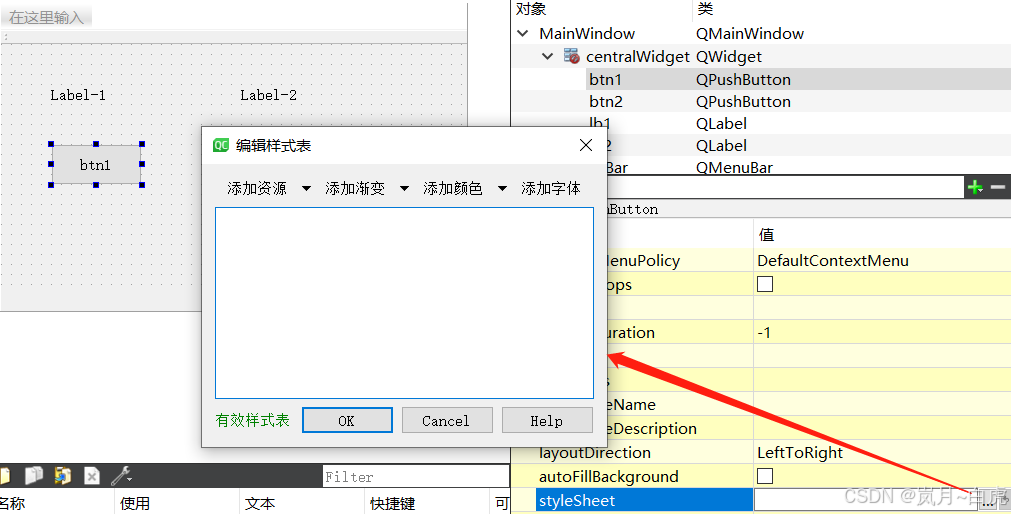
第三步:选中任意设置项
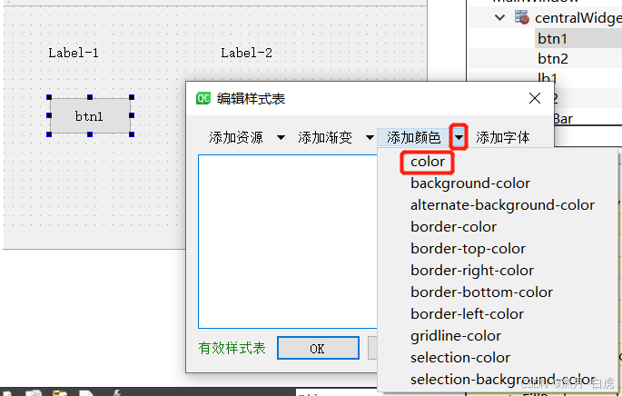
第四步:选中具体值
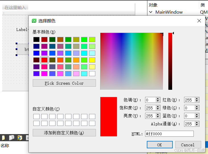
选中后:
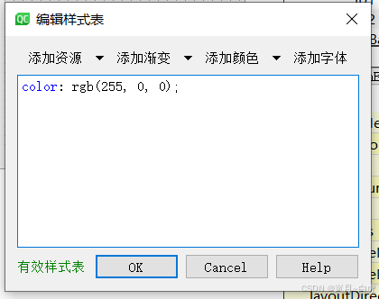
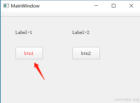
效果:按钮中的文本变红
允许同时设置多种属性和匹配值:

说明:
-
font: 用来设置字体
-
text-decoration: 用来设置文本样式
-
color: 用来设置文字颜色
-
background-color: 用来设置背景色
2.2 QSS 的基本写法
-
QSS 书写格式 :
选择器 {属性1: 值1;         background-color: red;属性2: 值2;         color: orange;......
}-
setStyleSheet(样式代码) : 该方法让 QSS 生效
示例:设置按钮的样式
// 设置 btn1 按钮的样式
// corlo: red;           设置字体颜色为红色
// font-size: 30px;      设置字体的大小为 30px
// font-family: '楷体';   设置字形为楷体
ui->btn1->setStyleSheet("QPushButton{color:red; font-size:30px;}");ui->btn1->setStyleSheet("color:orange; font-family:'楷体';");
3. 选择器
选择器的作用: 选中界面上的控件(组件)
| 选择器 | 示例 | 说明 |
|---|---|---|
| 通用选择器 | * | 一次性选中所有的部件 |
| 类型选择器 | QPushButton | 一次性选中所有的QPushButton按钮 |
| 属性选择器 | QPushButton[flat=true] | 选中QPushButton按钮上有flat=true的按钮 |
| 类选择器 | .QPushButton | 和类型选择器类似,但不匹配派生类 |
| ID选择器 | #btn | QPushButton#btn | 获取对象名为 btn 的部件 |
示例:
// * 通用选择器,能够选中所有部件
// 注意事项: 使用通过选择器时直接使用 this 调用 setStyleSheet 方法
this->setStyleSheet("*{color: red}");
// 类型选择器
// 一次性选中所有 QPushButton
this->setStyleSheet("QPushButton{color: orange}");// ID选择器, 部件对项目就是 ID值 (唯一的)
// 注意事项: ID选择器前需要加 #
// QPushButton#btn3 或者 #btn3 均可
this->setStyleSheet("#btn3{font-size: 30px}");// 属性选择器
ui->btn3->setFlat(true); // 给 btn3 设置 flat="true" 属性,去掉按钮边框
ui->btn3->setProperty("flat", true); // 功能同上
this->setStyleSheet("QPushButton[flat=true]{color: orange}");// 类选择器
this->setStyleSheet(".QLabel{color: blue; font-size: 30px}");// 从 QPushButton 派生的按钮
MyButton *myBtn = new MyButton;
myBtn->resize(100, 40);
myBtn->setText("我的按钮");
myBtn->setParent(this);
myBtn->move(30, 200);// 类型选择器能够选中所有的 QPushButton, 包括派生的 QPushButton
// this->setStyleSheet("QPushButton{color: orange}");// 类选择器能够选中所有的QPushButton, 不包括派生类
this->setStyleSheet(".QPushButton{color: orange}");4. 常用属性
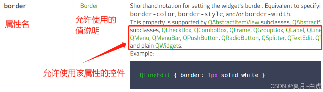
属性的使用方式可参考QSS 官方文档 https://doc.qt.io/qt-5/stylesheet-reference.html 和 示例https://doc.qt.io/qt-5/stylesheet-examples.html
4.1 font 属性
font 用来设置文字属性
-
font-family:设置文本使用的字形,如: 宋体、微软雅黑等
-
font-size:设置字体大小
-
font-style:设置字体是否倾斜
-
font-weight:设置文本的粗细,常用值: 400, 900
-
连写: font : 加粗 倾斜 大小 字形 (加粗和倾斜可以省略)
-
示例:
QLabel{font: 900 italic 18pt "Arial"; }
-
// 示例:
ui->lb2->setStyleSheet("QLabel{font-size:30px; font-weight: 25}");
ui->lb3->setStyleSheet("QLabel{font-size:30px; font-family:'楷体'; font-weight: 50; font-style:italic}");
ui->lb4->setStyleSheet("QLabel{font: 75 18pt 'Arial';}");
4.2 text 属性
-
text-decoration:设置文本水平线的位置
-
underline 下划线 | line-through 贯穿线 | overline 上划线 | none 无线条(默认)
-
-
text-align: 设置文本对齐位置
-
只能用于 QPushButton 和 QProgressBar
-
top | center | bottom
-
left | center | right
-
-
color: 设置文本颜色
-
十六进制: #AA09B5 (#00 00 00 #FF FF FF)
-
rgba: 红绿蓝色值, a 为透明度 0~1 之间 (rgb(0, 0, 0) rgb(255, 255, 255))
-
英文单词: red 、green、 cyan 等
-
ui->lb4->setStyleSheet("QLabel{text-decoration: overline; color: rgba(0, 0, 0, 0.15)}");
ui->pushButton->setStyleSheet("text-align: right bottom");
ui->progressBar->setStyleSheet("text-align: center; color: red");
4.3 背景
-
background-color: 设置背景色
-
色值设置同 QColor
-
-
background-image:url(图片资源地址) : 设置背景图
-
background-repeat:设置背景图是否重复
-
no-repeat | repeat-x | repeat-y | repeat(默认)
-
-
background-position: x y; 设置背景图位置
-
x 可选值: left 、 center、 right
-
y 可选值: top、 center、bottom
-
-
background-attachment: 背景图是否跟随滚动
-
scroll:跟随滚动
-
fixed:固定
-
ui->textEdit->setStyleSheet("""QTextEdit{""background-image:url(:/images/3.png);""background-repeat:no-repeat;""background-position: right bottom;""background-attachment: fixed;""}"
);
5. 选择器进阶
5.1 复合选择器
| 选择器 | 示例 | 说明 |
|---|---|---|
| 后代选择器 | QDialog QPushButton | 获取 QDialog 中所有的 QPushButton 按钮 |
| 子代选择器 | QDialog > QPushButton | 获取 QDialog 中子代 QPushButton 按钮 |
| 并集选择器 | QPushButton,QLabel | 同时获取 QPushButton 和 QLabel 控件 |
// 子代选择器
this->setStyleSheet("QDialog>QPushButton{color: red}");connect(ui->btn1, &QPushButton::clicked, [=](){QDialog dia(this);dia.setFixedSize(300, 300);QPushButton *btn = new QPushButton("btn", &dia);dia.exec();
});
5.2 子控件
-
当部件比较复杂时可以使用 :: 对其子部件进行样式的设置。例如: QComboBox
 示例:
示例:
// ::down-arrow  下箭头
ui->comboBox->setStyleSheet("QComboBox::down-arrow {image: url(:/images/arrow.png)}");
ui->comboBox->addItem("北京");
ui->comboBox->addItem("上海");
ui->comboBox->addItem("深圳");
5.3 伪状态
-
选择器可以包含伪状态来限制样式在部件的指定状态上应用
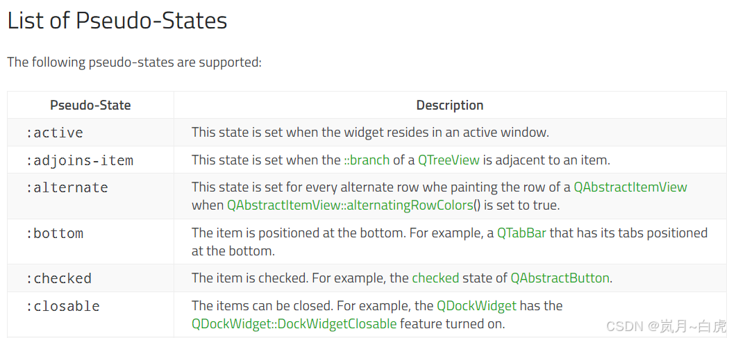
// :hover  鼠标悬浮在按钮上时触发
this->setStyleSheet("QPushButton:hover{color: red}");// :focus  获取焦点时触发
this->setStyleSheet("QLineEdit:focus{border: 1px solid red}");
6. 样式表特点
6.1 继承
如果一个控件没有设置样式,它会继承父控件的样式
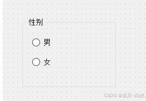
ui->groupBox->setStyleSheet("color: red");RadioButton没有设置文字颜色,但是父控件GroupBox设置了文字颜色,所以RadioButton的文字颜色就是红色 。
6.2 层叠
当使用多个选择器设置样式并加载在同一个控件上,这些样式都会生效。
示例:
ui->groupBox->setStyleSheet("color: red;");
ui->radioButton->setStyleSheet("font-size: 30px;");
6.3 冲突
-
当多个选择器选中同一个控件,并且同时设置同一个样式,则会产生冲突。
-
当冲突产生时,系统会按照优先级进行设置。规则为: 给控件直接设置的样式 > 继承的样式
ui->groupBox->setStyleSheet("color: red; font-size: 40px;");
ui->radioButton->setStyleSheet("font-size: 30px;");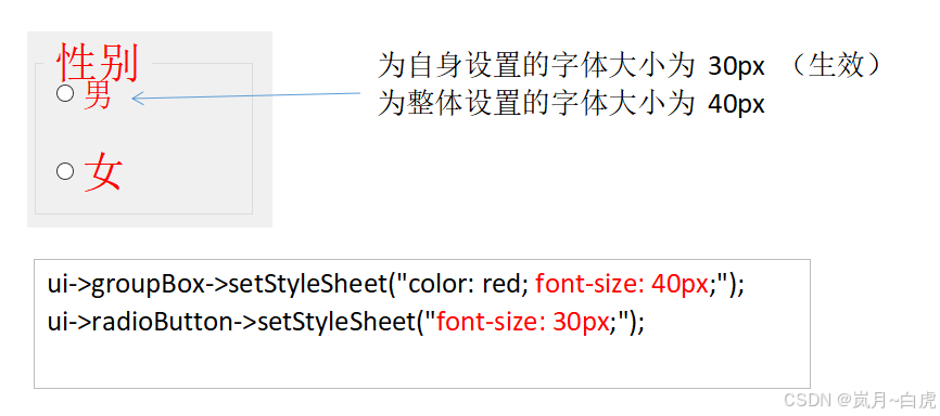
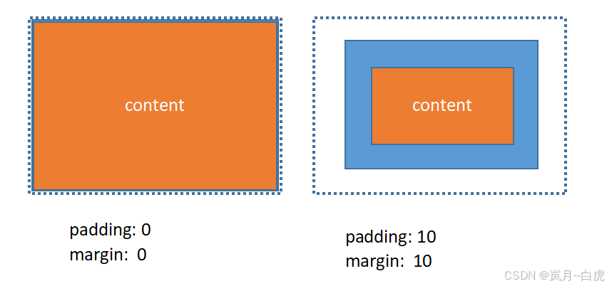
7. 盒子模型
当使用样式表时,每一个部件都被看做是拥有四个同心矩形的盒子,如下图所示。这四个矩形分别是内容(content)、填衬(padding)、边框(border)和边距(margin)。边距、边框宽度和填衬等属性的默认值都是0,这样四个矩形恰好重合。
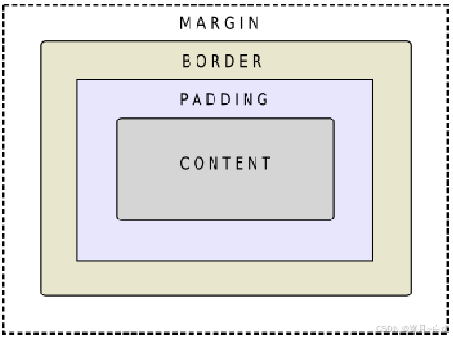
注意事项:
-
当控件的宽高已经被设置完成后,它所占的面积就固定了。
-
border、padding 和 margin 只会挤占 content 的面积
7.1 border 边框
-
border : 设置整体边框样式
-
边框样式可以拆开设置:
-
top、left、right、bottom
-
color、style
-
-
border-radius: 设置圆角
// 整体设置
this->setStyleSheet("QLabel {border: 2px solid red;}");// 分别设置上下左右
ui->label_3->setStyleSheet("""border-right: 3px dashed orange; ""border-top: 2px solid #338811; ""border-left: 5px dot-dot-dash rgba(0, 0, 0, .5);""border-bottom: 10px double red;"
);// 分别设置 边框粗细、样式、颜色
ui->label_3->setStyleSheet("""border-width: 3px;""border-style: solid;""border-color: #AE0987;"
);
圆角
QProgressBar {border: 2px solid grey;border-radius: 5px;  // 5px的圆角text-align: center;
}
7.2 padding 和 margin
ui->label_3->setStyleSheet("""border-width: 3px;""border-style: solid;""border-color: #AE0987;"
);ui->label_4->setStyleSheet("""border-width: 3px;""border-style: solid;""border-color: #AE0987;""padding: 15px;"
);
8. QSS 文件
-
在项目中为每一个控件单独设置样式是非常麻烦的事情
-
实际开发中,可以将样式写入到独立的 .qss 文件中,再在项目中使用 qss 文件即可
-
使用步骤:
-
创建一个 xxx.qss 文件并添加到项目资源中(过程同图片资源)
-
在 qss 文件中编写样式代码
-
在 main.cpp 文件中使用 QFile 读取 qss 中的样式代码,再使用 setStyleSheet 方法设置样式即可
-