何时使用
- 需要一个输入框而不是选择器。
- 需要输入建议/辅助提示。
和 Select 的区别
- AutoComplete 是一个带提示的文本输入框,用户可以自由输入,关键词是辅助输入。
- Select 是在限定的可选项中进行选择,关键词是选择。
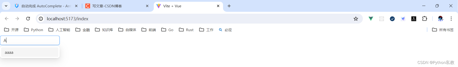
基本使用
基本使用。通过 options 设置自动完成的数据源。
核心代码:
<template><a-auto-completev-model:value="value":options="options"style="width: 200px"placeholder="input here"@select="onSelect"@search="onSearch"/>
</template>
<script lang="ts" setup>javascript">
import { ref, watch } from 'vue';interface MockVal {value: string;
}
const mockVal = (str: string, repeat = 1): MockVal => {return {value: str.repeat(repeat),};
};
const value = ref('');
const options = ref<MockVal[]>([]);
const onSearch = (searchText: string) => {console.log('searchText');options.value = !searchText? []: [mockVal(searchText), mockVal(searchText, 2), mockVal(searchText, 3)];
};
const onSelect = (value: string) => {console.log('onSelect', value);
};
watch(value, () => {console.log('value', value.value);
});
</script>
第一步:定义组件
- 动态绑定的值:
v-model:value="value" - 选项列表:
:options="options" - 选中时触发的事件:
@select="onSelect" - 搜索时触发的事件:
@search="onSearch"
<a-auto-completev-model:value="value":options="options"style="width: 200px"placeholder="input here"@select="onSelect"@search="onSearch"/>
第二步:定义搜索列表
const options = ref<MockVal[]>([]);
第三步:实现搜索方法
const mockVal = (str: string, repeat = 1): MockVal => {return {value: str.repeat(repeat),};
};const onSearch = (searchText: string) => {console.log('searchText');options.value = !searchText? []: [mockVal(searchText), mockVal(searchText, 2), mockVal(searchText, 3)];
};
vue3示例:
<script setup>javascript">
import {ref} from "vue";const value = ref('')
const options = ref([])const onSearch = (value) => {console.log("要搜索的值:", value)// 准备数据options.value = [{value: "a"},{value: "aaa"},{value: "aaaaaaa"},]
}</script>
<template><div class="p-8 bg-indigo-50 flex justify-center items-center"><a-auto-completev-model:value="value":options="options"@search="onSearch"class="w-32"/></div>
</template>
案例:选中事件
如何实现:@select="onSelect"
vue3示例:
<script setup>javascript">
import {ref} from "vue";const value = ref('')
const options = ref([])const onSearch = (value) => {console.log("要搜索的值:", value)// 准备数据options.value = [{value: "a"},{value: "aaa"},{value: "aaaaaaa"},]
}const onSelect = (value) => {console.log("选中的值是:", value)alert(value)
}</script>
<template><div class="p-8 bg-indigo-50 flex justify-center items-center"><a-auto-completev-model:value="value":options="options"@search="onSearch"@select="onSelect"class="w-32"/></div>
</template>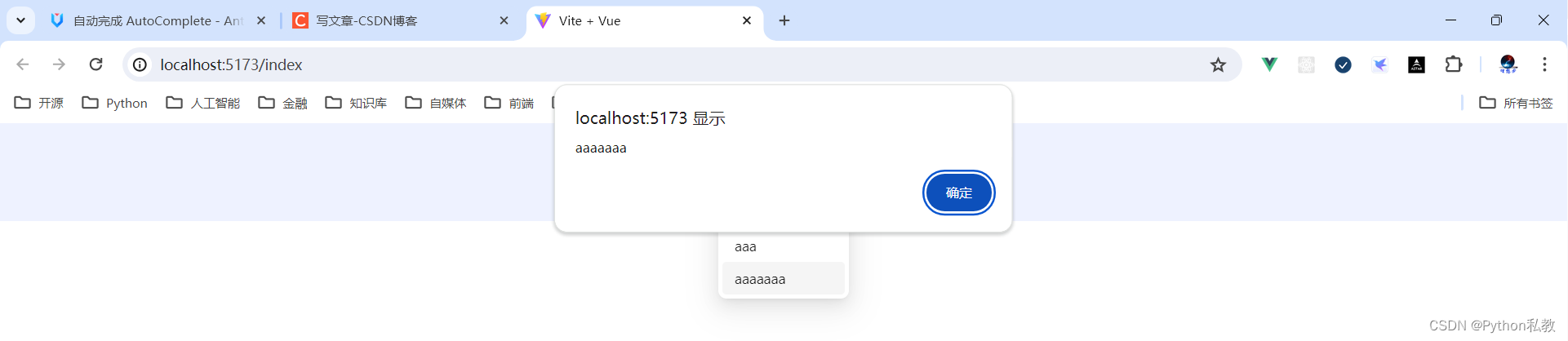
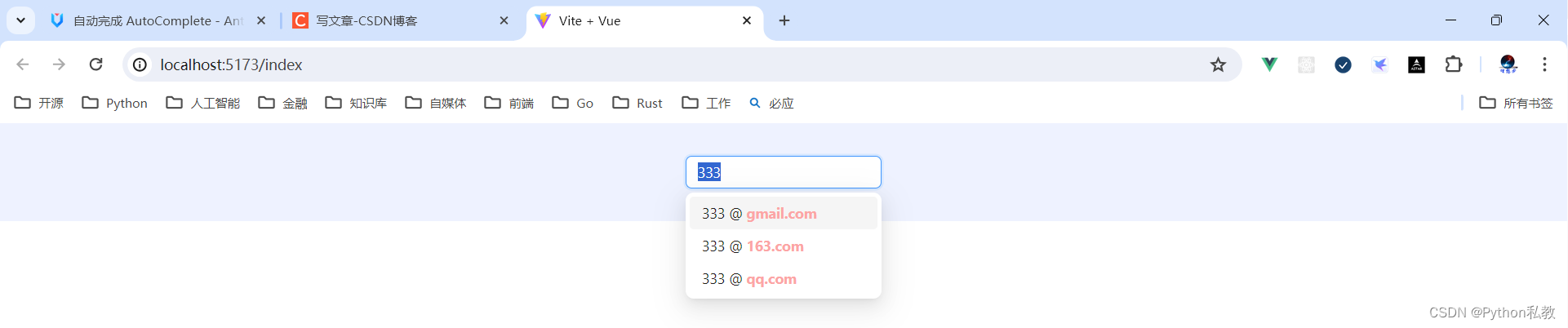
案例:自定义选项
核心代码:
<template><a-auto-completev-model:value="value"style="width: 200px"placeholder="input here":options="options"@search="handleSearch"><template #option="{ value: val }">{{ val.split('@')[0] }} @<span style="font-weight: bold">{{ val.split('@')[1] }}</span></template></a-auto-complete>
</template>
<script setup>javascript">
import { ref } from 'vue';
const value = ref('');
const options = ref([]);
const handleSearch = val => {let res;if (!val || val.indexOf('@') >= 0) {res = [];} else {res = ['gmail.com', '163.com', 'qq.com'].map(domain => ({value: `${val}@${domain}`,}));}options.value = res;
};
</script>
如何实现自定义选项?
<template #option="{ value: val }">
{{ val.split('@')[0] }} @
<span style="font-weight: bold">{{ val.split('@')[1] }}</span>
</template>
vue3示例:
<template><div class="p-8 text-center bg-indigo-50"><a-auto-completev-model:value="value"class="w-48"placeholder="请在这里输入内容":options="options"@search="handleSearch"><!--重写插槽--><template #option="{ value: val }">{{ val.split('@')[0] }} @<span class="font-bold text-red-300">{{ val.split('@')[1] }}</span></template></a-auto-complete></div>
</template>
<script setup>javascript">
import { ref } from 'vue';
const value = ref('');
const options = ref([]);
const handleSearch = val => {let res;if (!val || val.indexOf('@') >= 0) {res = [];} else {res = ['gmail.com', '163.com', 'qq.com'].map(domain => ({value: `${val}@${domain}`,}));}options.value = res;
};
</script>
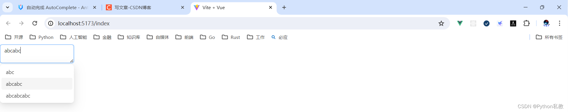
案例:自定义输入组件
核心代码:
<template><a-auto-completev-model:value="value":options="options"style="width: 200px"@search="handleSearch"@select="onSelect"><a-textareaplaceholder="input here"class="custom"style="height: 50px"@keypress="handleKeyPress"/></a-auto-complete>
</template>
<script setup>javascript">
import { ref } from 'vue';
const value = ref('');
const options = ref([]);
const onSelect = value => {console.log('onSelect', value);
};
const handleSearch = value => {options.value = !value? []: [{value,},{value: value + value,},{value: value + value + value,},];
};
const handleKeyPress = ev => {console.log('handleKeyPress', ev);
};
</script>
如何实现:重写默认插槽
<a-auto-completev-model:value="value":options="options"style="width: 200px"@search="handleSearch"@select="onSelect"><a-textareaplaceholder="input here"class="custom"style="height: 50px"@keypress="handleKeyPress"/></a-auto-complete>
案例:不区分大小写
核心代码:
<template><a-auto-completev-model:value="value":options="options"style="width: 200px"placeholder="input here":filter-option="filterOption"/>
</template>
<script setup>javascript">
import { ref } from 'vue';
const filterOption = (input, option) => {return option.value.toUpperCase().indexOf(input.toUpperCase()) >= 0;
};
const value = ref('');
const options = ref([{value: 'Burns Bay Road',},{value: 'Downing Street',},{value: 'Wall Street',},
]);
</script>
如何实现:
- 自定义过滤选项:
:filter-option="filterOption" - 编写自定义选项方法
const filterOption = (input, option) => {return option.value.toUpperCase().indexOf(input.toUpperCase()) >= 0;
};
案例:确定类目查询
核心代码:
<template><div class="certain-category-search-wrapper" style="width: 250px"><a-auto-completev-model:value="value"class="certain-category-search"popup-class-name="certain-category-search-dropdown":dropdown-match-select-width="500"style="width: 250px":options="dataSource"><template #option="item"><template v-if="item.options"><span>{{ item.value }}<astyle="float: right"href="https://www.google.com/search?q=antd"target="_blank"rel="noopener noreferrer">more</a></span></template><template v-else-if="item.value === 'all'"><ahref="https://www.google.com/search?q=ant-design-vue"target="_blank"rel="noopener noreferrer">View all results</a></template><template v-else><div style="display: flex; justify-content: space-between">{{ item.value }}<span><UserOutlined />{{ item.count }}</span></div></template></template><a-input-search placeholder="input here" size="large"></a-input-search></a-auto-complete></div>
</template>
<script setup>javascript">
import { ref } from 'vue';
const dataSource = [{value: 'Libraries',options: [{value: 'AntDesignVue',count: 10000,},{value: 'AntDesignVue UI',count: 10600,},],},{value: 'Solutions',options: [{value: 'AntDesignVue UI FAQ',count: 60100,},{value: 'AntDesignVue FAQ',count: 30010,},],},{value: 'Articles',options: [{value: 'AntDesignVue design language',count: 100000,},],},{value: 'all',},
];
const value = ref('');
</script>
<style scoped>
.certain-category-search-dropdown .ant-select-dropdown-menu-item-group-title {color: #666;font-weight: bold;
}.certain-category-search-dropdown .ant-select-dropdown-menu-item-group {border-bottom: 1px solid #f6f6f6;
}.certain-category-search-dropdown .ant-select-dropdown-menu-item {padding-left: 16px;
}.certain-category-search-dropdown .ant-select-dropdown-menu-item.show-all {text-align: center;cursor: default;
}.certain-category-search-dropdown .ant-select-dropdown-menu {max-height: 300px;
}
</style>
vue3示例:
<template><div class="certain-category-search-wrapper" style="width: 250px"><a-auto-completev-model:value="value"class="certain-category-search"popup-class-name="certain-category-search-dropdown":dropdown-match-select-width="500"style="width: 250px":options="dataSource"><template #option="item"><!--有分类的情况--><template v-if="item.options"><span>{{ item.value }}<astyle="float: right"href="https://www.google.com/search?q=antd"target="_blank"rel="noopener noreferrer">查看更多</a></span></template><!--所有--><template v-else-if="item.value === 'all'"><ahref="https://www.google.com/search?q=ant-design-vue"target="_blank"rel="noopener noreferrer">查看所有结果</a></template><!--其他情况--><template v-else><div style="display: flex; justify-content: space-between">{{ item.value }}<span><UserOutlined />{{ item.count }}</span></div></template></template><!--搜索框--><a-input-search placeholder="input here" size="large"></a-input-search></a-auto-complete></div>
</template>
<script setup>javascript">
import {ref} from 'vue';const dataSource = [{value: '分类1', // 分类options: [{value: 'AntDesignVue', // 左边的值count: 10000, // 右边的值},{value: 'AntDesignVue UI',count: 10600,},],},{value: '分类2',options: [{value: 'AntDesignVue UI FAQ',count: 60100,},{value: 'AntDesignVue FAQ',count: 30010,},],},{value: '分类3',options: [{value: 'AntDesignVue design language',count: 100000,},],},{value: '嘿嘿嘿',},{value: 'all',},
];
const value = ref('');
</script>
<style scoped>
.certain-category-search-dropdown .ant-select-dropdown-menu-item-group-title {color: #666;font-weight: bold;
}.certain-category-search-dropdown .ant-select-dropdown-menu-item-group {border-bottom: 1px solid #f6f6f6;
}.certain-category-search-dropdown .ant-select-dropdown-menu-item {padding-left: 16px;
}.certain-category-search-dropdown .ant-select-dropdown-menu-item.show-all {text-align: center;cursor: default;
}.certain-category-search-dropdown .ant-select-dropdown-menu {max-height: 300px;
}
</style>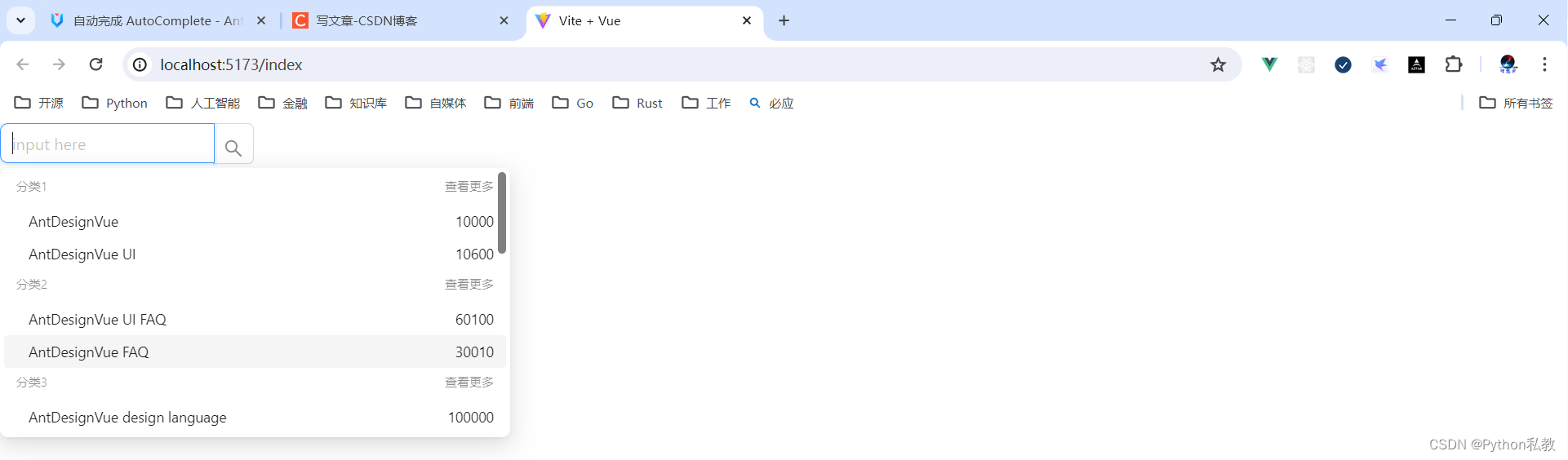
案例:不确定类目查询
核心代码:
<template><div class="global-search-wrapper" style="width: 300px"><a-auto-completev-model:value="value":dropdown-match-select-width="252"style="width: 300px":options="dataSource"@select="onSelect"@search="handleSearch"><template #option="item"><div style="display: flex; justify-content: space-between"><span>Found {{ item.query }} on<a:href="`https://s.taobao.com/search?q=${item.query}`"target="_blank"rel="noopener noreferrer">{{ item.category }}</a></span><span>{{ item.count }} results</span></div></template><a-input-search size="large" placeholder="input here" enter-button></a-input-search></a-auto-complete></div>
</template>
<script lang="ts" setup>javascript">
import { ref } from 'vue';
interface Option {query: string;category: string;value: string;count: number;
}
const value = ref('');
const dataSource = ref<Option[]>([]);
const onSelect = (value: string) => {console.log('onSelect', value);
};const getRandomInt = (max: number, min = 0) => {return Math.floor(Math.random() * (max - min + 1)) + min;
};const searchResult = (query: string): Option[] => {return new Array(getRandomInt(5)).join('.').split('.').map((_item, idx) => ({query,category: `${query}${idx}`,value: `${query}${idx}`,count: getRandomInt(200, 100),}));
};
const handleSearch = (val: string) => {dataSource.value = val ? searchResult(val) : [];
};
</script>
vue3示例:
<template><div class="global-search-wrapper" style="width: 300px"><a-auto-completev-model:value="value":dropdown-match-select-width="252"style="width: 300px":options="dataSource"@select="onSelect"@search="handleSearch"><template #option="item"><div style="display: flex; justify-content: space-between"><span>从分类<a:href="`https://s.taobao.com/search?q=${item.query}`"target="_blank"rel="noopener noreferrer">{{ item.category }}</a>查找到 {{ item.query }}</span><span>{{ item.count }} 条结果</span></div></template><a-input-search size="large" placeholder="input here" enter-button></a-input-search></a-auto-complete></div>
</template>
<script setup>javascript">
import { ref } from 'vue';
const value = ref('');
const dataSource = ref([]);
const onSelect = value => {console.log('onSelect', value);
};
const getRandomInt = (max, min = 0) => {return Math.floor(Math.random() * (max - min + 1)) + min;
};
const searchResult = query => {return new Array(getRandomInt(5)).join('.').split('.').map((_item, idx) => ({query,category: `${query}${idx}`,value: `${query}${idx}`,count: getRandomInt(200, 100),}));
};
const handleSearch = val => {dataSource.value = val ? searchResult(val) : [];
};
</script>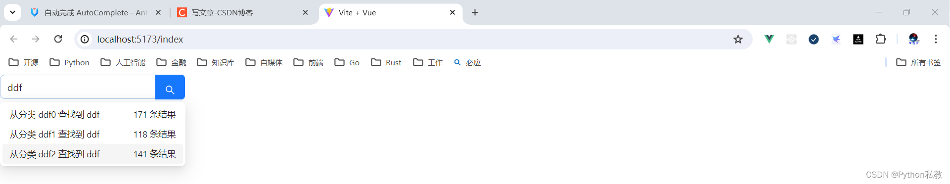
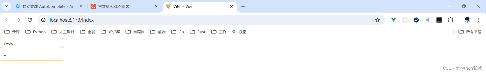
案例:自定义状态
使用 status 为 AutoComplete 添加状态,可选 error 或者 warning。
核心代码:
<template><a-space direction="vertical" style="width: 100%"><a-auto-completev-model:value="value":options="options"style="width: 200px"placeholder="input here"status="error"@select="onSelect"@search="onSearch"/><a-auto-completev-model:value="value1":options="options"style="width: 200px"placeholder="input here"status="warning"allow-clear@select="onSelect"@search="onSearch"@clear="onClear"/></a-space>
</template>
<script setup>javascript">
import { ref, watch } from 'vue';
const mockVal = (str, repeat = 1) => {return {value: str.repeat(repeat),};
};
const value = ref('');
const value1 = ref('');
const options = ref([]);
const onSearch = searchText => {console.log('searchText');options.value = !searchText? []: [mockVal(searchText), mockVal(searchText, 2), mockVal(searchText, 3)];
};
const onSelect = value => {console.log('onSelect', value);
};
const onClear = () => {console.log('onClear');
};
watch(value, () => {console.log('value', value.value);
});
</script>
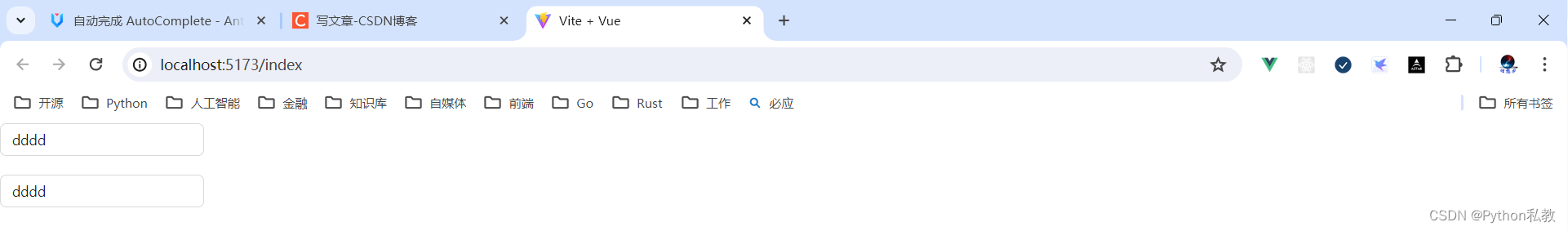
案例:自定义清除按钮
核心代码:
<template><a-auto-completev-model:value="value":options="options"style="width: 200px"placeholder="Clearable":allow-clear="true"@select="onSelect"@search="onSearch"/><br /><br /><a-auto-completev-model:value="value":options="options"style="width: 200px"placeholder="Customized clear icon":allow-clear="true"@select="onSelect"@search="onSearch"><template #clearIcon><close-outlined /></template></a-auto-complete>
</template>
<script setup>javascript">
import { ref } from 'vue';
const mockVal = (str, repeat = 1) => {return {value: str.repeat(repeat),};
};
const value = ref('');
const options = ref([]);
const onSearch = searchText => {console.log('searchText');options.value = !searchText? []: [mockVal(searchText), mockVal(searchText, 2), mockVal(searchText, 3)];
};
const onSelect = value => {console.log('onSelect', value);
};
</script>
如何实现:重写clearIcon插槽
<template #clearIcon><close-outlined />
</template>
属性
| 参数 | 说明 | 类型 | 默认值 | 版本 |
| allowClear | 支持清除, 单选模式有效 | boolean | false | |
| autofocus | 自动获取焦点 | boolean | false | |
| backfill | 使用键盘选择选项的时候把选中项回填到输入框中 | boolean | false | |
| bordered | 是否有边框 | boolean | true | 4.0 |
| clearIcon | 使用插槽自定义清除按钮 | slot | <CloseCircleFilled /> | 4.0 |
| default (自定义输入框) | 自定义输入框 | slot | <Input /> | |
| defaultActiveFirstOption | 是否默认高亮第一个选项。 | boolean | true | |
| defaultOpen | 是否默认展开下拉菜单 | boolean | - | |
| disabled | 是否禁用 | boolean | false | |
| popupClassName | 下拉菜单的 className 属性 | string | - | 4.0 |
| dropdownMatchSelectWidth | 下拉菜单和选择器同宽。默认将设置 min-width,当值小于选择框宽度时会被忽略。false 时会关闭虚拟滚动 | boolean | number | true | |
| dropdownMenuStyle | dropdown 菜单自定义样式 | object | 1.5.0 | |
| filterOption | 是否根据输入项进行筛选。当其为一个函数时,会接收 inputValue option 两个参数,当 option 符合筛选条件时,应返回 true,反之则返回 false。 | boolean or function(inputValue, option) | true | |
| open | 是否展开下拉菜单 | boolean | - | |
| option | 通过 option 插槽,自定义节点 | v-slot:option=“{value, label, [disabled, key, title]}” | - | 3.0 |
| options | 自动完成的数据源 | DataSourceItemType[] | ||
| placeholder | 输入框提示 | string | slot | - | |
| status | 设置校验状态 | ‘error’ | ‘warning’ | - | 3.3.0 |
| v-model:value | 指定当前选中的条目 | string|string[]|{ key: string, label: string|vNodes }|Array<{ key: string, label: string|vNodes }> | 无 |
事件
| 事件名称 | 说明 | 回调参数 | 版本 |
|---|---|---|---|
| blur | 失去焦点时的回调 | function() | |
| change | 选中 option,或 input 的 value 变化时,调用此函数 | function(value) | |
| dropdownVisibleChange | 展开下拉菜单的回调 | function(open) | |
| focus | 获得焦点时的回调 | function() | |
| search | 搜索补全项的时候调用 | function(value) | |
| select | 被选中时调用,参数为选中项的 value 值 | function(value, option) | |
| clear | 清除内容时回调 | function | - |
方法
| 名称 | 描述 | 版本 |
| blur() | 移除焦点 | |
| focus() | 获取焦点 |
![[数据分享第二弹]降水、植被、土壤等生态相关数据分享](https://img-blog.csdnimg.cn/img_convert/e23badd378a1f492ac79ef51f08d86e6.png)