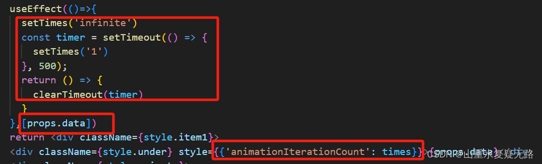
需求:随着数字的变动要求有时钟翻动动效
问题:只在加载时有动效
解决方案:通过判断数字改变(这里通过新旧数值变动来判断,不贴代码啦),每次变动的时候手动把animationIterationCount设置为infinite(持续动画),半秒后改为1(动画只执行一次),
特效参考代码
<!DOCTYPE html>
<html lang="en">
<head><meta charset="UTF-8"><title>数字翻牌效果</title><style>body {margin: 0 auto;padding: 0;text-align: center;}.container {position: absolute;left: 50%;top: 50%;transform: translate(-50%, -50%);width: 908px;height: 150px;background-color: #cc3131;border-bottom: 5px solid #ff8b8b;border-radius: 12px;}.item {position: relative;margin: 8px 5px 0;display: inline-block;width: 72px;height: 130px;/*background-color: #fe4e4e;*/background: -webkit-linear-gradient(#a42121, #fe4e4e, #bd2a2a); /* Safari 5.1 - 6.0 */background: -o-linear-gradient(#a42121, #fe4e4e, #bd2a2a); /* Opera 11.1 - 12.0 */background: -moz-linear-gradient(#a42121, #fe4e4e, #bd2a2a); /* Firefox 3.6 - 15 */background: linear-gradient(#a42121, #fe4e4e, #bd2a2a); /* 标准的语法 */border-radius: 12px;}.under, .on {position: absolute;left: 0;top: 0;width: 100%;height: 100%;line-height: 130px;color: #FACA38;font-size: 80px;border-radius: 12px;overflow: hidden;}.bottom {position: absolute;left: 0;top: 50%;width: 100%;height: 50%;line-height: 0;overflow: hidden;    /*不加这行就不会隐藏掉上面那半个数字部分*/background: -webkit-linear-gradient(#fe4e4e, #bd2a2a); /* Safari 5.1 - 6.0 */background: -o-linear-gradient(#fe4e4e, #bd2a2a); /* Opera 11.1 - 12.0 */background: -moz-linear-gradient( #fe4e4e, #bd2a2a); /* Firefox 3.6 - 15 */background: linear-gradient(#fe4e4e, #bd2a2a); /* 标准的语法 */}.animate {animation-name: flip;animation-duration: 1s;animation-direction: normal;animation-fill-mode: forwards;}.animate1 {animation-delay: .3s;-webkit-animation-delay: .3s;}.animate2 {animation-delay: .6s;}.animate3 {animation-delay: .9s;}.animate4 {animation-delay: 1.2s;}.animate5 {animation-delay: 1.5s;}.animate6 {animation-delay: 1.8s;}.animate7 {animation-delay: 2.1s;}.animate8 {animation-delay: 2.4s;}.animate9 {animation-delay: 2.7s;}@keyframes flip{from {transform: rotateX(180deg);width: 100%;}to {transform: rotateX(0);}}</style>
</head>
<body><div class="container"><div class="item"><!--底下那层--><div class="under">9</div><!--上面会翻动的那层--><div class="on animate animate0"><!--只需要下面那一半--><div class="bottom">9</div></div></div><div class="item"><div class="under">8</div><div class="on animate animate1"><div class="bottom"><div class="num">8</div></div></div></div><div class="item"><div class="under">7</div><div class="on animate animate2"><div class="bottom"><div class="num">7</div></div></div></div><div class="item"><div class="under">6</div><div class="on animate animate3"><div class="bottom"><div class="num">6</div></div></div></div><div class="item"><div class="under">5</div><div class="on animate animate4"><div class="bottom"><div class="num">5</div></div></div></div><div class="item"><div class="under">4</div><div class="on animate animate5"><div class="bottom"><div class="num">4</div></div></div></div><div class="item"><div class="under">3</div><div class="on animate animate6"><div class="bottom"><div class="num">3</div></div></div></div><div class="item"><div class="under">2</div><div class="on animate animate7"><div class="bottom"><div class="num">2</div></div></div></div><div class="item"><div class="under">1</div><div class="on animate animate8"><div class="bottom"><div class="num">1</div></div></div></div><div class="item"><div class="under">0</div><div class="on animate animate9"><div class="bottom"><div class="num">0</div></div></div></div></div>
</body>
</html>