数据概况文末有获取方式

随机森林部分
#调用R包
library(randomForest)
library(rfPermute)
library(ggplot2)
library(psych)
library(reshape2)
library(patchwork)
library(reshape2)
library(RColorBrewer)
#读取数据
df<-read.csv("F:\\EXCEL-元数据\\2020中.csv")
#设置随机种子,使结果能够重现
set.seed(123)
#运行随机森林
rf_results<-rfPermute(ESI~., data =df, importance = TRUE, ntree = 500)
#查看随机森林主要结果
rf_results$rf
#提取预测因子的解释率
predictor_var<- data.frame(importance(rf_results, scale = TRUE), check.names = FALSE)
#提取预测变量的显著
predictor_sig<-as.data.frame((rf_results$pval)[,,2])
colnames(predictor_sig)<-c("sig","other")
#合并显著因子和解释率表
df_pre<-cbind(predictor_var,predictor_sig)
df_pre$sig[df_pre$sig<=0.05]<-"*"
df_pre$sig[df_pre$sig>=0.05]<-" "
k <- df_pre$IncNodePurity[df_pre$sig=="*"]<-"#99c1e1"
# 自定义顺序列表
custom_order <- c("TEM", "PRE", "NDVI", "DEM", "SLOPE","LANDUSE","NPP","POP","GDP")
# 创建行名列
df_pre$rowname <- factor(rownames(df_pre), levels = custom_order)绘制随机森林条形图
# 绘制柱状图,使用自定义顺序
p1 <- ggplot(data=df_pre, aes(x=`%IncMSE`, y=rowname)) +geom_bar(stat='identity', width=0.6,fill=k) +#geom_errorbar(aes(xmin=mean-sd, xmax=mean+sd), width = 0.2, color = "black") +theme_classic() + labs(x='Increase in MSE(%)', y='') +scale_x_continuous(limits = c(min(0), max(df_pre$`%IncMSE`) + 10),breaks=seq(0,max(df_pre$`%IncMSE`) + 10,20),expand = c(0, 0)) +geom_text(aes(label=sig, x=`%IncMSE` + 0.1, y=rowname), hjust=-0.3, size=6) +theme(axis.text.y = element_blank())+theme(axis.text=element_text(color="black", size=11),axis.ticks.y = element_blank(),panel.grid.major.y = element_blank(),panel.grid.minor.y = element_blank(),panel.border = element_blank(),panel.background = element_blank())
p1
结果如下:

相关性热图部分
#读取环境变量和影响因子矩阵
env <- df$ESI
spe <- df[,-1]
#spe <- spe[rownames(env), ]
####环境变量和影响因子的相关性分析
library(psych)
library(reshape2)
#可通过 psych 包函数 corr.test() 执行
#这里以 pearson 相关系数为例,暂且没对 p 值进行任何校正(可以通过 adjust 参数额外指定 p 值校正方法)
pearson <- corr.test(env, spe, method = 'pearson', adjust = 'none')
r <- data.frame(pearson$r) #pearson 相关系数矩阵
p <- data.frame(pearson$p) #p 值矩阵
#结果整理以便于作图
r$env <- rownames(r)
p$env <- rownames(p)
r <- melt(r, id = 'env')
p <- melt(p, id = 'env')
pearson <- cbind(r, p$value)
colnames(pearson) <- c('env', 'spe', 'pearson_correlation', 'p.value')
pearson$spe <- factor(pearson$spe, levels = colnames(spe))
head(pearson)
#ggplot2 作图,绘制环境变量和因子的 pearson 相关性热图
# 自定义顺序列表
custom_order <- c("TEM", "PRE", "NDVI", "DEM", "SLOPE","LANDUSE","NPP","POP","GDP")
# 将 'env' 列转换为因子,并按照自定义顺序排序
pearson$env <- factor(pearson$env, levels = custom_order)出图
# 使用排序后的数据绘制热图
p2 <- ggplot() +geom_tile(data = pearson, aes(x = env, y = spe, fill = pearson_correlation)) +scale_fill_gradientn(colors = c('#3e689d', '#e8f0db', '#b0271f'), limit = c(-1, 1)) +theme(panel.grid = element_line(), panel.background = element_rect(color = 'black'), legend.key = element_blank(), legend.position = "bottom",#legend.margin = margin(t = -1, unit = "cm"), # 调整图例和图的上方间距#legend.box.margin = margin(t = 0, unit = "cm"), # 调整图例内部内容的上方间距axis.text.x = element_text(color = 'black', angle = 45, hjust = 1, vjust = 1), axis.text.y = element_text(color = 'black',size=12), axis.ticks = element_line(color = 'black')) +scale_x_discrete(expand = c(0, 0)) +scale_y_discrete(expand = c(0, 0)) +coord_fixed(ratio=1) +theme(axis.text.x = element_blank(),axis.ticks.x = element_blank(),panel.grid.major.x = element_blank(),panel.grid.minor.x = element_blank(),panel.border = element_blank(),panel.background = element_blank())+labs(y = '', x = '', fill = '')
p2
#如果想把 pearson 相关系数的显著性也标记在图中,参考如下操作
pearson[which(pearson$p.value<0.001),'sig'] <- '***'
pearson[which(pearson$p.value<0.01 & pearson$p.value>0.001),'sig'] <- '**'
pearson[which(pearson$p.value<0.05 & pearson$p.value>0.01),'sig'] <- '*'
head(pearson) #整理好的环境变量和物种丰度的 pearson 相关性统计表
p3 <- p2 +geom_text(data = pearson, aes(x = env, y = spe, label = sig), size = 6)
p3
合并两幅图,并导出
p3<-p3+theme(plot.margin = margin(0,0,0,0)) # 分别为上、右、下、左
p1<-p1+theme(plot.margin = margin(0,0,0,0))
p3+p1
#保存至ppt
library(eoffice)
topptx(filename = "F:\\出图\\2020中.pptx",height=5,width=3)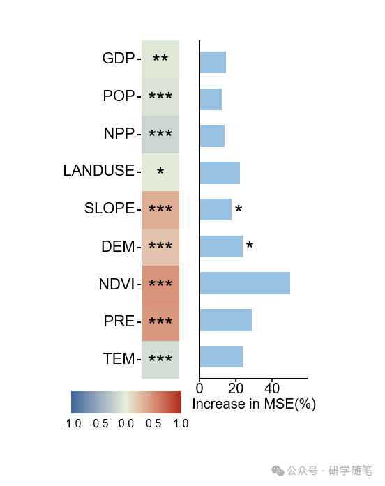
完整代码
#下载r包
install.packages("rfPermute")
install.packages("ggplot2")
install.packages("psych")
install.packages("reshape2")
install.packages("patchwork")
install.packages("randomForest")
#调用R包
library(randomForest)
library(rfPermute)
library(ggplot2)
library(psych)
library(reshape2)
library(patchwork)
library(reshape2)
library(RColorBrewer)
#读取数据
df<-read.csv("F:\\EXCEL-元数据\\2020中.csv")
#设置随机种子,使结果能够重现
set.seed(123)
#运行随机森林
rf_results<-rfPermute(ESI~., data =df, importance = TRUE, ntree = 500)
#查看随机森林主要结果
rf_results$rf
#提取预测因子的解释率
predictor_var<- data.frame(importance(rf_results, scale = TRUE), check.names = FALSE)
#提取预测变量的显著
predictor_sig<-as.data.frame((rf_results$pval)[,,2])
colnames(predictor_sig)<-c("sig","other")
#合并显著因子和解释率表
df_pre<-cbind(predictor_var,predictor_sig)
df_pre$sig[df_pre$sig<=0.05]<-"*"
df_pre$sig[df_pre$sig>=0.05]<-" "
k <- df_pre$IncNodePurity[df_pre$sig=="*"]<-"#99c1e1"
# 自定义顺序列表
custom_order <- c("TEM", "PRE", "NDVI", "DEM", "SLOPE","LANDUSE","NPP","POP","GDP")
# 创建行名列
df_pre$rowname <- factor(rownames(df_pre), levels = custom_order)
# 绘制柱状图,使用自定义顺序
p1 <- ggplot(data=df_pre, aes(x=`%IncMSE`, y=rowname)) +geom_bar(stat='identity', width=0.6,fill=k) +#geom_errorbar(aes(xmin=mean-sd, xmax=mean+sd), width = 0.2, color = "black") +theme_classic() + labs(x='Increase in MSE(%)', y='') +scale_x_continuous(limits = c(min(0), max(df_pre$`%IncMSE`) + 10),breaks=seq(0,max(df_pre$`%IncMSE`) + 10,20),expand = c(0, 0)) +geom_text(aes(label=sig, x=`%IncMSE` + 0.1, y=rowname), hjust=-0.3, size=6) +theme(axis.text.y = element_blank())+theme(axis.text=element_text(color="black", size=11),axis.ticks.y = element_blank(),panel.grid.major.y = element_blank(),panel.grid.minor.y = element_blank(),panel.border = element_blank(),panel.background = element_blank())
p1
#读取环境变量和物种丰度矩阵
env <- df$ESI
spe <- df[,-1]
#spe <- spe[rownames(env), ]
####环境变量和物种丰度的相关性分析
library(psych)
library(reshape2)
#可通过 psych 包函数 corr.test() 执行
#这里以 pearson 相关系数为例,暂且没对 p 值进行任何校正(可以通过 adjust 参数额外指定 p 值校正方法)
pearson <- corr.test(env, spe, method = 'pearson', adjust = 'none')
r <- data.frame(pearson$r) #pearson 相关系数矩阵
p <- data.frame(pearson$p) #p 值矩阵
#结果整理以便于作图
r$env <- rownames(r)
p$env <- rownames(p)
r <- melt(r, id = 'env')
p <- melt(p, id = 'env')
pearson <- cbind(r, p$value)
colnames(pearson) <- c('env', 'spe', 'pearson_correlation', 'p.value')
pearson$spe <- factor(pearson$spe, levels = colnames(spe))
head(pearson) #整理好的环境变量和物种丰度的 pearson 相关性统计表
#ggplot2 作图,绘制环境变量和物种丰度的 pearson 相关性热图
# 自定义顺序列表
custom_order <- c("TEM", "PRE", "NDVI", "DEM", "SLOPE","LANDUSE","NPP","POP","GDP")
# 将 'env' 列转换为因子,并按照自定义顺序排序
pearson$env <- factor(pearson$env, levels = custom_order)
# 使用排序后的数据绘制热图
p2 <- ggplot() +geom_tile(data = pearson, aes(x = env, y = spe, fill = pearson_correlation)) +scale_fill_gradientn(colors = c('#3e689d', '#e8f0db', '#b0271f'), limit = c(-1, 1)) +theme(panel.grid = element_line(), panel.background = element_rect(color = 'black'), legend.key = element_blank(), legend.position = "bottom",#legend.margin = margin(t = -1, unit = "cm"), # 调整图例和图的上方间距#legend.box.margin = margin(t = 0, unit = "cm"), # 调整图例内部内容的上方间距axis.text.x = element_text(color = 'black', angle = 45, hjust = 1, vjust = 1), axis.text.y = element_text(color = 'black',size=12), axis.ticks = element_line(color = 'black')) +scale_x_discrete(expand = c(0, 0)) +scale_y_discrete(expand = c(0, 0)) +coord_fixed(ratio=1) +theme(axis.text.x = element_blank(),axis.ticks.x = element_blank(),panel.grid.major.x = element_blank(),panel.grid.minor.x = element_blank(),panel.border = element_blank(),panel.background = element_blank())+labs(y = '', x = '', fill = '')
p2
#如果想把 pearson 相关系数的显著性也标记在图中,参考如下操作
pearson[which(pearson$p.value<0.001),'sig'] <- '***'
pearson[which(pearson$p.value<0.01 & pearson$p.value>0.001),'sig'] <- '**'
pearson[which(pearson$p.value<0.05 & pearson$p.value>0.01),'sig'] <- '*'
head(pearson) #整理好的环境变量和物种丰度的 pearson 相关性统计表
p3 <- p2 +geom_text(data = pearson, aes(x = env, y = spe, label = sig), size = 6)
p3
p3<-p3+theme(plot.margin = margin(0,0,0,0)) # 分别为上、右、下、左
p1<-p1+theme(plot.margin = margin(0,0,0,0))
p3+p1
#保存至ppt
library(eoffice)
topptx(filename = "F:\\出图\\2020中.pptx",height=5,width=3)